Storytelling is a powerful tool in graphic design. It can make or break your design and its effectiveness is determined by the story itself, how it’s told, and how you use it to support your overall concept.
The story you tell through your design can be as simple as a client’s brief or as complex as the history of a company, but it should always serve a purpose and contribute to your overall concept.
It should support your design and help communicate your message more effectively. The best stories are those that are relevant to the project at hand and have meaning for both you and your client.
In this article, we’ll explore what storytelling is and why it’s important for designers to understand before venturing into the world of visual storytelling.
From there, We’ll discuss some examples of how other designers have utilized storytelling in their own work—everything from movie posters to brand identities—and give tips on how you can apply those same principles when working on your own projects.
What is storytelling?

Storytelling is the act of creating a narrative. It’s a way to communicate ideas and information through a story that’s told in many different ways, but most commonly through words, images, or sounds.
In graphic design, we use storytelling as one of our main tools when communicating with an audience.
A good example of this would be posters for public events like concerts or festivals where there are multiple bands playing over several days at different venues around town – so you might have posters advertising each event separately (each poster telling its own story).
If you want to write a good story, first make sure it’s compelling. That means that readers want to keep reading because they care about what happens next and don’t want the story to end.
But what makes a good story? What are the elements of a compelling narrative? We’ll look at some examples from advertising, film, and literature to see how they use these elements to create effective stories.
Traditional storytelling

When it comes to storytelling, there are two types of stories: traditional and visual. Traditional stories are written down or spoken aloud in a linear fashion. They follow a beginning, middle, and end structure that can be seen as an analogy for the graphic design process itself:
Visual storytelling is different because it relies on visuals instead of words (or both). It’s also more open-ended; there’s no predetermined beginning or end–you’re free to interpret what you see however you want!
This makes visual storytelling much more flexible than traditional narrative forms like novels or plays because there aren’t any rules dictating how people should interpret your images unless they’re explicitly stated beforehand.
Importance of Storytelling in graphic design
Storytelling is an important part of human communication. It’s how we pass on knowledge and stories from one generation to the next, it’s how we relate to each other, and it’s what makes us feel like we are not alone in this world.
It’s also the reason why we love reading and watching movies. We want to be able to relate to the characters in these stories, and we want them to go through trials, tribulations, and triumphs that we ourselves have experienced or want for ourselves.
Now, imagine if you could use the same techniques to effectively tell a story in your graphic design. You’d be able to create something that would appeal to your clients and their audience more than ever before.
But how do you do this? How can you make sure that your designs are as effective as possible when it comes to storytelling?
The answer is simple: by using some of the same techniques that professional designers and filmmakers use. By understanding how to tell a story effectively, you can make it more likely that your designs will be well received.
While storytelling has been around for thousands of years, its role in graphic design is relatively new. There are many reasons why storytelling should be used as a tool for designers:
- It helps us connect with our audience
- It enables us to share our message with others more easily
- It can give meaning and context to your work
- It can help us create more memorable designs
- It can make your work more effective, persuasive, and resonant
Using Storytelling in the design process
Storytelling is a powerful tool in the design process because it allows you to communicate with your audience, build trust with them, and create a relationship and emotional connection with them.
It is also a great way to make your designs more memorable. When someone can relate an experience or feel to your work, that is when it becomes most effective and persuasive.
When you start telling stories about the design process, it will help you create more effective designs.
The best way to start telling stories with your designs is by asking yourself questions. Your audience has many questions and concerns when they are looking at your design, so it is important to understand what they want to know.
There are many different types of design stories, so it can be difficult to know what kind of story you want to tell.
The best way is to think about your audience and their needs. If you are designing for children, then the story will be different than if you are designing for adults.
As a designer, there are many ways that storytelling can be used. For example:
- In your portfolio or website copy (the story of how you got into the graphic design)
- On social media posts (why should people follow you?)
- In presentations (why should people listen to you?)
- In interviews or speeches (what makes you an expert?)
- On your business card (how did you get into this field?)
You may also like, Graphic Design and Environmental Sustainability (The Ultimate Guide)
How to tell a story through visuals?

The best way to tell a story through visuals is to use the power of metaphor. This means that you combine two seemingly unrelated things together in order to create new meaning and understanding.
For example, if I were designing a website for an author, I might combine their book cover with a typewriter keyboard to show how they write their stories on paper before publishing them digitally.
A great way to create a visual metaphor is by combining two things that are related but not identical. One of the best examples of this is the iconic Apple logo.
The apple represents knowledge and health, while the bite mark on it shows how much we enjoy using technology like iPhones and iPads (the bite mark also reminds us of how easy it can be for our devices to take over our lives).
While it may seem difficult to tell a story through visuals at first, the process can become easier with practice. Here are some tips for how to successfully tell your own visual stories:
1. Start with a clear message
Before you begin to design, make sure that you know what message you want your visual metaphor to convey. This will help keep your project focused and prevent it from becoming too abstract or confusing for others to understand. Ask yourself: What is my goal with this project? What are the primary benefits of using a visual metaphor over other forms of storytelling? How do I want people to feel when they see my finished product?
2. Use metaphors and symbols
Metaphors and symbols are powerful tools for visual storytelling. They allow you to communicate complex ideas in a way that is easy for others to understand because they map directly onto concepts that people already know. When choosing metaphors, try to choose ones that are familiar and universal (like the sun for happiness) rather than highly specific or culturally specific ones (such as an elephant for good luck).
3. Create a narrative
Stories are made up of a series of events that begin, continue for some time, and end. They give your audience something to follow along with as they learn about your topic, which makes it easier for them to understand what you’re trying to say.
4. Keep it simple
don’t overcomplicate your message. Try to use simple words and short sentences that people can easily understand. If you have a lot of information, consider breaking it down into smaller chunks and focusing on one at a time.
5. Use color and typography effectively
Color can help your audience quickly understand what they’re reading. Use contrasting colors to highlight important points, create visual interest, and make sure that your message is easy to read. 6. Avoid jargon Jargon is a language that’s only understood by a certain group of people; it often includes specialized vocabulary or technical terms.
The Role of Emotion in visual storytelling

The role of emotion in visual storytelling is to create an emotional connection with the audience. This connection can be made in a variety of ways, but it’s important that you understand exactly what your audience is feeling when they see your work.
For example, if someone looks at a piece of art and feels inspired, then that’s great! However, if they don’t feel anything at all then there’s no point in creating it in the first place.
You should also consider how much detail or information needs to be shown in order for viewers to understand what message you want them to receive from viewing your artwork (or graphic design).
If there’s too much information, then it can be difficult for viewers to grasp the meaning behind your art. On the other hand, if there’s not enough detail then people won’t understand what you’re trying to say in the first place.
So, what’s the solution? Well, it depends on what type of art you’re creating. If it’s a painting then you can put more detail in there to help viewers understand what message your art is trying to communicate.
On the other hand, if it’s a graphic design then less detail is usually better because you don’t want people getting confused about what they’re looking at and having no clue as to what the meaning behind your work is.
Also, read 12 Mistakes All Graphic Designers Must Avoid (Expert Advice)
Examples of storytelling in graphic design
Storytelling is a powerful tool in graphic design. It can be used to convey meaning, create emotion and make an impact on the audience. But just like any other tool or technique, it can be used either well or poorly depending on how it’s applied.
Let’s take a look at some examples of storytelling in graphic design that work well:
1. Nike

Nike is a brand that uses storytelling to create an emotional connection with its audience. They use powerful imagery, words, and phrases to tell stories about athletes who believe in themselves and go the extra mile to achieve greatness.
Nike’s “Dream Crazy” campaign features a video ad that tells the stories of athletes who have overcome adversity and achieved success.
Nike’s goal is to encourage its consumers to dream big and work hard so that they can achieve their goals.
2. Apple
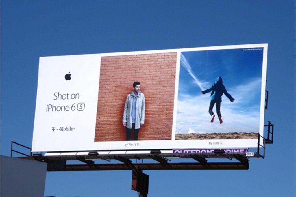
Apple is another brand that uses storytelling to connect with its audience. They use words and images to tell stories about how people can use technology to change their lives for the better.
Apple’s “Shot on iPhone” campaign features photos taken by professional photographers using iPhones. The campaign was created to show off the high quality of iPhone cameras and encourage consumers to take more photos.
3. Coca-cola
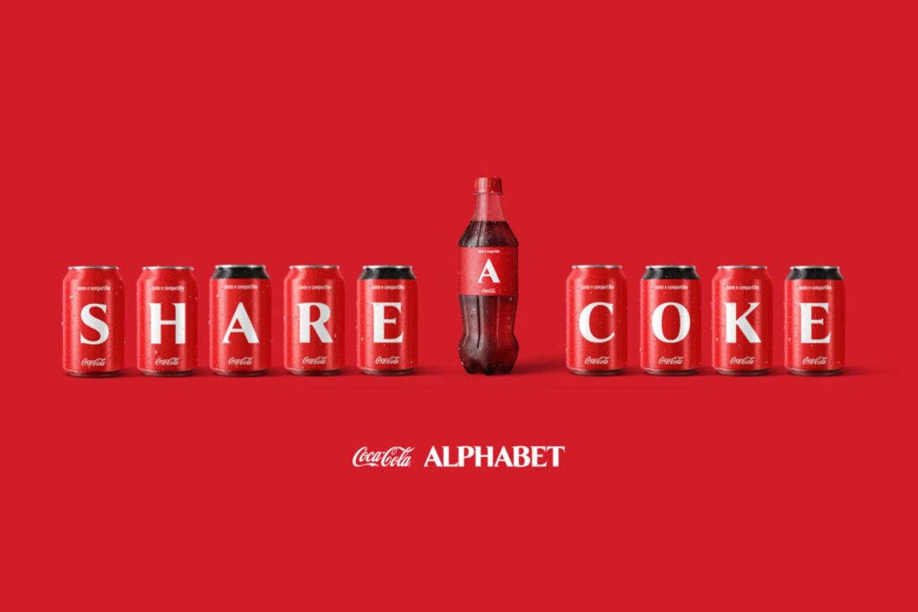
Coca-Cola consistently uses storytelling as a way of connecting with its audience. They use words and images to tell stories about how people can enjoy life through the simple pleasure of drinking Coca-Cola.
Coca-Cola’s “Share a Coke” campaign features personalized bottles of Coke that feature the names of real people from around the world.
The goal was to encourage consumers to share their experiences with others by drinking together at parties, sporting events, and other gatherings.
4. Starbucks

People can enjoy life through the simple pleasure of drinking coffee—and Starbucks uses words and images to tell stories about this.
They use their website, social media channels, and stores to build brand loyalty by telling engaging stories that are relatable to customers.
They also use their stores to create a community experience where people can come together and enjoy the drink. In addition, Starbucks showcases its products in an aesthetically pleasing way by using Instagram-worthy photos of lattes and cups of coffee.
The relationship between storytelling and branding
As a designer, you are a storyteller. You have the power to tell stories through your work that will resonate with your audience and create emotional connections.
The relationship between branding and storytelling is so important because it allows you to connect with consumers on an emotional level by creating a memorable experience for them.
When done correctly, this can lead to increased sales and higher customer loyalty for your brand (and hopefully yours!).
Branding is more than just logos; it’s about the message behind those logos–what they represent–and how they make people feel when they see them in their everyday lives or online communities like social media channels or websites where there are lots of other brands competing for attention too!
When you think about it, branding is actually quite similar to storytelling. Both are ways of communicating with people in an effort to get them interested in your products or services.
But the difference between them is that branding happens before a product even hits the market!
The importance of simplicity in visual storytelling
In visual storytelling, simplicity is key. You want to tell your story with minimal words and images so that it’s easy for your audience to understand what you’re trying to say.
This doesn’t mean you should use only one image per page; rather, it means that each image should convey its message clearly on its own merit without requiring any additional explanation or text from the author (that’s you).
And while there are no hard-and-fast rules about how many words should appear in your design documents, generally speaking, fewer words are better than more–especially when those longer texts are used only as decoration instead of contributing meaningfully toward conveying an idea or emotion through words alone.
The goal of words in design documents should be to enhance, not hinder, the overall visual experience.
When your audience looks at one of your images and has no idea what it means because it’s covered in text that doesn’t contribute anything to their understanding of the subject matter, then you’ve failed as a designer.
If you have to write a lot of text, then it’s likely that your design needs more work. The goal should be to convey as much meaning as possible through visuals alone.
If words are needed, then they should be used sparingly and only in places where they contribute meaningfully toward conveying an idea or emotion through words alone.
Conclusion
Storytelling can be a powerful tool in graphic design. It allows you to develop your brand, tell stories about your product or service and connect with your audience on an emotional level. The key is to use storytelling in ways that feel authentic and relevant to your brand. By following these guidelines, you’ll be able to create content that resonates with your audience and helps you build a strong brand identity.
Recommended reading: Why is Graphic Design Important to Your Brand?
FAQs
How is storytelling used in the design?
Storytelling is used in the design process to help guide the user through a journey. The story can be used to inform the user of what they are supposed to do, or it can be used to create an experience that resonates with them.
Is graphic design storytelling?
Graphic design is a form of storytelling. It’s the art of creating visual representations that can inspire, inform and persuade people. Graphic designers use images, text and space to tell stories that connect with the audience by appealing to their emotions.
What is the meaning of story in design?
In design, a story is part of a bigger picture. It’s the reason why you do what you do, and it’s the core message of your work. The story is what connects all of your products, services, and communications together into one cohesive brand.