
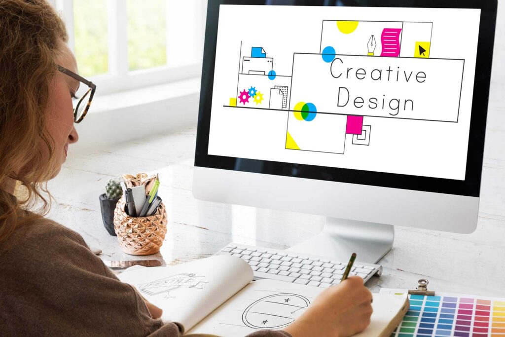
Typography, the art, and technique of arranging type, has long been an essential element of visual communication. As we navigate the digital landscape of 2024, its significance remains undiminished. In this blog post, we delve into the world of typography to understand why it continues to be indispensable in our modern era.
Effective typography goes beyond mere text on a page or screen; it serves as a powerful tool for conveying meaning, evoking emotions, and shaping perceptions. Whether we are browsing a website, reading a magazine, or interacting with a mobile app, typography plays a crucial role in capturing our attention, guiding our understanding, and enhancing our overall experience.
Throughout this exploration, we will uncover the multifaceted nature of typography, from its historical roots to its contemporary applications. We will examine the fundamental principles that underpin effective typographic design, exploring concepts such as font selection, hierarchy, and whitespace.
Moreover, we will discuss the broader implications of typography in branding, marketing, and user interface design, highlighting its profound influence on consumer behavior and brand identity.
Join us on this journey as we unravel the mysteries of typography and discover why it remains an indispensable tool for communication and design in 2024 and beyond.
1. What is Typography
Typography transcends mere aesthetics. It’s the skillful orchestration of type, meticulously arranged to ensure written language not only informs but resonates.
Beyond font selection, it’s a harmonious dance of form and function. Typefaces, spacing, and layout interweave to weave a tapestry of meaning, imbuing the text with personality and purpose.
From classic novels to vibrant websites, typography becomes the visual voice of communication. It sets the tone, ignites emotions, and shapes understanding. Whether in a brand logo or a captivating poster, typography acts as the visual ambassador, paving the way for impactful content.
Fonts, each with their distinct character, form the foundation of this artistry. But true mastery lies in the interplay of contrast, consistency, hierarchy, and whitespace. Color adds another dimension, further amplifying the visual journey.
Effective typography isn’t merely pleasing to the eye; it’s an invisible guide, leading the reader through a landscape of words. It prioritizes key information, fostering comprehension and engagement. More than just readability, it becomes a cornerstone of branding and marketing, shaping perception and forging emotional connections.
So, the next time you encounter text, appreciate the invisible artistry at play. For in the dance of letterforms lies the power to inform, engage, and captivate.
2. Why is Typography Important?
Typography, far from being a mere aesthetic flourish, is an essential pillar of effective communication. Across diverse mediums, it plays a critical role in shaping how messages are received, understood, and even felt. Its significance is particularly magnified in today’s digital landscape, where attention spans are short and competition for engagement is fierce.
A. Readability and Comprehension
The cornerstone of good typography is its ability to enable clear and effortless reading. Font choices, sizing, spacing, and alignment all work in concert to make information readily accessible. This ensures a wider reach, including readers with varying levels of proficiency or visual needs. Ultimately, well-crafted typography fosters communication fluency and enhances user experience across print and digital formats.
B. Brand Identity and Recognition
Beyond mere clarity, typography serves as a potent tool for brand building and recognition. Consistent use of specific fonts, colors, and styles throughout marketing materials, websites, and products creates a cohesive visual language that embodies the brand’s values and personality. This allows brands to stand out in a crowded marketplace, carving a unique identity that resonates with their target audience. Memorable typography becomes synonymous with the brand, leaving a lasting impression on consumers.
C. Evoking Emotions and Setting Tone
Typography transcends functionality, possessing the remarkable ability to evoke emotions and communicate tone. The subtle nuances of different fonts can convey warmth, professionalism, playfulness, or sophistication, influencing how readers interpret and connect with the content. This power applies across diverse settings, from website design and logo creation to crafting print advertisements. By harnessing the emotional resonance of typography, designers can foster deeper connections with their audience and enhance the impact of their message.
D. User Interface and Experience Design
In the digital world, where information overload is a constant challenge, clear typography plays a crucial role in user interface and experience design. It guides users through content, prioritizes key information, and simplifies navigation. By employing principles of hierarchy, contrast, and white space, designers create intuitive interfaces that facilitate seamless interactions and keep users engaged.
Typography is far more than just making words look pretty. It is a powerful tool with the potential to shape perception, enhance communication, and drive user experience. As we navigate an increasingly digital world, understanding and leveraging the power of typography is no longer an option, but a necessity for successful communication and brand building.
Also, Read 20+ Unique Fonts to Ignite Your Creative Spark
3. History of Typography
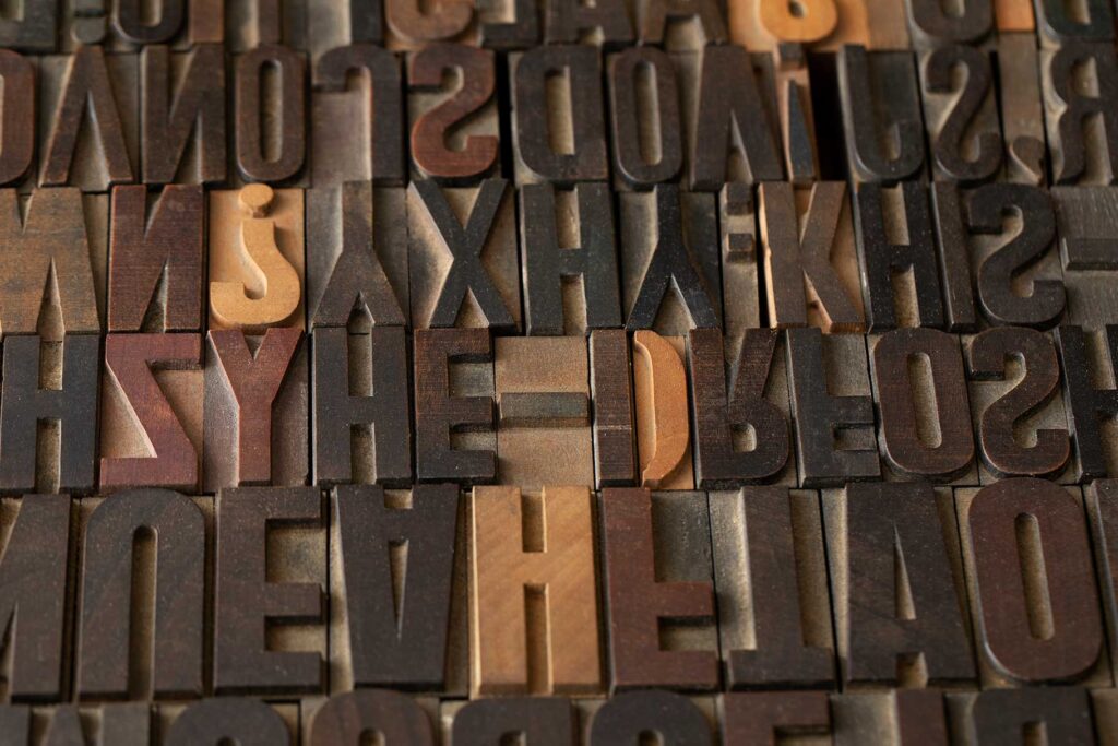
The history of typography is a captivating narrative woven with threads of innovation, cultural shifts, and technological advancements. From the dawn of written communication to the digital age, typography has profoundly shaped how we interpret and interact with the written word.
Early civilizations, like the Sumerians and Egyptians, laid the groundwork for typographic history by developing rudimentary writing systems, marking the first steps in this fascinating journey. Then, in the 15th century, Johannes Gutenberg’s revolutionary invention of movable type forever changed the landscape of printing.
By enabling the mass production of books and manuscripts, Gutenberg’s printing press paved the way for the wider dissemination of ideas, fostering a burgeoning knowledge society and democratizing access to learning.
Throughout history, typography has continuously evolved alongside technological progress and cultural transformations. The introduction of new typefaces, such as serifs and sans-serifs, mirrored changing aesthetics and design preferences. The Industrial Revolution further propelled this evolution, ushering in mechanized printing presses and standardized typeface design.
The 20th century witnessed a dynamic explosion of typographic styles and movements, ranging from the elegant modernism of the Bauhaus to the avant-garde experimentation of the Dadaists. The late 20th century marked a seismic shift with the arrival of digital typography, empowering designers to create and manipulate type with unparalleled precision and flexibility.
Today, typography flourishes in the digital age, offering an infinite array of typefaces and design tools at our fingertips. The rise of web typography has unlocked new avenues for creative expression and communication, while also presenting unique challenges regarding readability and accessibility.
In essence, the history of typography stands as a testament to the enduring power of language and the relentless human drive to innovate and connect. As we move forward, typography will undoubtedly remain a crucial tool for expressing ideas, shaping perceptions, and bridging cultures across continents.
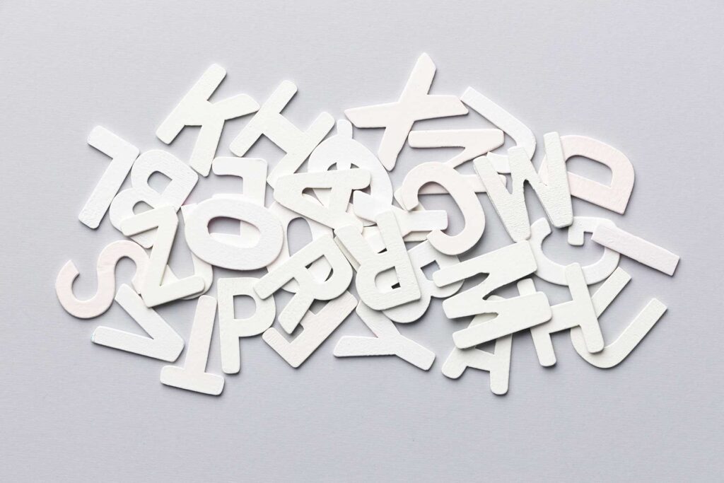
4. Elements of Typography
Typography, the art of shaping language into visually captivating and easily digestible messages, underpins various realms of communication and design. Grasping these fundamental elements is essential for anyone navigating the worlds of graphic design, branding, marketing, and publishing. Let’s embark on a journey to explore the core principles that govern typography and their significance in crafting impactful visual communication.
A. Fonts & Typefaces
Imagine the bricks and mortar of a building – that’s what fonts and typefaces are to typography. They define the style, shape, and overall appearance of text. While a font embodies a specific weight and style within a typeface family, the typeface encompasses a comprehensive set of fonts sharing similar design characteristics. The spectrum ranges from timeless serif fonts like Times New Roman to contemporary sans-serif fonts like Helvetica. Selecting the right typeface becomes vital in conveying the intended message and establishing the content’s tone.
B. Contrast
Contrast in typography signifies the variations in weight, size, color, or style between different text elements. By creating this contrast, designers can achieve several goals:
- Emphasize Key Information: Bold headings grab attention, directing the reader’s focus to crucial points.
- Guide Reader Attention: Contrasting colors can highlight essential points or calls to action, making them visually distinct.
- Enhance Readability: Lighter body text paired with bold headings creates a clear hierarchy, improving reading comprehension.
C. Consistency
Maintaining consistency in typography is paramount to ensuring coherence and unity throughout a design or document. Consistent application of fonts, sizes, spacing, and alignment builds a clear visual identity and reinforces brand recognition. Imagine marketing materials, websites, or publications adhering to established typographic guidelines – the result is a cohesive and professional presentation. Consistency also translates to a better user experience by minimizing visual clutter and confusion.
D. Hierarchy
Hierarchy refers to the organization of text elements based on their significance and relevance. Establishing hierarchy through variations in font size, weight, and style empowers readers to:
- Quickly Identify Key Information: Differentiated headings and subheadings guide the reader’s eye towards important content.
- Navigate Content Efficiently: Clear hierarchy facilitates comprehension by presenting information in a logical and structured manner.
E. White Space
White space, often referred to as negative space, signifies the area around and between text elements in a design. This “space” doesn’t necessarily have to be white; it can be any color or background texture that provides visual breathing room for the text. Utilizing white space effectively:
- Enhances Readability: Reduces visual clutter, allowing text to stand out clearly against the background.
- Creates Balance and Harmony: Improves the overall aesthetics and user experience by creating a sense of visual equilibrium.
F. Color
Color plays a multifaceted role in typography, influencing mood, tone, and brand identity. When choosing colors for text, designers must consider:
- Legibility: Maintaining high contrast is crucial for ensuring easy reading. Think black text on a white background vs. low-contrast combinations that can strain the eyes.
- Accessibility: Colors must be sufficiently distinct for users with visual impairments or color blindness.
- Meaning and Emotion: Color can evoke emotions, convey specific meanings, and differentiate between different types of content.
You may also like Evolution of Typography in Graphic Design (The Ultimate Guide)
5. How to Choose the Right Typeface
The typeface you choose plays a critical role in conveying your message and shaping the visual identity of your project. Here are some key considerations to ensure you select the one that truly shines:
A. Align with Purpose and Audience:
Start by understanding the project’s goals and target audience. Different typefaces evoke distinct emotions and tones. Choose one that reinforces your intended message and resonates with your viewers. For example, a modern sans-serif font might empower a tech company’s website, while a classic serif font lends elegance to a formal invitation.
B. Prioritize Readability:
Even the most visually captivating typeface loses its impact if it’s difficult to read, especially for extended text. Consider factors like x-height (lowercase letter height), letter spacing, and stroke width. Aim for a typeface that strikes a harmonious balance between style and legibility.
C. Embrace the Typeface’s Character:
Each typeface embodies a unique personality, be it elegant and refined, playful and whimsical, or bold and assertive. Select one that complements the overall mood and message of your project, reflecting the specific personality you want to convey.
D. Ensure Compatibility:
Harmony is key in design. Make sure your chosen typeface seamlessly integrates with other design elements like colors, images, and layout. Consistency fosters a cohesive visual experience, so choose a typeface that elevates the overall aesthetic rather than clashing with it.
E. Experiment and Explore:
Don’t be afraid to delve into the vast world of typefaces, each with its distinct quirks and characteristics. Take the time to explore different options and experiment with combinations until you find the perfect match that brings your project to life.
Remember: Selecting the right typeface is an investment in clarity, communication, and visual impact. By carefully considering these key factors, you can confidently choose a typeface that elevates your project and resonates with your audience.
Conclusion
Typography remains a cornerstone of effective communication, seamlessly transitioning from its historical roots to become an essential element in the 2024 digital landscape. This exploration has revealed the multifaceted importance of typography, encompassing its fundamental role in delivering information to its profound influence on brand identity and user experience.
Understanding typography’s history grants valuable insights into its evolution and lasting cultural impact. From ancient calligraphy to contemporary digital fonts, typography has continuously adapted and thrived, shaping our interaction with written language.
Furthermore, the discussed elements – fonts, typefaces, contrast, consistency, hierarchy, white space, and color – serve as guiding principles for effective design. These elements play a crucial role in capturing attention, conveying meaning, and enhancing readability, regardless of whether you’re crafting a logo, designing a website, or formatting a document.
As we navigate the digital landscape, the importance of selecting the right typeface becomes increasingly evident. By carefully considering the project’s purpose, target audience, and design principles, we can leverage the power of typography to elevate our communication and leave a lasting impression.
By embracing typography, we not only honor its rich history but also unlock its potential for future innovation and creativity. As we look ahead, let us continue to recognize the significance of typography in shaping our digital experiences and fostering meaningful connections through the written word.
Recommended reading: Best 15 Must-Have Fonts for Graphic Designers (Professional)
FAQs
Q: What exactly is typography?
A: Typography refers to the art and technique of arranging type to make written language legible, readable, and visually appealing. It involves the selection of fonts, spacing, size, and layout to communicate effectively in various forms of media.
Q: Why is typography important in modern communication?
A: Typography plays a crucial role in modern communication by enhancing readability, conveying emotions, and reinforcing brand identity. It helps grab attention, guide the reader’s eye, and create a memorable visual experience across digital and print platforms.
Q: How does typography impact branding and marketing efforts?
A: Typography is an essential element of branding and marketing as it helps establish brand identity, evoke specific emotions, and differentiate a brand from its competitors. Consistent and well-chosen typography can strengthen brand recognition and influence consumer perceptions.
Q: Can typography affect user experience on websites and digital platforms?
A: Yes, typography significantly impacts user experience on websites and digital platforms. Clear and legible typography enhances readability, making content easier to consume. Additionally, typography choices can influence navigation, interaction, and overall user satisfaction.
Q: How can I choose the right typeface for my project?
A: When choosing a typeface, consider factors such as the project’s purpose, target audience, readability requirements, and brand personality. Experiment with different typefaces, pay attention to legibility and ensure compatibility with the overall design aesthetic.
Q: What are the key elements of typography to consider when designing?
A: The key elements of typography include fonts and typefaces, contrast, consistency, hierarchy, white space, and color. Each element plays a vital role in creating visually appealing and effective typography that engages the audience and communicates the intended message.
Q: Is typography only relevant for graphic designers and marketers?
A: Yes, typography is relevant for anyone involved in communication, including writers, editors, web developers, and business owners. Understanding typography principles can help improve the effectiveness of written communication across various industries and professions.