In the realm of graphic design, where visual communication serves as a powerful medium, one principle stands resolute in its impact: minimalism.
As design landscapes evolve, the elegance of minimalism remains timeless. In this comprehensive exploration, we delve into the essence of minimalism—a realm where simplicity, clarity, and functionality converge to create compelling narratives.
From renowned minimalist designers to the psychology of limited color palettes, we navigate the intricacies of this design philosophy.
Join us as we unravel how the deliberate absence of excess fosters an eloquence that speaks volumes, and as we equip you with the insights and tools to wield minimalism’s understated power in your graphic endeavors.
Principles of Minimalist Graphic Design

At the heart of the captivating world of graphic design lies the profound philosophy of minimalism.
This segment of our guide delves into the foundational Principles of Minimalist Graphic Design, which hinge on the art of purposeful simplicity.
Characterized by clean lines, uncluttered compositions, and an innate focus on essential elements, the minimalist design transforms visual communication into a refined art form.
Renowned for its ability to convey messages with unparalleled clarity, minimalist design relies on a trio of principles—simplicity, clarity, and functionality.
By stripping away extraneous details, each element within a minimalist composition gains prominence, thus allowing for a more profound impact on the viewer.
Throughout this section, we’ll explore the eloquence of simplicity, drawing inspiration from the works of esteemed minimalist designers whose mastery of this art has left an indelible mark on the design landscape.
Less is More
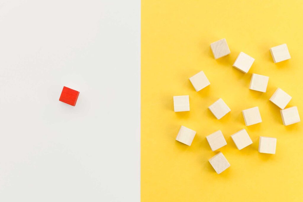
In the realm of graphic design, the adage “less is more” resonates profoundly, and this segment of our guide delves into the intricacies of mastering composition and layout within minimalist design.
The cornerstone of this principle is the potent use of negative space—where emptiness becomes a canvas for storytelling.
With deliberate precision, minimalist compositions achieve a harmonious equilibrium between elements, allowing each to breathe and resonate with clarity.
Balancing simplicity with sophistication, minimalist layouts captivate the viewer by guiding their gaze with purposeful restraint.
By employing the strategic placement of focal points, designers orchestrate visual narratives that unfold seamlessly. Our exploration extends to the profound impact of minimalism in print media, web design, and branding, where every element earns its place through meticulous consideration.
Through case studies and real-world examples, we uncover the alchemy of minimalist composition.
By embracing the strategic placement of every stroke, shape, and pixel, designers harness the power of subtlety to evoke emotions and provoke thought.
Whether crafting an advertising campaign, web interface, or printed collateral, the ability to master composition and layout within minimalism stands as a hallmark of design prowess.
You may also like The Ethics of Graphic Design (Complete Guide)
Typography
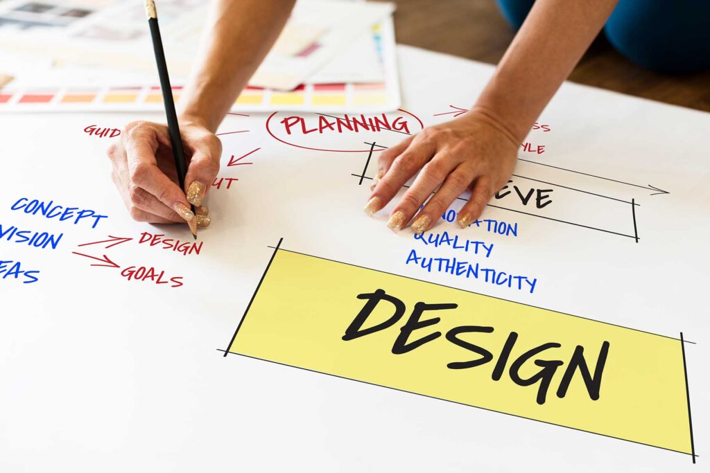
Within the realm of minimalist graphic design, typography emerges as a silent yet resonant protagonist, capable of weaving narratives with nuanced precision.
This segment delves into the crucial role of typography and the art of selecting the right fonts to achieve maximal minimalist impact.
The minimalist aesthetic demands typography that seamlessly merges with the design’s essence, enhancing its message rather than overwhelming it.
Selecting fonts marked by clean lines, unadorned elegance, and optimal legibility ensures that each character contributes harmoniously to the overall composition. The deliberate use of negative space surrounding letterforms amplifies their significance, embracing a visual cadence that speaks to the viewer.
Moreover, typography is not merely a conveyance of content—it’s a design element in its own right. The interplay between fonts can form a visual rhythm, a dance of simplicity that enriches the viewer’s experience.
Our exploration extends to the meticulous consideration of font size, spacing, and hierarchy in different design contexts. By fusing typography’s subtleties with minimalist sensibilities, designers imbue their creations with an understated eloquence that amplifies the intended message.
In this segment, we journey through the anatomy of letters, unearthing how typography becomes a conduit for minimalist expression.
From bold statements to delicate whispers, the right choice of fonts wields an artistic arsenal that harmonizes with minimalist design’s refined ethos.
Color Palette
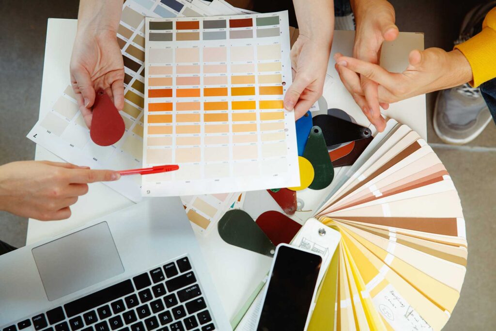
Color, in the minimalist realm of graphic design, takes on a role of profound significance. This segment delves into the captivating world of color palettes and the compelling impact of restricted hues within minimalist design.
Minimalism’s restrained aesthetic extends to the color spectrum, emphasizing the power of limited colors to convey depth, emotion, and symbolism.
By intentionally selecting a reduced palette, designers amplify the impact of each hue, transforming simplicity into an elegant statement.
The psychology of color within this context becomes a symphony of subtlety, with every shade bearing meaning and evoking response.
Through meticulous analysis of successful minimalist designs, we explore the balance between color’s expressive potential and minimalist sensibilities.
The strategic pairing of colors, their interplay with negative space, and their ability to guide focus are all essential components in this harmonious orchestration.
Our journey takes us from monochromatic schemes that celebrate the beauty of a single color to carefully curated palettes that evoke emotion and narrative.
We delve into the power of contrasts and the revelation that even a handful of colors can create a kaleidoscope of visual experiences.
Ultimately, the art of minimalism extends to the deliberate use of color, where each shade becomes a brushstroke in a sophisticated composition.
By harnessing the potency of limited colors, designers create visual symphonies that resonate with the essence of their messages.
Creating Depth and Focus
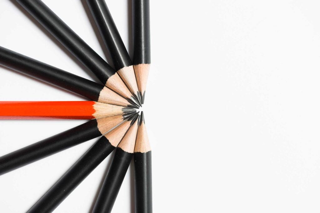
Within the realm of minimalist graphic design, imagery, and icons become vessels of profound expression. This segment delves into the art of crafting minimalist imagery and icons that transcend simplicity to create depth, focus, and powerful visual narratives.
Minimalist imagery is a testament to the adage that a single image can speak volumes. By employing clean lines, essential shapes, and unembellished forms, designers infuse each element with purpose.
The judicious use of negative space imparts a sense of spaciousness, inviting the viewer to explore not only what is present but also what is absent.
Furthermore, icons—a universal language of symbols—find their quintessence in minimalism. These visual metaphors distill complex ideas into elegant, stripped-down representations.
By incorporating thoughtful details and subtle variations, designers create icons that transcend mere visuals, serving as gateways to stories and concepts.
Through captivating case studies, we unveil the art of crafting minimalist imagery and icons that engage the imagination. The interplay of shape and space, the use of contrast and subtlety, and the ability to evoke emotion with minimalistic strokes all contribute to a tapestry of visual storytelling.
In essence, minimalist imagery and icons transcend their own simplicity, becoming catalysts for introspection, exploration, and interpretation.
By embracing these foundational elements, designers elevate their creations from mere design to an evocative dialogue between form and perception.
Check out our latest post on The Intersection of Graphic Design and Virtual Reality (Ultimate Guide)
Functionality and User Experience

In the realm of minimalist graphic design, aesthetics, and function converge to forge a user experience of unparalleled elegance and clarity.
This segment delves into the integral role of minimalism in enhancing functionality and user experience, particularly within digital interfaces.
Minimalism’s hallmark of decluttered simplicity finds its true utility in creating user-friendly designs. By prioritizing essential elements and eliminating distractions, designers facilitate seamless navigation and interaction.
The deliberate arrangement of elements and intuitive placement of calls to action usher users toward their intended destinations effortlessly.
Through a comprehensive exploration of minimalist web design, app interfaces, and interactive platforms, we uncover the strategies behind fostering user engagement and satisfaction.
Case studies of minimalist interfaces that excel in usability shed light on the psychology behind user-centered design.
Moreover, minimalist design’s emphasis on clarity and efficiency transcends screens to embrace print and environmental designs.
From signage to packaging, the minimalist approach communicates succinctly and consistently, ensuring a harmonious brand experience.
In essence, the marriage of minimalism and functionality within design attains a symbiotic relationship—a union where each element serves a purpose and each interaction is an effortless journey.
By cultivating minimalist user experiences, designers ensure that aesthetics are not sacrificed for function and that every touchpoint resonates with the user’s needs.
Minimalism in Branding and Logos
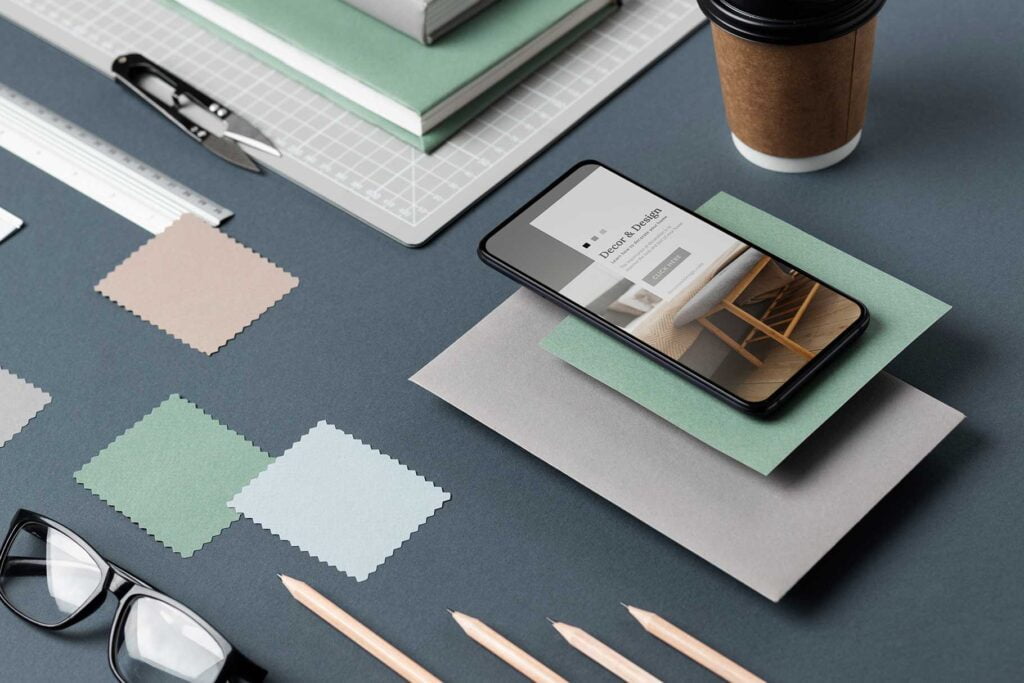
Amidst the ever-evolving landscape of graphic design, minimalist principles emerge as cornerstones in the realm of branding and logos.
This segment delves into the transformative impact of minimalism in shaping memorable brand identities.
In the dynamic world of branding, simplicity wields remarkable power. Minimalist logos distill a brand’s essence into a visual signature that is unmistakable and timeless.
Through the artful alignment of lines, shapes, and negative space, designers create emblems that transcend trends, leaving an indelible mark on the audience’s perception.
Case studies spotlight iconic minimalist logos, elucidating how strategic design choices encapsulate the ethos of an entire brand.
The minimalist approach invites audiences to engage with a brand’s core values directly, free from superfluous distractions. The psychology of perception plays a pivotal role in minimalist branding, where every curve and angle becomes a deliberate communication tool.
Our exploration also extends to the world of logotypes—text-based minimalist logos that underscore the power of typography.
The fusion of letterforms with minimalist sensibilities creates brand identities that are not only recognizable but also resonate with sophistication.
In essence, minimalist branding and logos achieve a delicate balance between visual allure and communicative precision.
By embracing minimalism, brands distill their narratives into refined symbols, etching their legacy in the annals of design history.
Pushing the Boundaries

As the realm of graphic design continually evolves, some designers venture beyond convention to explore the realm of experimental minimalism.
This segment delves into the avant-garde territory where the art of pushing minimalist boundaries yields fascinating and thought-provoking results.
Experimental minimalism challenges preconceived notions by redefining the very essence of simplicity.
Designers in this realm embrace unconventional techniques, juxtaposing unexpected elements and provoking introspection. The results are compositions that demand engagement and interpretation, transcending the expected while retaining a minimalist core.
Our journey traverses diverse media, from interactive installations to multimedia campaigns, where designers employ experimental minimalism to forge narratives that provoke, surprise, and ignite discourse.
By melding minimalism with abstraction, these creators venture into uncharted territories, invoking emotions and sparking conversations.
Through captivating case studies and examples, we explore the driving forces behind experimental minimalism—risk-taking, innovation, and the pursuit of new visual languages.
We dissect the challenges and rewards of pushing boundaries, acknowledging that not all experiments yield intended outcomes, yet every exploration expands the horizons of design.
In essence, experimental minimalism becomes a daring voyage into the unknown, where designers shatter conventions to reconstruct new perspectives.
By embracing the essence of minimalism while pushing the limits of form and function, creators catalyze conversations that linger long after the visuals fade.
Conclusion
In this comprehensive guide to “The Art of Minimalism in Graphic Design,” we’ve explored the enduring allure of simplicity and purpose. From foundational principles to typography, color palettes, and user experiences, minimalism communicates with elegance. Its impact extends from branding to experimental realms, reshaping design’s boundaries. As we conclude, remember that minimalism isn’t just an aesthetic—it’s a philosophy that amplifies through restraint. Each element carries weight, and each choice resonates. By embracing minimalism, designers craft narratives that transcend visual clutter, inviting audiences to engage deeply with the essence of design.
Recommended reading: 12 Best Graphic Design Tools to Master in 2023
FAQs
Q: What is the primary goal of minimalism in graphic design?
A: The primary goal of minimalism is to distill design to its essential elements, conveying clear and focused messages while creating visually appealing compositions.
Q: How does minimalism enhance user experience in digital interfaces?
A: Minimalist design reduces visual clutter, prioritizes essential content, and guides users intuitively, resulting in more user-friendly and engaging digital interfaces.
Q: Can I use a limited color palette while still maintaining brand recognition?
A: Absolutely. A limited color palette can enhance brand recognition by making colors more memorable and impactful, ensuring a consistent and cohesive brand identity.
Q: Is experimental minimalism suitable for all design projects?
A: Experimental minimalism challenges conventions and can be best suited for projects seeking to provoke thought, spark conversations, and push creative boundaries. It might not align with all objectives.
Q: How can I balance minimalist aesthetics with conveying complex ideas?
A: Utilize the power of symbolism, negative space, and deliberate compositions to convey complex ideas. The key is to distill concepts into their core elements while retaining visual intrigue.
Q: What role does typography play in minimalist design?
A: Typography is a significant design element in minimalism. It should be chosen carefully to align with the minimalist aesthetic, enhancing the overall visual harmony and message of the design.
3 thoughts on “The Art of Minimalism in Graphic Design (The Ultimate Guide)”