The logo of a brand is the face of that company. It’s the first thing people see when they visit a website, and it should reflect the company’s personality. But just like fashion trends come and go, so do logo design trends. The good news is: Logo design will never die out completely!
However, logo trends do change. And it’s important for designers to stay on top of the latest developments in this field. If you want to create a professional logo that stands out from the crowd, then keep reading…
There are always new trends to look out for, and we’ve put together a list of 10 logo design trends that will be popular in the next five years.
These trends are based on our observations from the past 5 years and what we think will happen in the future. So whether you like it or not, these will probably become your new go-to logo design styles!
What is a logo design trend?
A trend is a fashionable or popular way of doing something. In the world of logo design, it’s an evolving style that has been consistently used by successful companies to create recognizable brands.
Logo trends are here to stay because they’re effective at communicating your brand identity and personality in a way that feels fresh and current.
If you don’t know what your competitors are doing, then it’s easy for them to get ahead of you! The best way for designers and clients alike is to stay up-to-date with industry best practices so that everyone can benefit from being part of the same conversation about how best to communicate through visual imagery (aka logos).
Why is it Important to follow the logo design trend?
It’s important to follow the logo design trend because it will help you stand out from the crowd, and create a brand that is memorable, professional, and unique.
When you follow trends in logo design, you are showing your clients that their business is important enough for you to invest time into learning about what other brands are doing in order for them to stand out from the competition.
The more knowledgeable about trends you are as a designer, the more confident clients will feel about working with you on their projects because they know that any ideas or concepts they have come up with will be considered by someone who has experience in this area already (which saves both parties time).
Following trends also allows businesses to develop their own unique voice through branding campaigns such as web design or advertising campaigns which include all forms of marketing including social media posts etc., allowing companies like Coca-Cola (Coke) who uses red triangles on its bottles every year during Christmas season since the 1920s; McDonald’s using golden arches since 1940s; Apple using apple-shaped logos since 1980s, etc.,
So, when people see those shapes within these companies’ products/services they automatically associate them back together again!
1. Minimalism
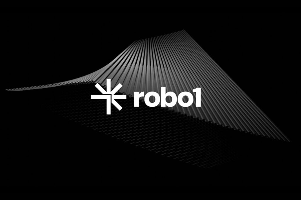
Minimalism is a design style that emphasizes simplicity and the essential form of a product. Minimalist designs are usually simple, clean, and easy to read.
The best minimalist logos are simple but not too simple; they use one or two colors at most (usually just black and white), but some can have as many as four.
Minimalist logos usually use one or two colors, but some can have as many as four. They’re also very simple and clean without too many frills like gradients or drop shadows–and sometimes even no outline at all!
2. Outer and inner space logos
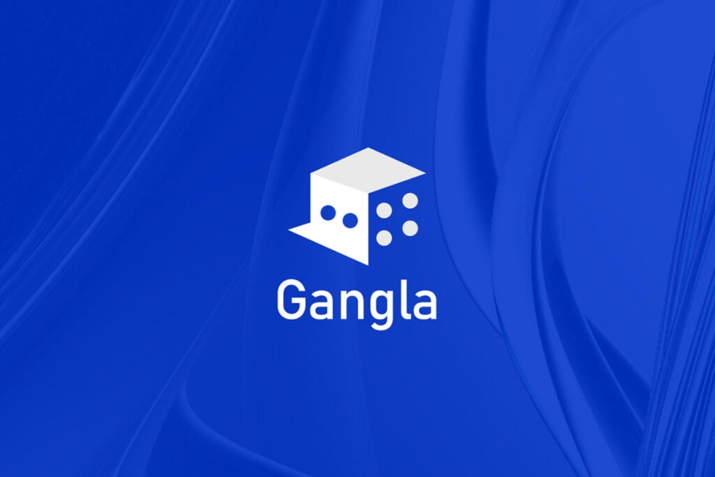
Outer space logos are a popular choice for brands that want to convey a sense of adventure or mystery.
They’re usually colorful and use gradients, but they can also be simple black-and-white designs that look like they were taken straight out of an old science fiction movie.
Inner space logos, on the other hand, tend to be dark or monochromatic with a very little color. They often feature geometric shapes like circles or rectangles that have been distorted in some way–either stretched out into tentacles or squished into an oval shape.
Check out our trending post about 10 Best Free Online Logo Makers for Eye-Catching Logos
3. Hand-Drawn Logos
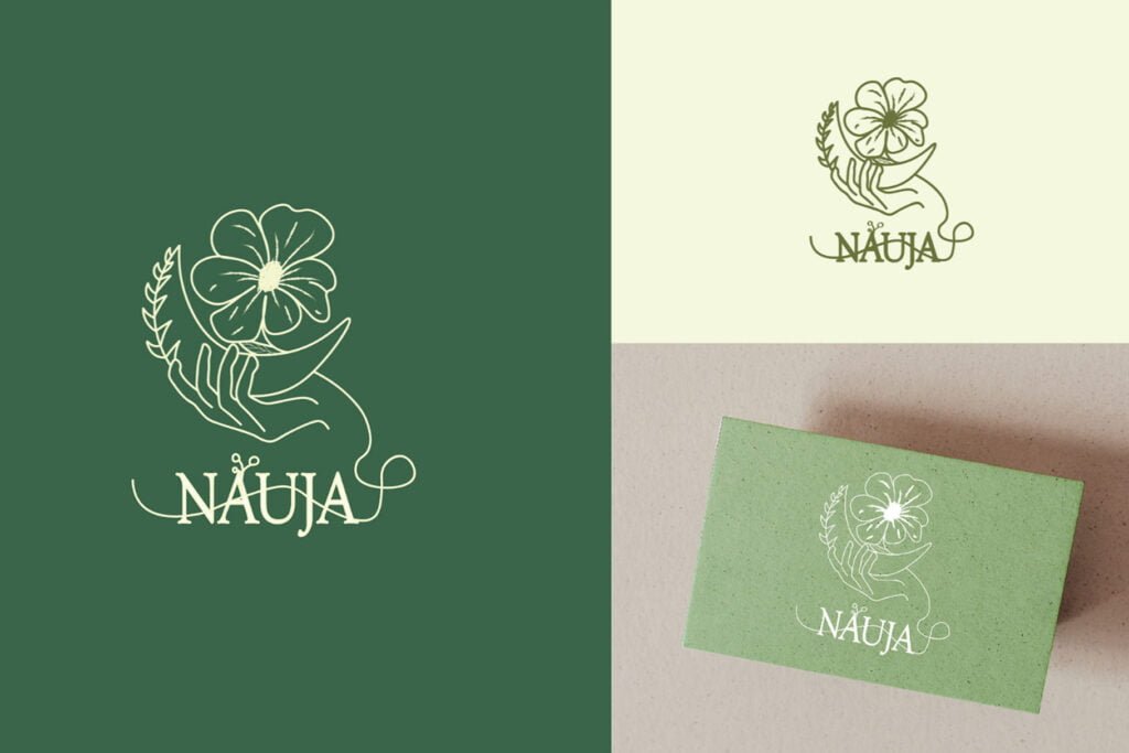
Hand-drawn logos are organic, human, and personal. They’re also more memorable than a computer-generated image. Hand-drawn lettering looks like it took time to create, which gives it an added sense of value for customers–it’s not just any logo, but one that has been crafted with care and attention to detail.
Hand-drawn logos are flexible in their use across different mediums: print, web or social media platforms (and even physical products).
This means they can be used on packaging materials; printed on clothing; used as an icon on social media channels such as Twitter or Instagram; displayed on websites either as banner images at the top of the page with text underneath or integrated into other graphics like infographics etc., depending on what works best within each individual design context.
“Hand-drawn lettering is also generally easier to read due to its clear typography style compared against other types such as serif fonts,” says Samantha Lee from Samantha Lee Design Agency which specializes in creating custom hand-drawn logos for businesses around Australia.
4. Custom Lettering
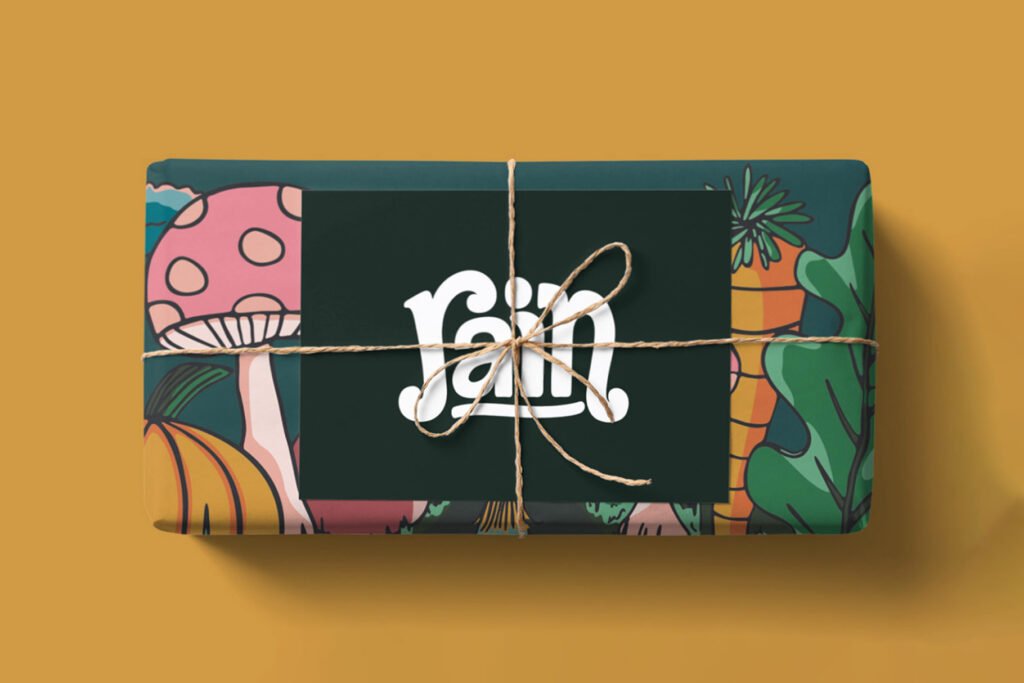
Custom lettering is a great way to incorporate your brand name into your logo. Custom lettering can be used in logos with various fonts and styles, such as script, serif, sans-serif, or handwritten fonts.
You can also choose whether to use custom lettering with a unique font or use a more standard one.
For example, you might want to create a hand-drawn logo that includes your company name in custom lettering written in all caps but with a drop shadow.
Or you might opt for a more classic look by using lowercase letters and serif fonts like Times New Roman or Arial Black.
It also works well when combined with other design elements like typography or abstract shapes (such as circles).
5. Logo Mascots
Logo mascots are a growing trend in logo design. They’re not just for kids anymore! A logo mascot is a fun, friendly character that represents your brand and can be used in many different ways.
The purpose of a mascot is to help customers remember your business and give them an emotional connection to it–so choose wisely!
Mascot design is tricky; there’s nothing worse than seeing something cheesy or cheesy-looking (see: Mr. Peanut). But when done right, mascots can also be cute, useful, and even educational (like Smokey Bear).
So what makes a good mascot?
Here are some tips to keep in mind when designing your own:
- Choose a design that will work well on all types of media. This means creating something that can be used in small sizes (like logos) as well as large ones (like billboards).
- Make sure your design will appeal to a wide audience. If your mascot only appeals to children, it may not be effective.
- Keep things simple! The simpler you can make your design, the better.
You may also like Top 12 Famous Brands and Their Logo Color Combinations
6. Lowercase Logos
Fonts with lowercase letters are more modern and sophisticated. They’re easier to read—especially on the web; they’re friendlier and more approachable than uppercase logos; many big brands (like Coca-Cola) have recently switched from all caps to lowercase
The Lowercase logo trend isn’t just a trend; it’s a reflection of how we communicate in today’s world. We’re more informal, friendly, and accessible than ever before—and our logos are too.
The use of lowercase letters makes your brand seem approachable, friendly, and easy to read. In short, there are many reasons why you should consider using a lowercase logo.
7. Icons in the Lettermarks

Icons can be used to replace letters, words, and even the entire logo. They can be used to add meaning and personality to the design or brand.
Icons are also a great way to show that you understand the importance of visual communication, and they can be used to create an emotional connection with your audience.
Icons are a great way of adding meaning without needing to use text, which makes them ideal for international audiences who may not understand all languages or dialects.
This logo trend can be seen in the “Smart” and “Connected” logos shown above. This logo has been designed with an icon that is representative of the brand, which makes it instantly recognizable.
8. Playful
Playful logos are fun, unique, and memorable. They can be used to represent a company’s brand personality and attract younger audiences.
Playful logos are also appropriate for children’s products, baby products, or toys. Examples of companies that use playful logos include Disney, Toys R Us, Nike (the swoosh), and Adidas (the three stripes).
Playful designs can be used by sports teams too! For example, the New York Yankees logo is a baseball with eyes; the Boston Red Sox has a red sock with an “S” on it; while the Chicago Cubs have just two letters–a “C” for Cubs!
The playful logo design trend is a great way to attract younger audiences and create a fun, memorable brand.
Don’t forget to check out 15 Clean Logo Design Templates for a Professional Look
9. Distorted Geometry
Geometric shapes are used to create logos. The trend reflects the cultural changes of our time, as the world becomes more and more digital.
Logo design trends reflect this shift in thinking and being a logo designer means taking risks. Logos need to be recognizable, but not boring; they must be timeless and stand out from other brands so that people can easily identify them on screen or paper without having to read their name first (e.g., Airbnb).
The best logos have become iconic because they’ve been able to do just that: make an impact with minimalism while still conveying meaning through shape alone (Google), or by simplifying complex ideas into something easy enough for anyone who sees it–even children–to understand instantly (Apple).
The distorted geometric logos that have become popular in recent years are easy to recognize and memorable, but they’re also somewhat generic and boring. They lack the character of the more traditional logos that have stood the test of time.
10. Modern art deco
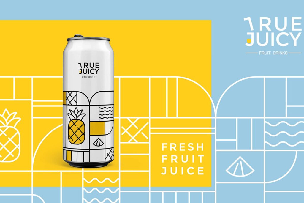
Modern Art Deco is a combination of modern and art deco. Modern Art Deco is a more modern take on the art deco style, which was popular in the 1920s and 1930s.
The term “modern” means it’s more recent than traditional, whereas “art” refers to fine arts like painting and sculpture.
The geometric shapes used in this design are similar to those found in both styles; however, they are often simpler than those found in classic deco logos because they’re meant for use on digital platforms such as websites rather than physical objects like buildings or furniture.
Colors tend toward bright shades like reds, greens, and blues that contrast well against light backgrounds such as white or black (which helps them stand out).
The use of geometric shapes is a great way to create logos that are unique and recognizable. Because the human brain has an innate ability to easily recognize certain shapes, it makes sense that these types of logos are used all over the world by businesses large and small.
The style is also characterized by clean, simple lines and bold, geometric shapes. It’s often seen in logos that use a combination of letters and graphics (such as an icon or symbol), which creates an eye-catching design…
Conclusion
The logo design trend is an important thing to be aware of because it will help you create a better brand identity for your business. You should keep track of these trends and use them when necessary. Keep in mind that trends are just that—trends. They come and go, and they shouldn’t be the only thing you consider when designing your logo. However, they can help you create a design that’s more eye-catching and memorable than others.
Recommended Reading: 8 Pro Tips to Design an Attractive and Well-Considered Logo
FAQs
What is the future of logo design?
The future of logo design is in the hands of the designers. It depends on how far they are willing to take their creativity and how much they are willing to push the boundaries of what a logo can be.
Is logo design in high demand?
Yes, logo design is in high demand.
The global graphic design market is expected to reach $63 billion by 2021, up from $54 billion in 2018.
What is the latest logo trend?
The latest logo trend is using bold, geometric shapes to create a striking, memorable design. This look is an excellent choice for companies that want to attract attention and stand out from the crowd.
What type of logo is most frequent?
The most common logo is the wordmark. It’s a combination of text and an image, usually a logo mark. It’s the most classically recognized logo design, known the world over by everyone.
3 thoughts on “10 Professional Logo Trends for the Next 5 Years”