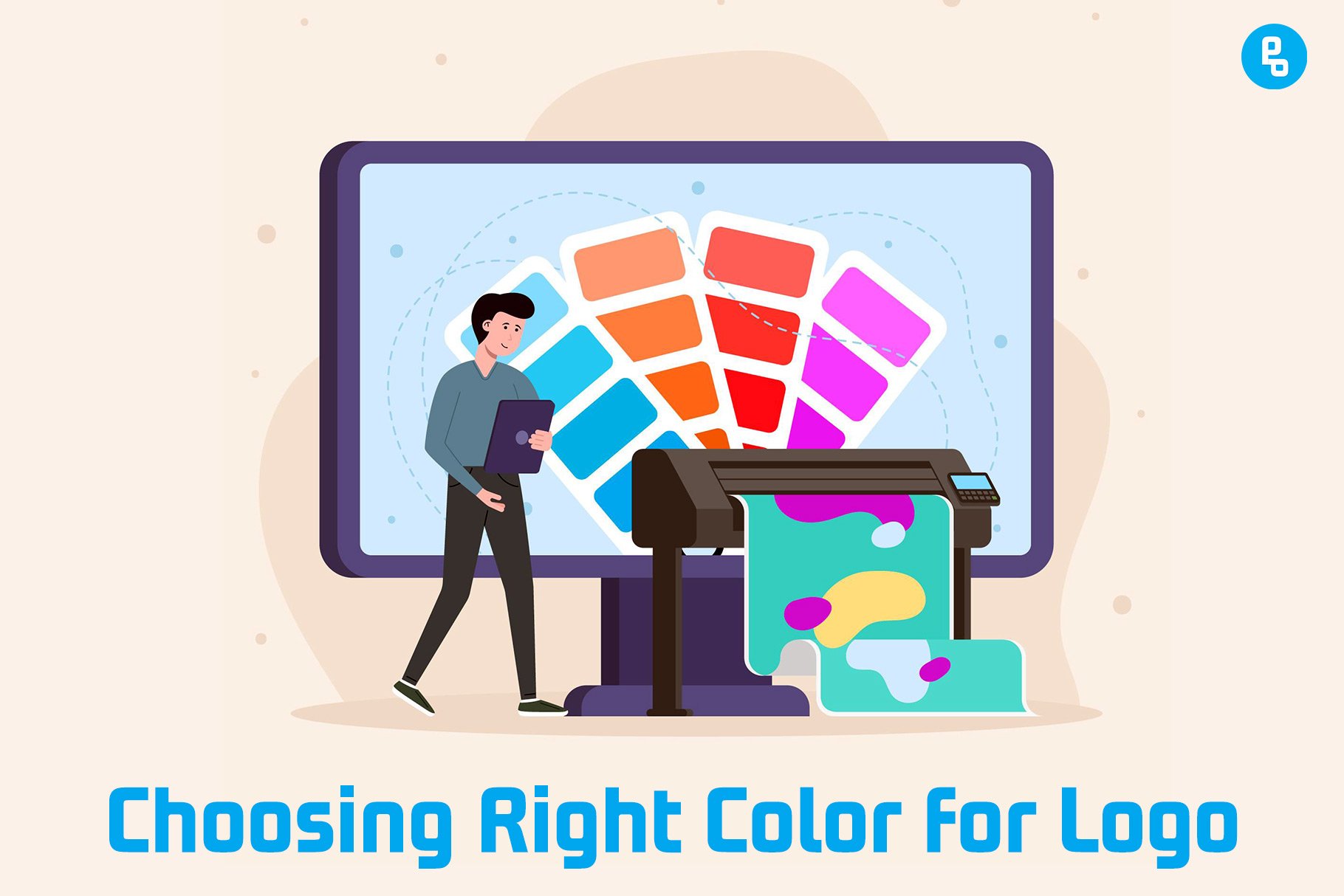
Whether you’re a graphic designer or a business owner, color plays a major role in logo design and branding.
In fact, according to studies by Pantone and LogoLounge, there are only about 20 colors in the world that have universal appeal and are seen as professional.
That said, choosing the right color for your logo design is essential for attracting customers and building trust.
But how do you choose the right color for your logo? In this post, We’ll walk you through the process of choosing a color scheme and show you how to pick the ideal colors for your brand.
Color Psychology in Logo Design

Color can be a powerful tool. It can affect your mood and perception of a brand, product, and even logo design.
So, How does color work?
Colors are made up of three primary colors: red, yellow, and blue. When these colors are combined in different ways (in varying amounts), we get other colors like green or purple.
You may have heard of complementary colors — this means that when two opposite hues are placed next to each other on the color wheel (for example yellow against blue), they create a high contrast effect that makes them stand out even more than if they were alone!
This is why many logos use complementary schemes like orange against green; it helps them pop off the page! But there’s more…
There’s also an emotional connection with certain hues that influences how people react toward them — whether positive or negative — so choosing wisely will help convey exactly what kind of message you want to be portrayed through your branding efforts!
How a Logo Color Can Affect the Perception of Your Brand
The color of your logo is one of the most recognizable elements and should be chosen carefully. It can help you convey your message and influence how people perceive your brand.
A logo’s colors convey certain meanings, which means that they can help you communicate exactly what you want them to know about your business–or even change their perceptions about it!
For example, red is often associated with excitement or urgency (think emergency vehicles). A red-orange shade may be used as a warning sign on roadways or in stores where fire hazards exist; meanwhile, yellow signifies happiness (think traffic lights).
If you’re looking for ways to connect with customers on an emotional level through color choices, here are some examples:
- Red = Passionate
- Orange = Inspirational/Joyful
- Yellow = Happy/Excited
The Most Common Logo Colors

The most common colors used in logos are red, orange, and blue. These are the colors that make up the primary palette of most brands’ branding schemes.
Green is another popular color to use because it’s associated with nature and health. Black is also a good choice as it creates a strong impression on customers and conveys professionalism.
White can be used as an accent color or as part of your logo design if you want to create something simple but memorable.
Yellow has become increasingly popular over the last few years due to its association with happiness–making it perfect for companies that sell products related to this emotion like food or drinks!
Purple is another great option if you’re looking for something more creative than traditional reds or blues but don’t want too much attention drawn away from your brand name since purple blends well into any background image when printed on paper products such as business cards or flyers (as long as they’re not too dark).
Grey tones work well when paired with black text against white backgrounds because they create contrast without being overly distracting; however, if used alone they may seem bland compared to brighter options like orange which creates visual interest without sacrificing readability at small sizes such as gray text would require.
Let’s have a look at the percentage of big brands with different color choices:
- Blue: 33%
- Red 29%
- Black, Grey, Silver: 28%
- Yellow, Gold: 13%
Also read, Top 10 Factors to Consider Before Designing a Logo
Identify how many colors you want in your logo
Identifying how many colors you want in your logo is the first step in determining which colors are right for you.
If you’re looking for a simple and clean design, one or two colors may be all that’s necessary–and if so, this will be reflected in the price of your logo design.
If you have more complex branding requirements or are trying to convey specific messages through color combinations (for example: “we sell products for babies”), then consider expanding beyond two primary colors into three or four secondary hues as well; this will allow us more flexibility when creating unique designs that include multiple shades from each primary color group.
Finally, remember that there are no hard-and-fast rules about how many colors should appear in any given logo design!
Guide to Logo Color Meanings
When it comes to logo design, color is an extremely important component. The right choice can help convey your brand’s message and personality.
With so many different shades and hues available, it can be difficult to choose just one color that best represents your company or brand.
So, let’s explore the meanings behind some common colors used in logos, as well as how you can use them effectively in your own designs.
White Logos
White is a symbol of purity, clarity, and simplicity. It can be used to represent peace, tranquility, and innocence, as well as cleanliness.
White logos are great for brands that want to project an image of purity and simplicity. They’re also perfect for companies with products or services that are meant to be simple or easy to use (think Apple).
Grey/Silver Logos

Grey and silver are neutral colors, meaning they don’t have any connotations. This can be good or bad: a neutral color will not attract attention in itself, but it also won’t turn people away from your logo.
Grey is associated with professionalism, elegance, and wisdom (think about how grey suits are worn by lawyers). If you have a business that needs to stand out from the crowd or convey authority in some way (like lawyers), then grey may be a good choice for your logo design.
Grey logos tend to be easy on the eyes because they aren’t too bright or harsh–they’re just right! They’re also easier to print than other colors because there aren’t many details in them–you don’t need special paper stock or inkjet cartridges for printing greyscale images; all you need is black ink!
Black Logos
Black is a great color for a logo. It’s often associated with luxury, power, and sophistication, which can be used to create a very strong visual impact.
Black is also a very versatile color; it can be used literally (as in the case of black-and-white logos) or in an abstract way. Black can represent elegance and sophistication, but it can also be edgy and modern.
Black is also associated with authority and power–think of the black uniforms worn by police officers or military personnel.
Yellow/Gold Logos
Yellow is the first color that babies can see, and it’s a happy color. Yellow is associated with optimism, joy, and energy; it symbolizes intellect, knowledge, and wisdom.
Because yellow is a warm color, it can also symbolize passion and optimism. It’s associated with the sun, which makes sense because sunflowers turn toward the sun.
In fact, the word “gold” comes from the Anglo-Saxon word “geld,” which means “yellow.” Gold is often used in logos because it conveys prestige and sophistication.
Yellow logos are often used by companies in the service industry (like law firms) who want to convey trustworthiness; they’re also popular among banks because they remind people of money (and everyone loves money).
Red Logos
Red is a powerful color. It conveys energy, passion, and love. Red can be associated with blood, fire, and danger, but it also represents strength and confidence–the same characteristics that are needed to build your brand. In fact, red is the color of passion!
Red logos are ideal for companies that want to convey intensity or excitement in their branding strategy. Consider using this hue if you’re selling something related to sports (like athletic shoes), entertainment (like concert tickets), or food products like hot sauce or ketchup–you get the idea!
If you’re looking to create a more professional look, consider using a red logo that’s combined with another color.
For example, if you’re selling insurance, consider using black and white or silver as your primary colors. Or if you’re selling sports gear, use navy blue instead of red!
You may also like, 10 Professional Logo Trends for the Next 5 Years
Green Logos
Green is a calming color. It’s associated with nature, growth, and fertility. Green also has associations with money and abundance. Green is also associated with balance, harmony, and healing.
Lighter shades of green represent youthfulness, new beginnings, or freshness; they’re often used in logos for companies that want to appear youthful or environmentally friendly (like Google).
Darker shades of green are associated with the natural world and the earth. They’re often used in logos for companies that want to appear traditional, environmentally friendly, or organic (like Whole Foods).
Green is also a popular color for logos because it’s easy on the eyes. The human eye has a hard time focusing on things that are bright green against a white background—this makes green logos easier to read than some other colors.
Blue Logos
Blue is one of the most popular colors for logos, and for good reason. Blue is a calming color that conjures feelings of peace, trust, and loyalty.
It’s also associated with the sky, water, ocean, and other elements that have been around since the beginning of time.
The color blue has been used in art since ancient times as well as in modern culture today–think about how often you see it on TV or in movies!
Blue can be found all over our world, from the sky above us to the sea below us; from our oceans’ waves crashing against rocky shores to swirling rivers rushing through forests; from peaceful lakes surrounded by lush green trees to vast deserts where nothing seems alive except those who dare enter their domain… The list goes on!
Blue is also a powerful color, and it’s associated with the sky and water. It can be calming or energizing depending on its shade and intensity.
Logo Colors by Industries
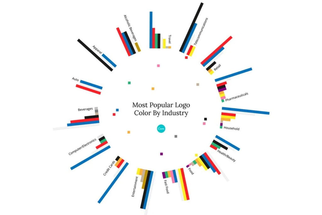
Logo colors are an important part of your brand identity. When choosing a logo color, it is important to consider how the color will appear in print and online.
Colors have different effects on the eye depending on their intensity and saturation. The color wheel is a useful tool to help you choose the right logo colors for your brand.
Each industry has a set of colors that are commonly used in logos, but there’s no rule saying you can’t use another color.
For example, a dark red may look great on screen but not so much when printed on paper or other materials.
The above image shows some suggestions for how you might select the right logo color.
Don’t forget to check out 8 Pro Tips to Design an Attractive and Well-Considered Logo
The Color Wheel
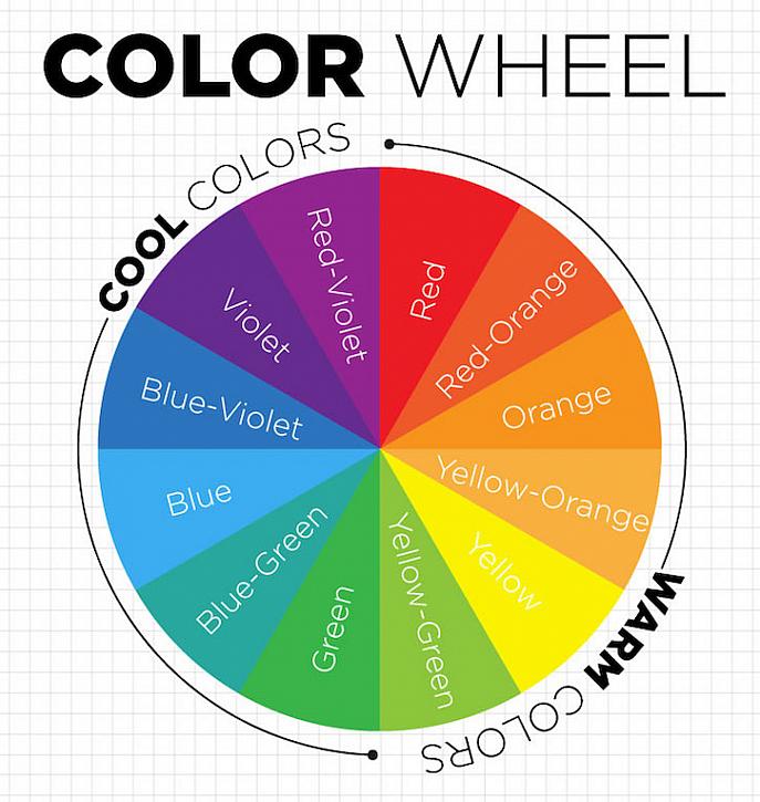
The color wheel is the most basic tool for understanding color. It’s a circular diagram that shows how different hues relate to each other, based on their position in the spectrum.
In order for your logo design to be effective, you need to understand how colors work together and what they mean.
Color theory (particularly when combined with psychology) can help you choose the right colors for your logo design by showing which ones will communicate the desired message or feeling most effectively.
The color wheel shows how different hues relate to each other, based on their position in the spectrum. In order for your logo design to be effective, you need to understand how colors work together and what they mean.
Color theory (particularly when combined with psychology) can help you choose the right colors for your logo design by showing which ones will communicate the desired message or feeling most effectively.
Complementary Colors
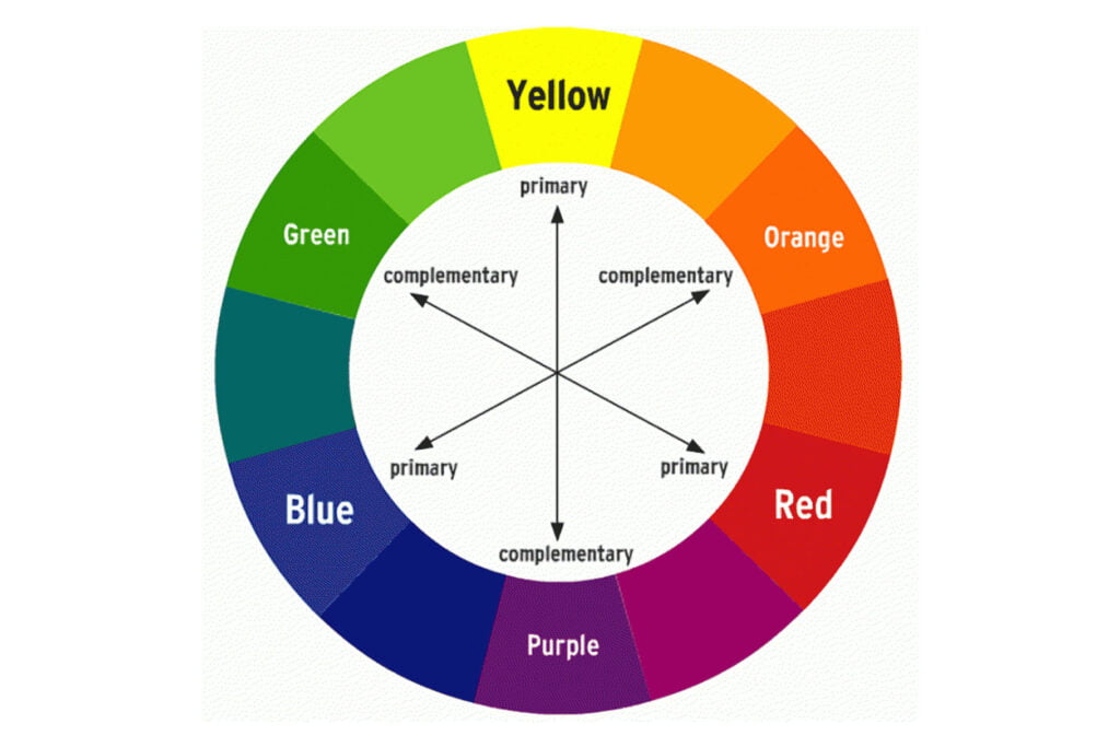
Complementary colors are colors that are opposite each other on the color wheel. The most common complementary color scheme is red and green, but you can use any two colors as your base.
For example, blue and orange or purple and yellow could also work as complementary colors for your logo design.
The colors that make up a logo or brand can be complementary colors because they create contrast with each other by being so different from one another.
This style is often used in logo design because it gives off an energetic vibe–it makes people think “modern” when they see it!
When using complementary colors in your logo, it’s important to make sure that the contrast between them is clear. If your base color is dark red and you choose a lighter orange as your second color, for example, it won’t have the same effect as if you used white and black together.
The above image shows the best complementary color combinations for logo design.
Explore famous brand color palette resources
Color palette resources are a great way to help you choose the right color for your logo design. They can be used as inspiration, or even as a starting point for your design process.
There are many different types of resources available, but here are some of our favorites:
- Fiverr’s Logo Maker: This tool allows you to choose from a wide range of colors and backgrounds. Plus, it has an option for matching your brand’s existing color palette, which can be helpful if you already have a strong understanding of how colors work together.
- Pantone Connect: This tool allows you to choose from Pantone’s full-color library, and also provides information about each color’s meaning.
- Coolors: This tool is great for generating a wide range of palettes, whether you want bright colors or muted tones. It has the option to generate a complementary pair of colors as well.
- Basic Principles of Color Theory: Color theory is the study of how colors work together in design. To get started with color, it’s important to know some basic principles. This guide, written by the University of Missouri, discusses the color theory and its applications in art and graphic design.
Conclusion
We hope that this article has helped you learn more about logo color psychology and how it affects your brand. We know that choosing the right color for your logo can be a daunting task, but with these tips and resources, we hope you’ll be able to find the perfect shade of blue (or red or green) in no time!
Recommended Reading: Top 12 World-Famous Logos and Their Story
FAQs
What is the color rule for the logo?
The color rule for the logo is that it should be easily identifiable as a company’s logo, but not so much so that it’s generic. The colors should be memorable and meaningful to the brand, but they shouldn’t be so specific that they can only describe one thing.
Which color is best for logo design?
The best color for your logo design depends on the industry you’re in, and whether or not you want to use a logo that is easily recognizable. For example, if you’re in the food industry, you’ll want something simple and clean. This will allow customers to easily recognize your company and make sure they don’t confuse the brand with other similar products.
What color logo attracts attention?
It is thought that red attracts attention the most, followed by yellow and then green. However, the color of your logo depends on the context in which it is viewed.
What 3 colors go well together in logo design?
When it comes to logo design, the best way to go about choosing colors is by using complementary colors.
Complementary colors are those on opposite sides of the color wheel. For example, blue and orange, red and green, or yellow and purple.
These will provide the starkest contrast in your design and make it very easy for your audience to see what they’re looking at.
3 thoughts on “How to Choose the Right Color for Your Logo Design”