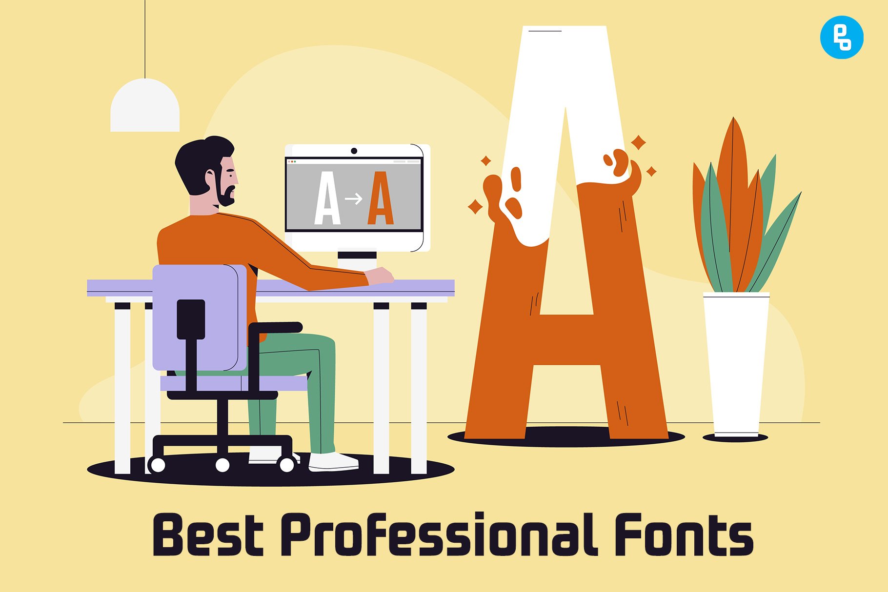
In any design project, the use of fonts is crucial. They can make or break the user experience, and they’re one of the first things that people notice about your work.
But choosing them can be difficult, especially if you’re not sure which ones will work for your next project (or which ones even exist).
In this article, we’ll explore 15 professional fonts that are sure to help you create the best designs possible.
What makes a great font?
A great font is easy to read. The most important thing about a font is that it’s legible: your readers should be able to easily read your text without straining their eyes (unless they want to).
Consistent throughout all uses of the font across all platforms and devices.
This includes both print and digital media like websites or apps, so it’s important to choose something that will look good when scaled up or down in size as well as applied differently in different contexts (e.g., bolded vs italicized).
The more consistent your branding becomes across all mediums, the stronger its impact will be on consumers’ memories–and this goes for other aspects of design too!
How to choose the best professional font?
When choosing a font, you should consider the Legibility and Readability of the font.
Fonts should be legible and readable at a distance. A good font will have letters that are easy to distinguish from one another, even when viewed from afar.
This is especially true if you’re designing for print or digital screens (though it’s also important for smaller print as well).
You want people who read your work to be able to understand what they’re seeing without straining or squinting their eyes.
When choosing a font, consider how it might look when displayed on a computer screen or printed out.
Best Professional Fonts
1. Trajan
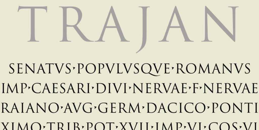
Trajan is a serif typeface that was designed by Carol Twombly and released in 1989. Trajan is based on the letterforms of capitalis monumentalis or Roman square capitals, used for the inscription at the base of Trajan’s Column (the oldest known use of this form).
The typeface has been used to brand several products and organizations; these include United Airlines, HBO, Toyota, Jeep, and more recently Dropbox.
Trajan is a versatile and legible serif typeface that works well for both body text and display applications. It has a traditional feel that makes it easy to recognize, but its unique features set it apart from other fonts.
2. Museo Sans
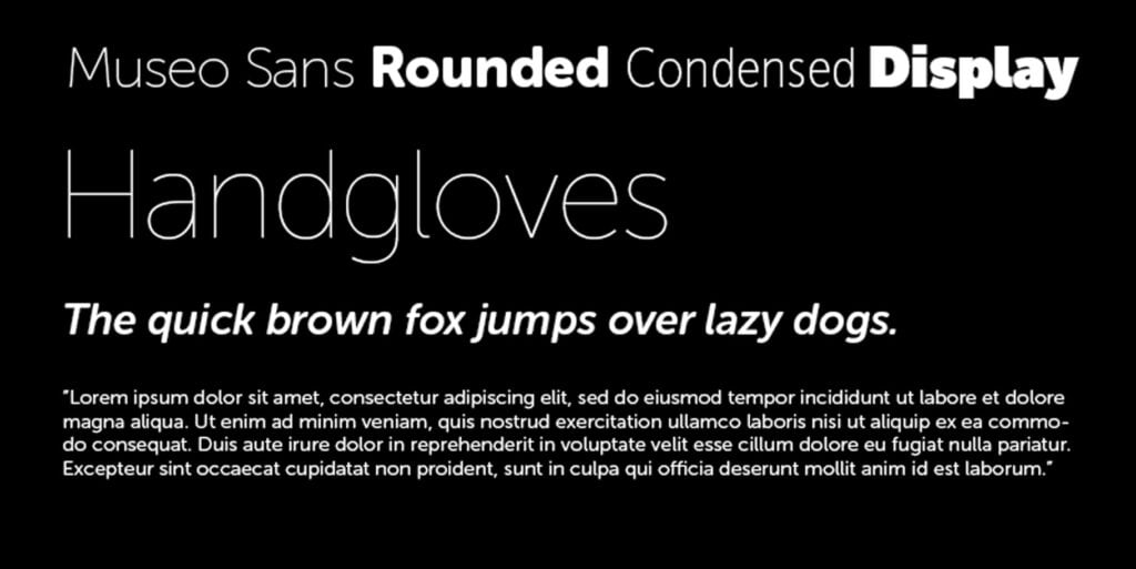
Museo Sans is a sans serif typeface family with a broad range of styles and weights. It was designed by Jos Buivenga, who released it in 2012 under the SIL Open Font License (OFL), and has since been used in several books and magazines worldwide.
The Museo Sans family consists of six different styles: Light, Regular, Medium, and Bold for the standard range; Rounded, Rounded Bold, and Rounded ExtraBold for the display range; and Condensed, Narrow, and UltraCondensed for the condensed range.
Museo Sans was intended to be used in long texts and in printed materials, where its high legibility makes it an excellent choice for text-heavy websites or brochures.
Check out our post on 12 Typography Books That Will Make You A Better Designer
3. Futura
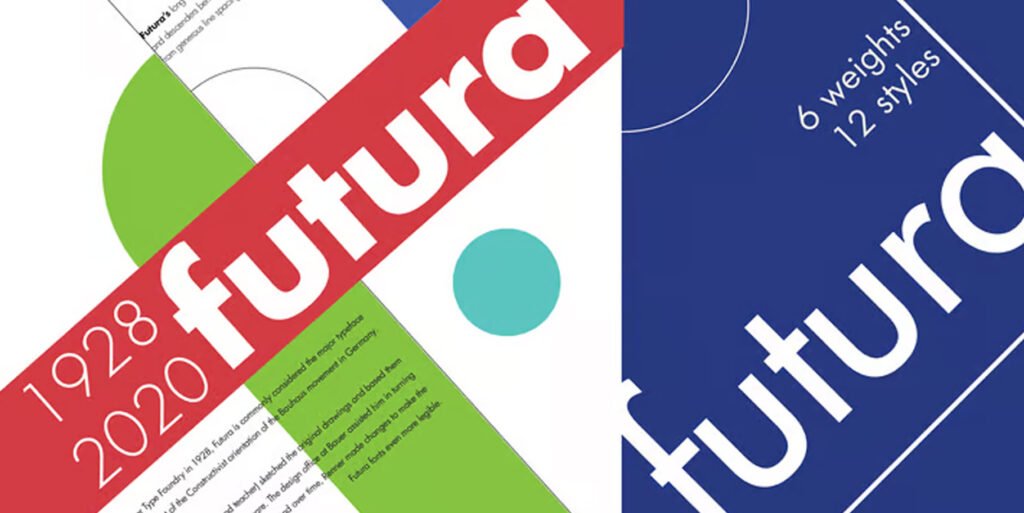
Futura is a geometric sans-serif typeface that was designed in 1927 by Paul Renner. It is considered the most geometrically perfect sans-serif typeface and has long been popular in both display and text use.
Futura was one of the first typefaces of the 20th century to have a bold weight; it was also one of the first geometric designs to be used on an industrial scale.
4. Bitter
Bitter is a monospaced font, which means that all characters are the same width. It’s also a sans-serif font and a geometric one, with sharp corners and edges.
Bitter has rounded corners on its letters that give it an airy feel, but it still retains some of the harshnesses of other fonts in this category like Droid Sans Mono or Futura Condensed Extra Bold Condensed Extra Black.
Bitter is a great font for coding and other technical uses. It’s also good for headlines that need to be eye-catching but not distracting.
5. Helvetica
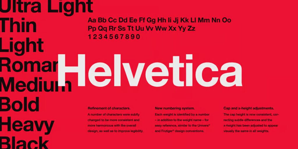
Helvetica is a modern sans-serif typeface developed in 1957 by Swiss typeface designer Max Miedinger with input from Eduard Hoffman.
It has become one of the most widely used typefaces and has been licensed to over 3,000 companies worldwide.
It was originally released by Linotype GmbH but has since been sold to Monotype Imaging which continues to develop it.
Helvetica is considered a highly legible typeface, with a large x-height and tight letter spacing. It’s considered the best font for body text due to its neutral character.
Helvetica is also used extensively in signage and advertising as it can be easily read from a distance.
6. Bodoni
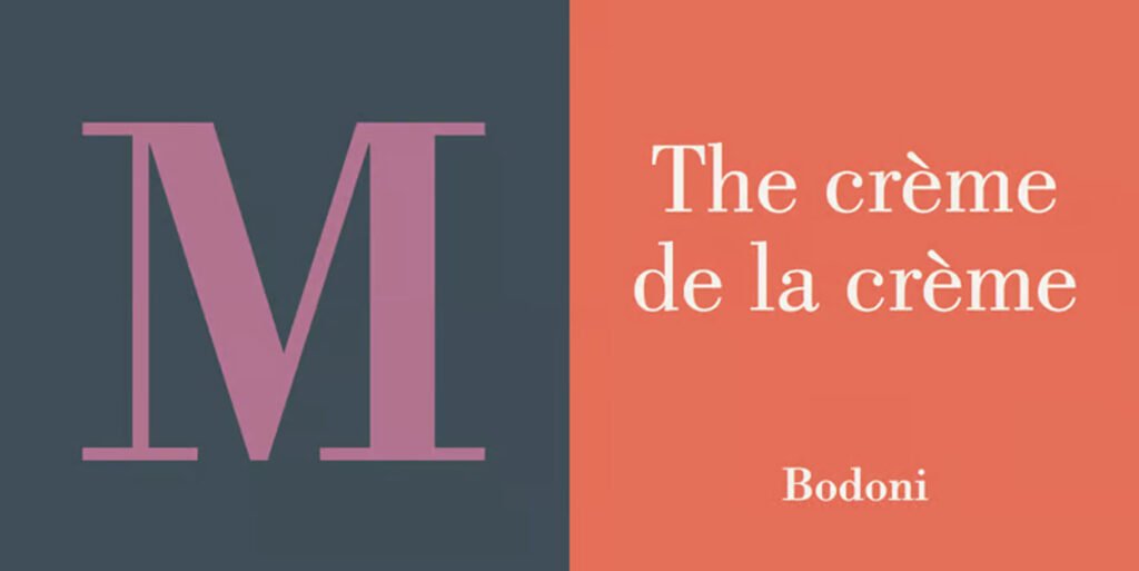
Bodoni is a sans-serif typeface designed by Giambattista Bodoni (1740–1813). It was the first typeface to use the lowercase ‘a’ and ‘g’ with a horizontal stroke.
It was inspired by the Roman inscriptional capitals of antiquity, with a large x-height and open letter spacing. Bodoni is used for titles, headings, and display purposes.
It was originally released as a metal typeface by Giambattista Bodoni in 1798. It’s considered an example of the modernist movement, with its clean and simple lines.
Bodoni font is best suited for a large variety of uses, including titles, headings, and display purposes. It is a serif font that has a strong personality and is best suited for branding projects.
7. Proxima Nova
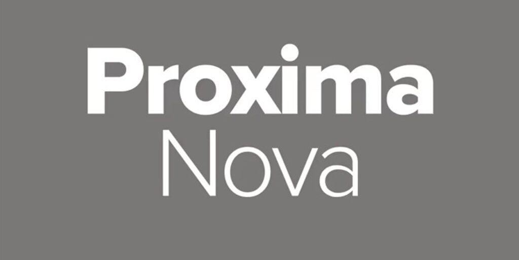
Proxima Nova is a geometric typeface with a warm and contemporary feel. It was designed by Mark Simonson and published by Font Bureau in 2000.
Proxima Nova is a sans-serif typeface, which means it doesn’t have any tails or curves on the end of its strokes.
Sans serif fonts tend to be more modern looking than serif fonts because they are simpler (and therefore easier to read) while still maintaining their own distinct style.
It can be used for headings, subheadings, titles, and body copy. It is a very versatile font that is best suited for modern brands or projects with a futuristic feel.
8. Brandon Grotesque
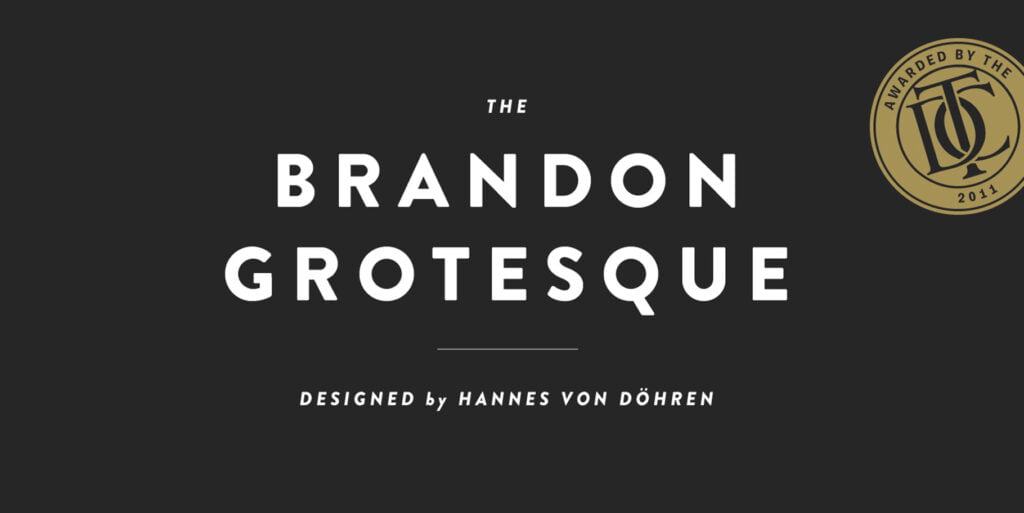
Brandon Grotesque is a geometric sans-serif typeface designed by Hannes von Döhren, Kris Sowersby, and Christian Schwartz.
It is a member of the Brandon family of typefaces; other members include Brandon Text and Brandon Printed (the latter being used for this article’s title).
Brandon Grotesque was released in 2011 after its initial development in 2003. The designers were inspired by Futura Medium which they felt was too heavy for use at large sizes so they simplified it into its current form.
These fonts can be used in a wide variety of projects. They are great for use in logos, posters, magazine layouts, and more.
9. Canela
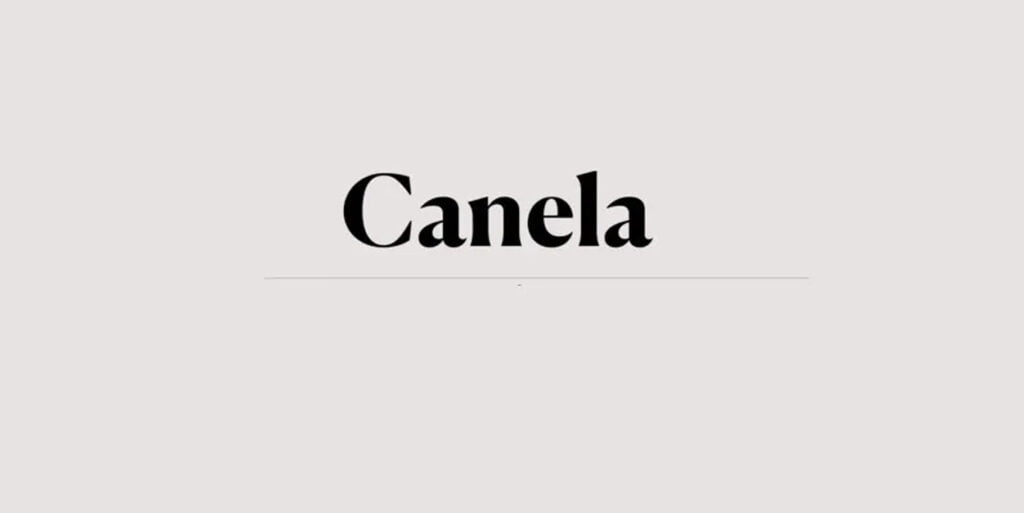
Canela is a sans-serif typeface designed by Matt Ellis and published by Font Bureau. It is intended for corporate use and is available in nine weights and three widths.
Canela was inspired by the work of architect Louis Kahn, who designed many buildings during his career as an architect.
The name “Canela” comes from the Spanish for cinnamon, which relates to its warm color palette that evokes feelings of warmth and comfort.
Best for use in corporate branding and editorial applications, Canela is a versatile typeface that can be used to create an intimate, warm feeling or a more modern, contemporary appearance.
Don’t forget to check out our latest article about 20 Best Vintage Fonts for Design and Branding (Expert Choice)
10. Raleway

Raleway is a sans-serif typeface that was designed by Matt McInerney and distributed by The Monotype Corporation.
It is a highly legible typeface used for display typography, especially in posters and advertisements.
The font was released on January 1, 2013, as part of the Raleway family together with Raleway Light, Regular, Bold, and Black weights with italics.
The family has been expanded since then with new styles such as Condensed (2014), Outline (2014), Extra Bold Condensed (2015), etc.
This font is best for displaying large blocks of text, as it has a large x-height and thin strokes. It is also ideal for headlines and can be used for subheadings.
11. Times New Roman
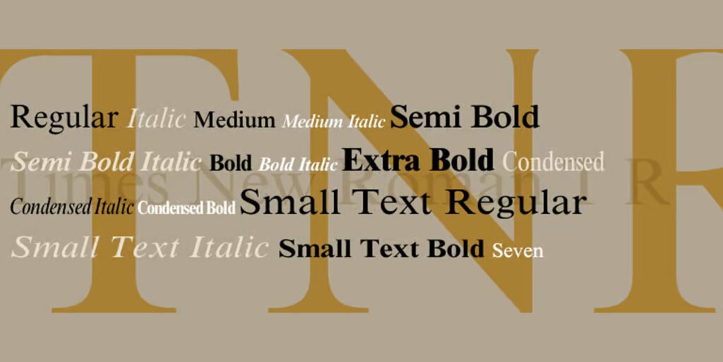
Times New Roman is a serif typeface created by Stanley Morison of Monotype. It was designed for The Times newspaper in 1931 and has since become one of the most widely used typefaces in the world.
In addition to its use in newspapers, it’s also commonly used in book publishing and desktop publishing software like Microsoft Word.
It is a very traditional typeface, and its popularity has been attributed to this. It has a large x-height and wide letterforms, which makes it easy to read at small sizes.
The serifs on Times New Roman are very small, and the typeface is often used in situations where it’s important that they be legible. It is also commonly used as a body text font because of its legibility.
12. Source Sans Pro
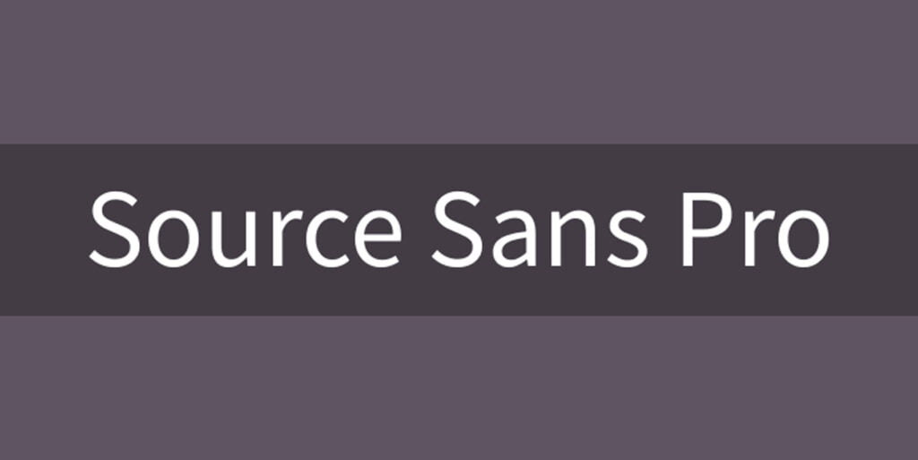
Source Sans Pro is a humanist sans-serif typeface, designed by Paul D. Hunt. It is intended to be “the most legible” open-source font family and has been used on websites including CNN, eBay, Khan Academy, and many others.
It has a large x-height and wide letterforms, which makes it easy to read at small sizes.
The serifs on Source Sans Pro are very small, and the typeface is often used in situations where it’s important that they be legible. It is also commonly used as a body text font because of its legibility.
13. Source Serif Pro

Source Serif Pro is a sans-serif typeface family designed by Paul D. Hunt, who also designed Source Sans Pro and Source Serif.
The family consists of 12 fonts in 3 weights (light, regular and bold) with an italic version for each weight.
It is a humanist sans-serif typeface with serifs that are very small and thin, which gives it a clean and modern look. The rounded tips of the letters are similar to those found in Neue Haas Grotesk.
14. Frutiger
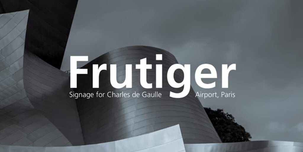
Frutiger is a geometric sans-serif typeface designed by Adrian Frutiger in 1968. It was commissioned by the Charles de Gaulle Airport and unveiled in 1975.
The typeface is used for signage at Charles de Gaulle Airport, Paris Metro, London Heathrow Airport, Helsinki Central Railway Station, and many other places around the world.
Frutiger’s original name was Avenir but he later changed it to Frutiger as he did not want any associations with French avant-garde art movements of the time (notably Lettrisme).
15. Rockwell
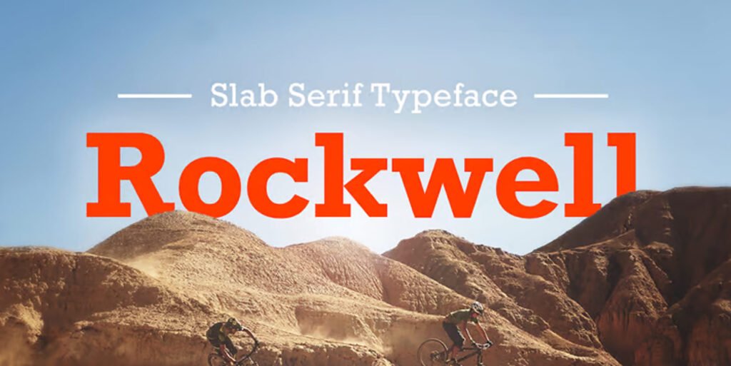
Rockwell was designed by Jeremy Tankard in 1989. It is a slab serif typeface, with a high contrast and a geometric structure.
Rockwell features small serifs on the ends of its strokes, giving it an interesting look when used for body text or headlines.
Rockwell is a very versatile typeface, and it is often used for advertisements and logos. Some of the companies that use this font include NBC, LinkedIn, and The Guardian.
Conclusion
So, there you have it. Fifteen of the best professional fonts for designers. The best fonts are the ones that you use as your go-to for every project. They’re the ones that help you create a cohesive design that looks clean, professional, and timeless. We hope this article has given you some ideas for which font might work best for your next project!
Recommended reading: 15 Best Tattoo Fonts for a Pro Tattoo Art
FAQs
What font looks most professional?
The most professional fonts are ones that are clean, legible, and easy to read. They’re usually sans-serif fonts that have a little bit of an edge but aren’t too busy or distracting. In my opinion, the font that looks most professional is Helvetica.
What fonts do professional designers use?
Professional designers use a wide range of fonts, but there are some that stand out more than others. Some of the most common include Helvetica, Arial, and Verdana. These are all sans-serif fonts, which means that they don’t have any serifs.
Which font is best for the eyes?
The best font for reading is a sans-serif font. Sans serif fonts are easier to read than serif fonts because they have no little lines on the ends of the letters. These lines can get in the way of your eyes as you look at them, which makes it harder for you to read what’s written.
How to choose the best professional font?
Choose a font that is easy to read, but also has personality. A professional font will be easy to read, so you don’t have to squint to decipher what it says! It should also have some character, so that it doesn’t look like every other letter you see in your daily life.
4 thoughts on “15 Best Professional Fonts for Designers (Expert Curation)”