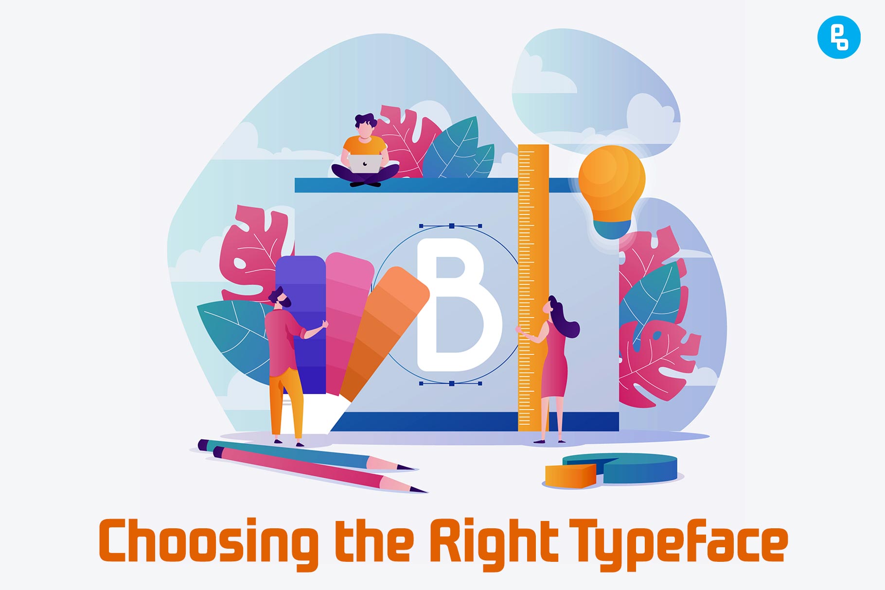
Choosing the right typeface can really make a difference in the way your brand communicates. It’s not just about aesthetics, but also how well the font fits with your personality, medium, and context to convey its message clearly.
The right typeface can help you make a lasting impression on your audience and set the tone for your brand’s voice. The wrong one, on the other hand, can be disastrous.
Choosing the right typeface for your brand is a lot like choosing a friend. You have to find someone who has similar interests and values, but also complements each other in order to build a strong relationship.
It’s no different when it comes to selecting a typeface — it should reflect what you’re trying to say while complementing your overall design.
In this article, We’ll show you how choosing the right typeface affects all these different aspects of design and branding.
Why is it important to choose the right typeface?
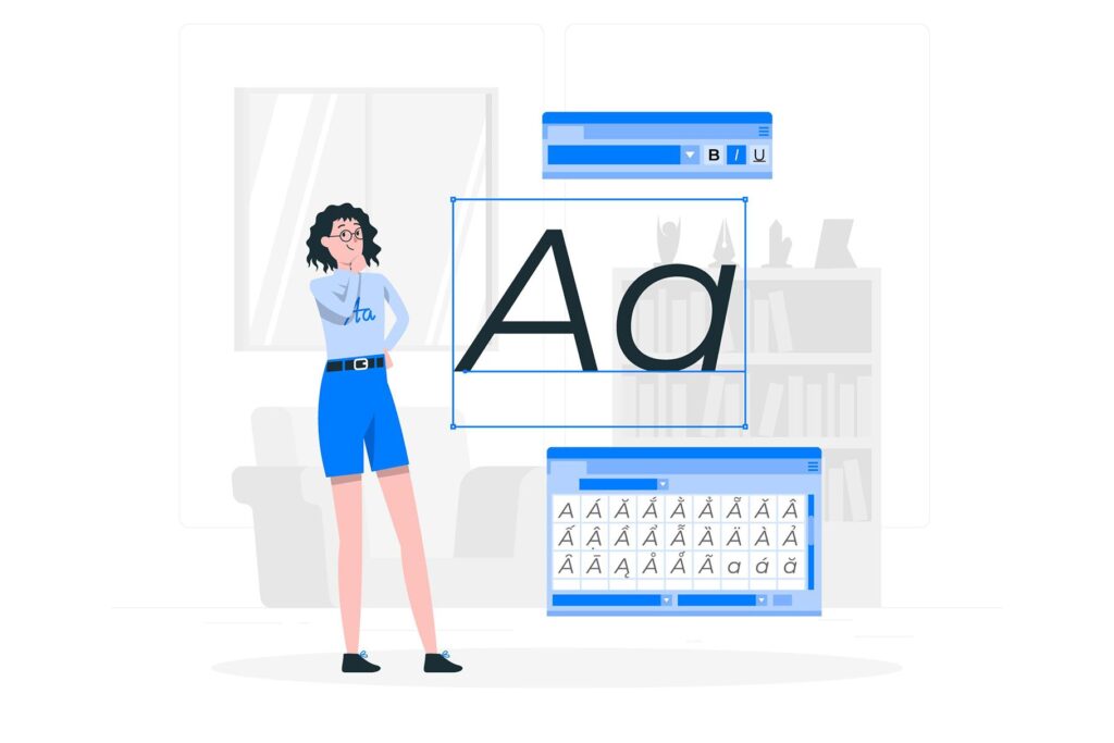
Choosing the right typeface is one of the most important decisions you can make when designing a logo or branding for your company.
The typeface that you choose will be used throughout all of your marketing materials, on social media platforms, and in printed material such as business cards and brochures.
It’s essential that this design element reflects not only who you are but also what message you want to convey through your brand.
If it doesn’t match with these aspects then it could end up being detrimental in terms of brand recognition and customer loyalty over time as people become familiar with seeing certain types of fonts across different mediums (e-mail signatures; web browsing).
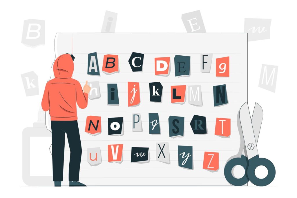
To help narrow down which option would work best for any given situation there are many different styles available: serif vs sans-serif; script vs block letters etc., and the selection of which can be the difference between a strong brand and a weak one.
If you find yourself in need of some design inspiration, check out this article on How to choose the best font for your brand and how they can help you stand out from your competitors!
1. Communicating the brand’s personality
Typefaces are a form of communication. They convey meaning, tone, and feeling. They can even help you express your brand’s personality in a way that words never could.
And the best part is, you don’t have to be a professional designer or have a degree in graphic design to use typefaces effectively. You just need to know how they work and what they can do for your brand.
By understanding how typefaces communicate, you’ll be able to create more compelling content that’s on-brand and resonates with your audience.
Typefaces can be used to convey a message, or they can be used to convey a feeling (for example: playful).
A typeface might also help you communicate something about the nature of your business (for example: modern, traditional).
When used correctly, typefaces can help you tell a story about your brand. They can make your content more engaging and memorable. But before we dive into that, let’s talk about what makes a typeface work in the first place.
There are two factors that determine whether a typeface works for your content: the form and the function.
The form of a typeface refers to its design, including the shape and style of each letter. It’s important to choose a typeface with consistent forms when creating your brand voice so that it looks cohesive across different types of content.
The function of a typeface refers to how it’s used in context. It’s important that your brand voice has a specific function, which will help you select the right typeface.
2. Legibility and Readability
Legibility and readability are two of the most important factors to consider when choosing a typeface.
Legibility refers to how easy it is for readers to distinguish the characters in a particular font, while readability refers to how easily they can make sense of those characters.
There are many factors that affect legibility: font size, weight (boldness), style (italic), and spacing between letters and words–all these things play an important role in determining how readable your text will be for your audience.
For example, if you have very small text on a page with low contrast between background colors then it will be hard for people who aren’t well-versed in reading small print or don’t have good vision acuity (i.e., older adults) to see what’s written there at all!
The opposite is true if you have very large, readable text on a page with high contrast between background colors. This will be easier for anyone to read, regardless of their visual abilities.\
You may also like, 20+ Best Decorative Fonts for Spectacular Designs (2023)
3. Accessibility
The third factor to consider when choosing a typeface is accessibility. This means that you should choose a font that can be read by all people, regardless of the medium it’s displayed on or the ability of the reader.
Fonts should be easy to read on screen and in print. You don’t want your readers squinting at tiny letters or straining their eyes trying to make out what they’re reading just because you chose an interesting font for your website!
For example, if you’re using a typeface that is only available in a digital format, then it won’t be accessible to people who can’t read onscreen or don’t have access to computers.
Similarly, if you’re printing documents for distribution and want them to be accessible for everyone, make sure that your chosen font is one of those supported by whatever printer you’re using!
Fonts should also be easily readable for people with dyslexia, who may have trouble interpreting certain letterforms (e.g., ‘b’ versus ‘d’) or recognizing patterns within words like ‘the’.
It should be designed to look good in all sizes, whether that’s a small banner at the top of your website or an enormous poster on the side of a building.
It should also have consistent spacing between letters, words, and lines so that readers aren’t confused about where one sentence ends and another begins.
4. Context and Medium
The context of the project and the medium in which you’ll be using your font are also important factors to consider.
If you’re designing a logo for a brand, for example, then it makes sense to pick something that reflects that brand’s personality–and if you’re designing an invitation card for a party at your friend’s house (or maybe even yours), then it might not matter so much how many people see it as long as they know who sent it!
Serif fonts are generally easier to read at larger sizes than sans-serif ones, so if you want something readable without being too small or thinned out by anti-aliasing effects (which smooth rough edges) then a serif font will often be your best bet.
The same is true if you’re designing a logo or something else that will be viewed by millions of people all over the world, where legibility is more important than style.
If you’re designing a flyer for your local coffee shop, though, then it might not matter so much how many people see it as long as they know who sent it!
5. Consistency and Cohesion
Consistency and cohesion are important for a brand’s communication. The same fonts, colors, and images should be used across all media to help establish a consistent identity.
Consistency helps establish brand recognition as well as maintain brand equity. This is especially important for companies that want to establish themselves as leaders in their industry.
If a customer sees your brand everywhere, they’ll be more likely to recognize it and trust it. Cohesion helps people understand your company’s message and allows them to recognize it more easily. If a customer sees your brand everywhere, they’ll be more likely to recognize it and trust it.
Consistency helps establish brand recognition as well as maintain brand equity. This is especially important for companies that want to establish themselves as leaders in their industry.
If a customer sees your brand everywhere, they’ll be more likely to recognize it and trust it.
6. Trends and Timelessness

Choosing a typeface that is trendy can be a good thing. It will make your design look current, relevant, and fresh.
However, it’s important not to follow trends blindly and make sure you don’t use too many of them at the same time.
If you want your design to be timeless, choose a typeface that isn’t dependent on any particular trend. This will make the design look fresh and modern without becoming dated in the future.
You also need to make sure that you’re not just choosing a typeface because it’s trending. If your goal is to create a timeless design, then you should try to find a typeface that will still look good years down the line. This can be difficult because what’s in style today may not be tomorrow.
Choosing timeless fonts on the other hand gives you more freedom in terms of how you want your design to look over time.
You won’t have any problems using this typeface 10 years from now as well as today because it’s been around for so long and has stood the test of time!
The best way to do this is by looking at how the typeface has been used in past designs. You can also look at how other designers have used it in their own projects.
Also, read 15+ Best Adventure Fonts for Stunning Designs
7. Cultural and Regional Considerations
When designing for different cultures, you should be aware of cultural differences. For example, a font that looks modern and elegant in one culture might look old-fashioned or even comical in another.
It’s important to consider the culture of your audience when choosing a typeface; make sure your design is appropriate for them.
In addition, you should be aware of local differences. For example, some typefaces are more commonly used in one region than another. If you’re designing for a specific area, it’s important to choose a typeface that will be well-received by locals.
When designing for different cultures, you should be aware of cultural differences. For example, a font that looks modern and elegant in one culture might look old-fashioned or even comical in another.
It’s important to consider the culture of your audience when choosing a typeface; make sure your design is appropriate for them. In addition, you should be aware of local differences.
8. Functionality
The next step is to choose a typeface that is functional. This means choosing a typeface that is easy to read, understand and use. You want your content to be legible, readable, and accessible for users.
You also want your content to be easily understood by readers. You can do this by choosing a typeface that is appropriate for its purpose.
For example, if you are designing a poster for a concert, you should use a serif font because it is easier to read in small sizes.
If you are designing a poster for a concert, you should use a serif font because it is easier to read in small sizes.
If you are designing a website, serif fonts are more legible than sans-serif fonts because they have more weight. However, if you are designing a poster for a concert, you should use a sans-serif font because it is easier to read in small sizes.
Finally, it should be consistent so that it feels like one cohesive experience across all devices or mediums (print vs digital).
9. Pair up properly
When choosing a font for your design, it is important to pair them up properly.
For example, you should use the same serif or sans-serif font throughout your design and avoid mixing different styles of typefaces. This will help keep things consistent and readable.
When pairing fonts, you should pay attention to the font’s weight (bold, light), serif or sans-serif style, and character set. If a font has too much contrast with the other one, it can be jarring to read.
For example, if you pair up a serif font with a sans-serif one, it may look more like a comic book than an article on an insurance website.
In general, it is best to use a font that has similar characteristics in its weight and style. For example, if you have a sans-serif font with thin lines and small letters, avoid pairing it up with another thin font.
Instead, try mixing it with a bold typeface or one that also has thin strokes but is more condensed than your first choice.
Conclusion
The right typeface can be the difference between a good design and a great one. It’s important to choose your font wisely, as it will define the personality of your brand and help people connect with you. However, it’s also important not to get too caught up in all the hype surrounding new fonts or trends because they may not be right for your project at hand. Ultimately, we hope this article has given some insight into what makes typefaces unique so that when faced with choosing one yourself you feel confident about taking on that task!
Recommended reading: Role of Typography in Logo Design (The Ultimate Guide)
FAQs
Why is it important to choose the right font?
Choosing the right font can make or break your business. It can be the difference between a successful product launch and a failed one. The way you communicate to your customers is just as important as the content of your message. If you want to communicate effectively, you need to choose a font that is easily readable and conveys the right message.
How to choose the right font?
The font you choose for your design can make or break it.
Choosing the right font is about more than just aesthetics—it’s about creating an experience that makes your audience feel something, whether it’s excitement, calm, or anything in between.
What is the key to choosing fonts?
The key to choosing fonts is to make sure that the font you choose is readable.
You want your readers to be able to read your text, and if they can’t, then you’re not doing your job.
4 thoughts on “The Importance of Choosing the Right Typeface”