
If you’re in charge of creating a brand for your company, it’s important to choose the right font. This can make or break how people perceive your brand – from the way it looks down to the way it sounds when someone reads it out loud.
We all recognize the power of a well-designed font. Some fonts are just more pleasing to the eye than others, and these are usually ones that have been crafted by professional designers. But what if you don’t have any professional designers on hand? How do you choose which fonts will work best for your brand?
Although there are many different fonts out there that can be used for branding purposes, choosing them can be tricky because they all look so different from one another. In this article, we will discuss some tips on how you can select the right font or fonts for your company’s branding needs.
Choosing Font for a Brand
1. Set your brand personality

Your brand personality should always be consistent across all mediums available. If you want to present a cool, hipster vibe, then don’t suddenly throw in something stodgy and conservative (unless that’s the look you’re going for).
You can also use your brand personality as a tool to help guide people through the process of choosing a font.
For instance, if someone is looking for an elegant script font, they’ll likely be drawn to something classic like Garamond or Caslon because it matches their vision of what elegance is. On the other hand, if someone wants something more contemporary but still stylish and elegant, then maybe Minion Pro would work better than Baskerville.
2. Understand your target audience

Choosing the right fonts for your brand is all about understanding your audience. To choose fonts that are appropriate and relevant, you need to know who they are and what kind of message they respond to. Are they young or old? Do they prefer a casual tone or something more formal? Do they tend toward traditional or modern aesthetics?
You can also use demographic research and surveys to determine what kind of fonts will be most appealing to different segments of your audience—but keep in mind that these sources aren’t always accurate, so pay attention if their responses don’t match up with the insights you’ve gathered about them.
The best way to figure out what kind of fonts your audience prefers is to ask them. There are many ways you can do this, such as surveys and focus groups. You can also try running some QnA tests on different versions of your website or social media to see which type of font gets the most clicks or conversions.
3. Use only two fonts
You should use only two fonts in your branding. One for headings, and one for body text.
Why? Because this makes your branding unique and recognizable. If you use the same font for both headings and body text, then it will be difficult to tell them apart at first glance. You want people to know what they’re looking at as soon as they see it—you don’t want them wondering whether or not they’re still on your website or on someone else’s site!
The fonts should be easily readable. Using a fancy font on your website is not only bad branding, but it’s also dangerous for your business. If people can’t read what you’re saying because they can barely make out the letters, then they’re going to leave! You want your brand to be recognizable and easy to read at first glance.
4. Don’t mix a serif font with a sans-serif font
If you’re using a serif font, make sure the rest of your branding is sans-serif. The best way to look at this rule is by thinking about fonts as clothing: the more formal and professional an event or setting is, the less likely it will be appropriate for you to wear jeans or sneakers—and vice versa!
So if your design project calls for something elegant or fancy, like an invitation card for a wedding reception, don’t pair it with something casual like Comic Sans (a very non-professional-looking font). Instead, go with something like Myriad Pro looks much cleaner than Comic Sans while still remaining readable enough that guests will understand what they’re supposed to do on their invitation cards when they come in person rather than just printing out those details in advance online before going and picking them up at home beforehand so they can just bring those instead (which would defeat the purpose of those invitation cards).
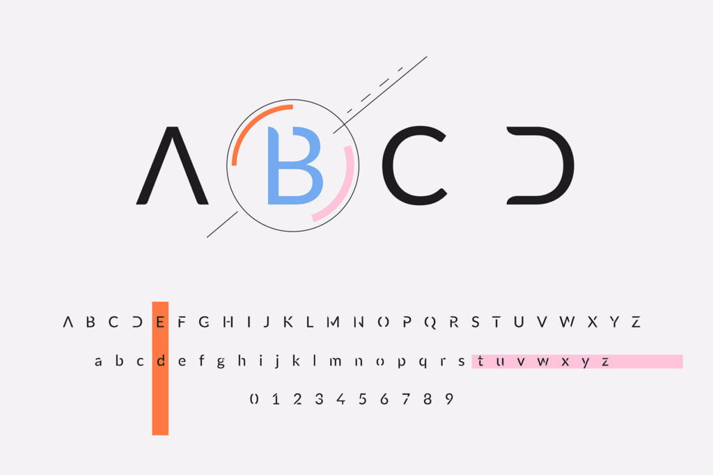
5. Typefaces should be easy to read

The last thing you want is to choose a font that’s illegible.
Serif fonts are often easier to read than sans-serif fonts because they have flourishes on the ends of each letter, which makes it easier for your eyes to follow them across the page.
If you have poor vision or suffer from eye strain, don’t use a highly decorative font; instead, go for something simpler like Arial or Verdana.
For example, If you’re printing your invitations, the typeface should be easy to read in both color and black and white. The only way to check this is by printing proof of your design. If it looks good then, chances are it will look good when you print it out too.
6. Don’t choose anything overused

Avoid choosing a font that’s overused. The idea behind picking a unique typeface is to ensure your brand stands out from the crowd.
There are thousands of fonts out there and many of them are used extensively by big-name brands, so if you choose one that’s already been overused, it will be hard for people to tell your brand apart from everyone else’s.
Comic Sans may have been cool in the 90s, but it’s hardly ever appropriate today — unless you’re making memes (and even then I’d advise against it). And while Papyrus still looks surprisingly fresh in some instances (like when used sparingly), I wouldn’t recommend using this font unless you want all eyes on your work to roll right off the page.
7. Your fonts should make sense for your brand

When it comes to choosing fonts for your brand, you should think about two things: how the font looks and how easy it is to read.
A good font will be easy to read, whether it’s handwritten or typed. If your audience is older or doesn’t have great eyesight, then you should make sure that whatever font you choose has enough contrast between letters so that they are not hard to distinguish from one another.
You also want your branding text to be easily readable in all conditions—on screens and printouts alike—so keep this in mind when choosing a typeface.
It’s not just about making sure that people can read what you’ve written; it makes sense for fonts used by companies as well because they help communicate what kind of company they are through visual cues such as their logo or advertising materials (see the section on Logo Design). Don’t forget though: while there are many different kinds of fonts available today which can give any brand its unique identity through typography alone – there’s nothing worse than having something unreadable! So pick wisely my friend.
Conclusion
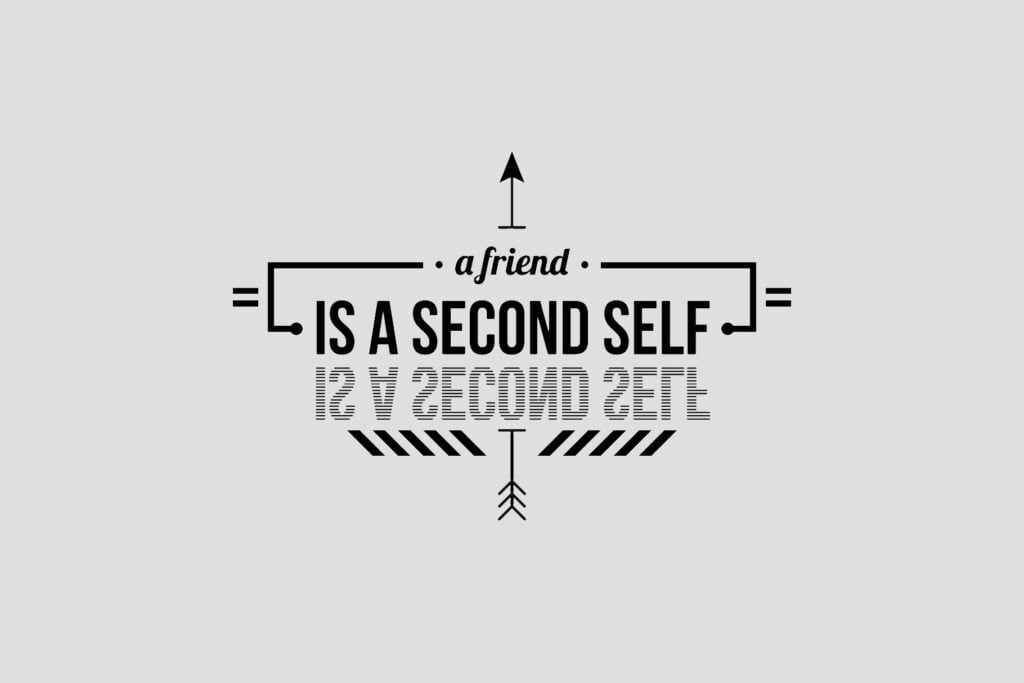
In conclusion, your fonts are essential to the identity of your brand. A well-designed font can be a great asset to any business and make sure that your customers remember you. It can be the difference between a company that’s just another faceless brand and one that stands out from the crowd.
With a little research and thought, you can choose a font that’s both distinctive and functional. It will help your brand stand out from the competition while still being easy to read.
Recommended reading: 15+ Top Elegant Luxury Fonts for Branding and Designing
FAQs
How can I choose the best font to design a website?
You can use a variety of fonts to design your website, but it is important to choose one that is clear and easy to read.
When choosing a font for your website, you should consider the overall aesthetic of the site. You might want to use a bold font for headlines and a more traditional font for body text.
What are the most beautiful fonts for branding?
The most beautiful fonts for branding are those that make the brand stand out, but also fit with its image. Some of the most beautiful fonts include:
1. Bebas Neue (a font that’s both elegant and simple)
2. Cormorant (a bold and strong font)
3. Open Sans (a clean, modern font)
What is the importance of font in branding?
Fonts are essential in branding because they communicate the brand’s personality and values. They can also convey a sense of professionalism, authority, or friendliness, depending on their use and design.
Fonts are often used as a way to attract attention or to differentiate between products in an industry.
I agree with your point of view, your article has given me a lot of help and benefited me a lot. Thanks. Hope you continue to write such excellent articles.