Typography is one of the most important components of graphic design. It can make or break a design, so it’s important to know the basics of typography.
It is the art and technique of using type to set written language. The word “typography” comes from the Greek words “typos” (meaning “form, shape or example”) and “graphos” (meaning “to write or draw”).
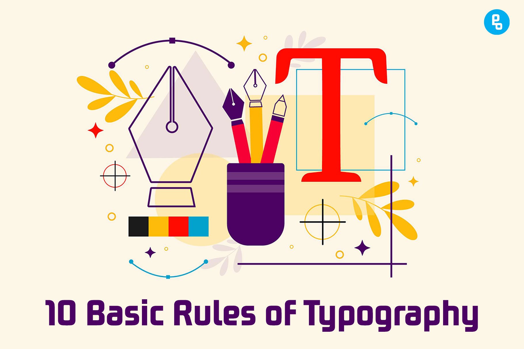
In this post, we’ve compiled a list of 10 rules that every designer should follow when designing with type. The 10 Basic Rules of Typography.
What is Typography?
Typography is the art and technique of arranging type in order to make information more readable and visually appealing.
It is a major component of graphic design, along with color, layout, and imagery. In fact, typography is one of the most important elements that define a website’s overall look and feel.
However, typography is not just about using a variety of fonts and choosing the right one for each project. It’s also about arranging those fonts so that they make sense together, using them consistently throughout your designs (especially headings and body text), and making sure that people can easily read it without getting confused by different styles and sizes (i.e., sans serif vs. serif).
10 Basic Rules of Typography
1. Legibility
Legibility is a term used to describe the readability of a typeface. Legibility is important for both writing and reading, whether you’re trying to make your own handwriting legible or you’re just trying to figure out how many fonts have been included in this article.
The basic rule for improving legibility is to increase the contrast between strokes and add weight to strokes that are thin. It sounds simple enough, but there are lots of ways you can do it!
For example, you could use line spacing (also called leading) or kerning (the distance between letters), or even change the widths of certain characters. These edits will make your text easier on the eyes—and they’ll make it more fun too!
2. Readability
Readability is the most important rule of typography. The text should be easy to read and understand.
This is why you need to choose a good typeface, set it in a readable size, weight and style; use white space; use contrast effectively; make sure there are no lines longer than 65 characters (the width of an average person’s attention span); and use italics sparingly.
For example, the line length should be about 30–40 characters for body text if you want people to read your article without getting tired too quickly or losing their concentration on what you’re trying to say.
Read our article on How To Choose The Best Font For Your Brand
3. Contrast
Contrast is the relationship between the elements on a page. The contrast should be clear and not too much. If it is too much, you will have problems with legibility and readability.
You want to make sure that the contrast between lines is enough so that they can be easily distinguished from each other when you look at them up close. They should be straight and not curved, which makes things harder for your eyes because they don’t create any contrast when they are curved like this.
You also want to make sure that there is enough contrast between the lines and the background so that you can easily see them without getting tired too quickly or losing their concentration on what you’re trying to say.
4. Alignment
The alignment of type and other elements is a process that affects the readability and legibility of your text. To understand alignment, it’s important to know that there are several different types:
- Justified (flush left, flush right)
- Centered
- Flush left, ragged right (a.k.a. “ragged-right” or “oblique”)
- Flush right, ragged left (a.k.a., “flush-left” or “flush”)
The most common and easiest to read is justified alignment. This means that the text is flush left or right, with all the lines of text aligned at their respective margins. This type of text flows smoothly from line to line, which creates a pleasant reading experience.
5. Proximity
The use of space between letters helps with readability and legibility is called proximity.
Proximity is used to group similar letters together, such as all the vowels in a font or all the consonants in a typeface. It also separates different categories of letters (such as upper case vs lower case) and groups them together. For example, if you have a lot of “f”s and “t”s, they should be closer together than they would be if you had more “m”s and “w”.
Proximity is also used to separate letters that would normally be too close together. For example, if you have an “m” and an “n”, they should be separated from each other by a gap of space. This helps with legibility as well as readability since it makes the letters easier to distinguish from one another.
6. Line Length
The line length is the number of characters you have on a single line. It’s important to choose the right line length for your body text, as it directly affects readability and comprehension. A line that’s too long can be difficult to read, while one that’s too short can look crowded or even unbalanced.
Making sure your lines aren’t just right isn’t as easy as picking out a typeface and placing it in context—you also need to think about what message you want people to take away from your work, whether it’s something serious (like an article) or something more casual or fun (like an infographic).
If you’re working with long-form content like blog posts or articles, try experimenting with different word lengths until you find one that works best for both your content and audience.
7. Hierarchy and Emphasis
The following techniques are used to create a visual hierarchy in order to emphasize certain elements over others:
- Use different typefaces and font sizes. A good rule of thumb is to use one typeface at the largest size, two fonts at the next size down (one for headings, one for body copy), and one or two other variations (monospaced or lining numerals) smaller still. Only use a fourth if you need something very small—for example, tabular data on a spreadsheet in an annual report.
- Use bold, italics, underlining or color as needed to emphasize key points or information; don’t rely on these alone because they’re so easy to miss! For example: “Bold text has been ignored”, “Text highlighted with italicized bold blue highlights special keywords”, etcetera…
8. Rhythm and Proportion
Rhythm, or pattern, is the backbone of any design. It helps guide your eye through the layout and creates a sense of order.
Take a look at this example:
The rhythm in this design is very obvious; however, it’s not balanced. The text box doesn’t have enough white space surrounding it, so there isn’t much contrast between the text and its background color (blue).
If we were to add more white space around our text box and make a few adjustments to its proportions (the relationship between its size and other elements), we would create better balance in this design:
By adding more white space around our text box, as well as making small adjustments to its proportions (making sure they’re more equal), we achieve balance in this design by creating contrast between important elements like headlines and body copy.
Checkout our latest article on 20 Best Vintage Fonts for Design and Branding
9. Repetition
Repetition is one of the most important visual principles because it helps create order and unity in a design. It’s essentially repeating an element throughout your design (or multiple elements), but changing their size and shape to make them more interesting.
Sometimes, repetition is used in a design to create a sense of balance or rhythm. For example, if you had two columns of text that were exactly the same length, it would make your reader feel uncomfortable because there’s no variation between them.
Repetition is also important when it comes to color: If you use two colors that are very similar in hue (dark blue and light blue come to mind), then using them together won’t evoke a strong reaction from your readers because they’re so similar.
However, if you use two colors that are very different—like red and green—then the combination of those two colors will stand out. A repetition is a powerful tool in design because it helps create patterns and rhythms that readers can follow easily.
10. Balance
The principle of balance is the tendency for an element in a composition to be offset by another element.
In other words, if you put two objects side by side, then there will usually be a reason why one object is larger than the other or positioned lower on your page than the other. If this isn’t true, then readers will feel like something is off about your design.
Balance is important because it helps readers understand where they are in a design. If you don’t have any balance, then readers will feel like they’re lost and won’t know where to look next.
Conclusion
Typography is an art and one of the most important parts of the design. Typography can make or break your design, so we hope these tips will help you to create better text in your projects!
If you found this article helpful, please leave your thoughts in the comments below! We love to hear from our readers. If you have any questions about typography or design, feel free to ask them here as well!
If you want to learn more about design, check out our Graphic Design page.
Recommended reading: How To Choose The Best Font For Your Brand
FAQs
What is Typography?
Typography is the art of arranging type for print, web, and other digital media. It involves selecting typefaces and sizes, adjusting their spacing, and placing them on a page or screen.
Why is typography important?
Typography is important because it conveys information to the reader. Typography guides the reader’s eye and helps them to understand what they’re reading.
Is Typography Important in Graphic Design?
Typography is important in graphic design because it helps to convey the message of the design. It can also help with branding, and it helps to give the design a consistent look and feel.
Your article helped me a lot, thanks for the information. I also like your blog theme, can you tell me how you did it?
Your article helped me a lot, is there any more related content? Thanks!