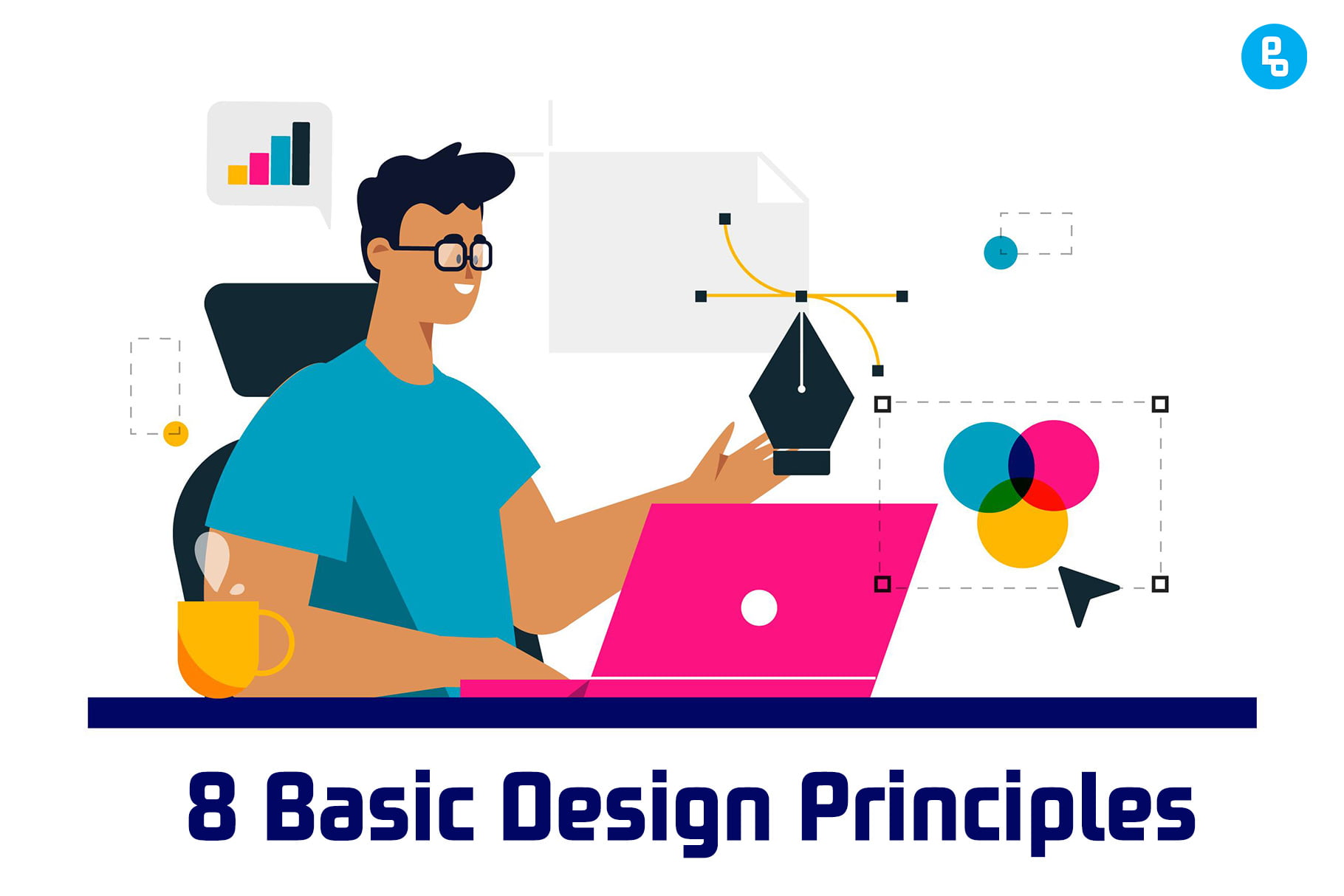
Design principles are guidelines for creating good design. They give you a framework for problem-solving and decision-making, which can help you create more effective and cohesive designs. There are many different types of design principles that can be used in different ways, but here are 8 basic design principles I’ve found helpful when designing anything.
What Are the Principles of Design?
The principles of design are a set of guidelines that help designers create aesthetically pleasing work. These principles are used in all forms of art, but most notably in graphic design.
The principles have been around for many years and were created by artists and designers who wanted to learn how to make their work more appealing to the eye.
Following are the 8 Basic design principles that will help you enhance your design understanding.
- Symmetry
- Contrast
- Hierarchy
- Balance
- Scale
- Proximity
- Space
- Repetition
8 Basic Design Principles
1. Symmetry
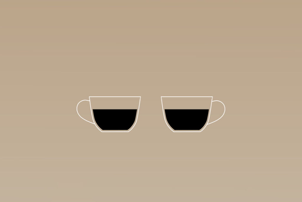
Symmetry is a basic principle of design that can be used to create balance and rhythm, as well as focal points. It’s easiest to understand what symmetry means by looking at an example. If you have two objects side by side, they may appear balanced if they are the same shape, size, and color. This is called bilateral symmetry because both sides look the same when seen from above (like your face).
If one object has something different than its counterpart—a different shape or color, for example—the design will not feel balanced because there’s no sense of symmetry.
For example, You could use asymmetrical objects in your designs for variety or just to break up the monotony of a symmetrical layout, but try not to make them too drastic otherwise, it will throw off any sense of balance in your composition.
2. Contrast
Contrast is the difference between two or more things. It can be used to emphasize a point, make things stand out, create visual interest and make something look more interesting.
For example, a dark color can be used to set off against a light background, or vice versa. The same principle applies to the use of different sizes and shapes; you can also create contrast by placing two objects in close proximity that have very different textures. You can also create contrast by placing two objects in close proximity that have very different textures.
3. Hierarchy
Hierarchy is a fundamental design principle that allows viewers to easily understand the relationships between elements in a layout.
Hierarchy helps the viewer scan, read and engage with your content more easily. It uses visual aids such as size, weight, color, and placement to help draw attention to what’s important within a design.
There are many ways you can use hierarchy in your designs:
- Use larger fonts for titles than the body copy
- Increase line spacing between paragraphs when they’re related so they stay together but don’t become too crowded together if there are multiple paragraphs per line of text (e.g., two short lines instead of one long one)
4. Balance
Balance is the harmony of form and composition. It’s achieved when the weight of elements is distributed evenly, with no one side or area appearing heavier than another. Balance can be symmetrical or asymmetrical, which simply means that it’s either mirrored on both sides (i.e., two equal weights on each end) or not mirrored at all (i.e., one heavyweight and one lightweight).
Symmetrical balance is a formal arrangement of elements in which the two sides are mirror images of each other, while asymmetrical balance has less symmetry but still uses some sort of visual order to guide your eye through a design (this might be vertical lines running down an image or rows/columns containing items).
5. Scale
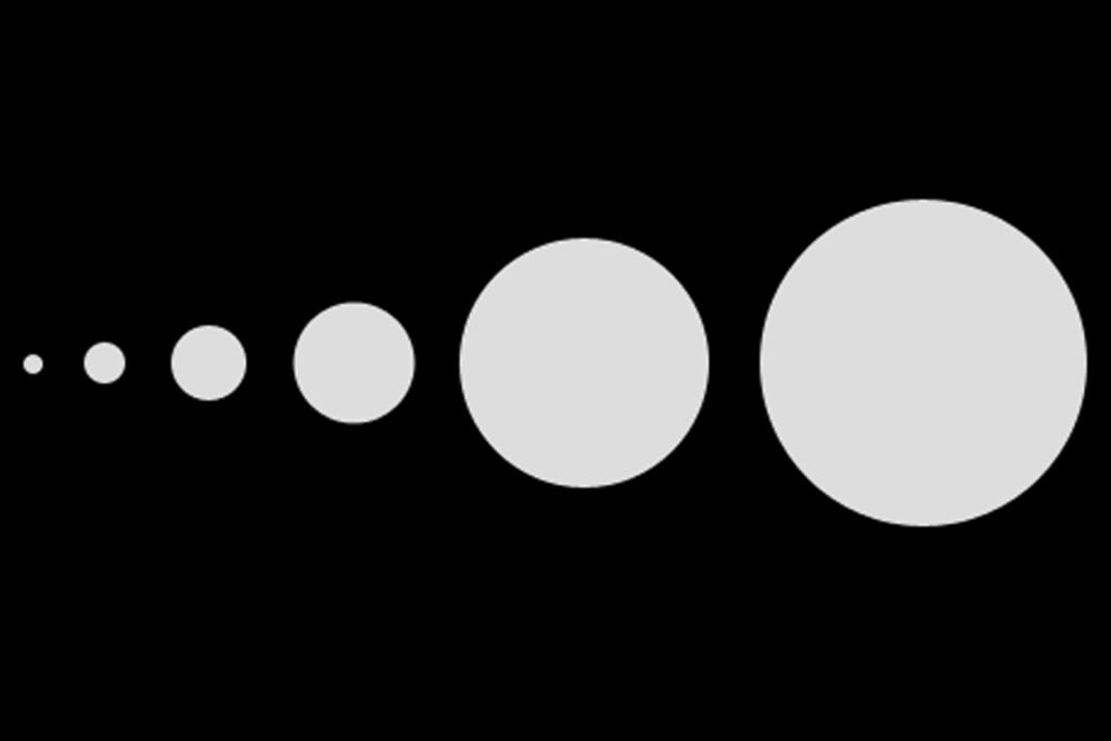
Scale is the size of design elements (e.g., type, images, and spacing) relative to each other and to the whole composition. As we saw earlier in this chapter, typography has rules that govern its use. These rules are universal, but they vary according to typeface style and scale: large display types are often very different from small text faces; serif typefaces are different from sans-serifs; etcetera.
The size of a design element should be appropriate for the content it conveys. The same is true for line length: short lines are used for succinct text (e.g., captions under pictures), whereas long lines provide room for more detailed information (e.g., a paragraph).
The size of your design elements should also be appropriate for your audience’s reading habits—for example, if you want them to read an entire page or article without getting bored, keep line lengths fairly short so that readers can read several lines at once without having to move their eyes around too much between words or sentences.
6. Proximity
Proximity is the closeness of elements. It can create a sense of order or disarray, balance, or imbalance. It creates a visual connection between elements and helps guide the viewer’s eye through your design.
Proximity is a powerful tool to use when designing your layout. It can help guide the viewer’s eye through your content and create a sense of order or disarray, balance or imbalance. For example, you could place related text and images close together so that they appear to be connected—this helps reinforce their relationship with each other.
7. Space
Space is the amount of white space on a design. It can be used to create balance, contrast, hierarchy, rhythm, tension, and unity.
In design terms ‘white space is also known as negative space or open space.
It’s critical for making your designs look professional and clean, too much or too little white space will make it hard for users to focus on what matters most in your design (the message).
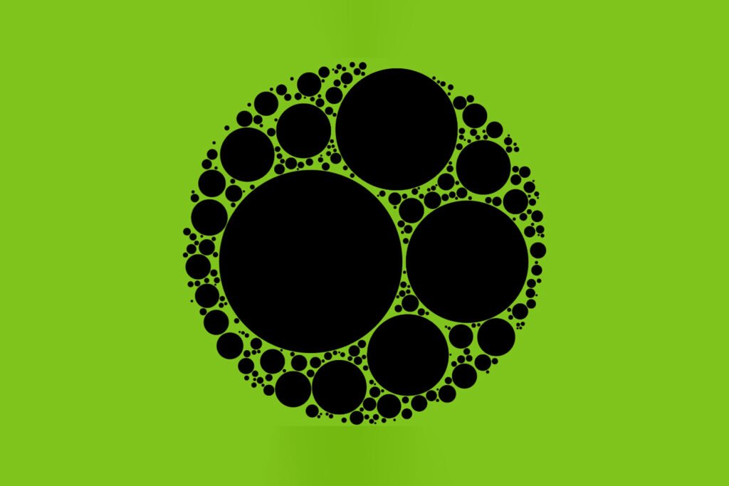
8. Repetition
Repetition is the use of similar elements throughout a design. Repetition can be used to create rhythm and unity, but it can also be used to create emphasis.
When you look at this image, what do you notice first? The repetition of bright yellow circles draws your eye right in.
Repetition can happen on different scales: there could be multiple instances of an element or just one instance. In the example below, there are three instances of one shape repeated throughout the design.
Conclusion
Following these basic design principles will help you create a more cohesive and engaging brand. The key is not to overthink them or try to memorize them all at once, but rather just pick one each week and work on it until you’re comfortable using it in your designs.
Recommended reading: 12 Best Graphic Design Trends that will skyrocket in 2023
FAQs
How do you use the principles of design?
Principles of design are a set of guidelines that help you create designs that are visually appealing and easy to use. They include things like alignment, balance, contrast, proximity, and more.
What are the fundamentals of design?
The fundamentals of design are the key principles that underpin all design, from the smallest and most intimate detail to the largest and most expansive concepts.
What are the core graphic design principles?
The core graphic design principles are:
1. Balance
2. Proportion
3. Repetition
4. Alignment
Your article helped me a lot, thanks for the information. I also like your blog theme, can you tell me how you did it?