Many graphic designers are confused by the use of photography in graphic design. A graphic designer’s job is to create and enhance visual communication.
The use of images in graphic design can drastically increase the effectiveness of your artwork, whether it’s a logo design or some other type of graphic project.
This article will help you understand how to incorporate photography into your work so that it enhances rather than distracts from the message you want to convey.
What is Photography In Graphic Design?
Photography is the art of creating a picture with light. With good photography, you can capture a moment in time that expresses what it felt like to be there.
Photography is one way to visually tell a story or convey an idea. It can also be used as a creative tool to enhance your design projects.
It is also the art, practice, and technique of creating durable images by recording light or other electromagnetic radiation, either electronically by means of an image sensor or chemically by means of film, which is sensitive to light.
Photography is used in many fields of science, engineering, and business for the documentation of the world around us. It is also widely used in advertising and as a tool to capture our memories or document important events.
Checkout our article on 8 Basic Design Principles and how to use them Creatively
Ways to Use Photography in Graphic Design
1. Create unique backgrounds
You can use photography to create a unique background for your design.
A background is a space behind an object in a scene, and it’s important to make that space as interesting as possible.
If you’re working on a design where there are multiple elements or objects, consider using photography as your background instead of just going with solid colors or patterns. This creates a more dynamic and immersive experience for your viewer compared to other options.
You can create unique backgrounds using any number of different types of photography—landscapes, nature scenes, people shots, abstract patterns, and textures—but it’s best to keep them simple so they don’t compete with other elements in the design
A good rule of thumb is to only use one type of photography as your background so it’s not too busy or distracting.
2. Tell a story
One of the best ways to use photography in graphic design is to tell a story.
You can do this by using a single photo that creates a narrative, or you can combine multiple photos that work together to create one cohesive story.
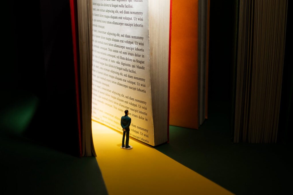
You can also use photography to create moods and feelings in your audience.
For example, if you want to make someone feel happy, you might use an image of children playing in the park or puppies playing with each other; if you want them to feel sad or nostalgic, try using an image from their childhood or an old photograph from their grandparents’ house; and if you want them excited about something new, show them something beautiful or exciting happening now.
Some people think that it’s better to use just one photo, but if you want to tell a story and create a narrative, then it’s perfectly fine to use multiple photos.
In fact, I recommend doing so because it helps your audience understand the context of what they’re seeing or experiencing.
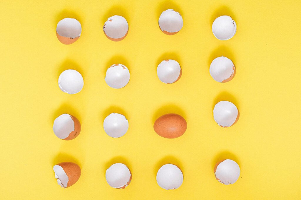
3. Create visual interest
Photography is a great way to create visual interest. Use contrast, color, and shapes to highlight important elements in your design.
A good photo will make you want to look at it, while a bad one will make you want to turn away.
Make sure that the background is neat and clean so that your subject stands out, and if there’s text involved in the image then make sure that it’s legible.
For example, be sure not to use bright colors for text because they can be difficult to read against certain backgrounds.
You can also use negative space, texture, and repetition to draw attention to certain areas of the page.
4. Enhance the composition of your artwork
The art of using photography in graphic design is to enhance the composition of your artwork. Photographic imagery can be used to create a feeling or mood, tell a story or simply provide visual interest.

It’s especially important that the photo is well-composed so that it enhances, rather than detracts from, your design.
When choosing a photo for your project, consider the following: Is there anything in the image that distracts from what you’re trying to convey? Is there enough contrast between dark and light areas? How does it look when reduced to thumbnail size?
A good way to incorporate photography into your designs is by using photographs with many elements such as nature scenes, cityscapes, and people shots.
When you have many elements in an image it creates visual interest – which keeps the viewer’s eye moving around the page and prevents them from skipping ahead quickly like they might do when reading text-only pages.
5. Blurred photographs as background
Blurred photographs can be used to create a sense of depth, movement, and space.
By blurring the background, you can draw attention to your subject matter. You can also use blur as a way of adding light and shadow.

When you use a blurred background, it can be helpful to add a solid color behind the subject matter. This will help create a strong contrast between your subject and the background.
When you are using a blurred background, it is important to make sure that your subject matter is not too small. If your subject matter is small, then the viewer may not be able to see it clearly.
You can also use blur as a way of adding light and shadow. By blurring the background, you can draw attention to your subject matter. You can also use blur as a way of adding light and shadow.
6. Overlay text over an image
Text can be used to add a creative element to your design. By placing text over an image, you can create a unique look and feel for your project.

You should make sure that the font that you choose is easy to read and does not distract from the image itself.
If you are using your image as a background, then it is important to make sure that the text overlays or sits on top of it. You do not want the text to be part of the picture itself.
This can be an easy way to add text to your images. You can use the text tool in GIMP to create your own overlay. If you want to use a font other than what is available on your computer, then you may need to purchase it from a font site online.
7. Create a mood or feeling
One of the most basic ways to use photography in graphic design is to create a mood or feeling. Moods are conveyed by color, lighting, and composition.

You can use these techniques to convey excitement, happiness, sadness, or tension.
For example, if you want the viewer to feel happy and relaxed, then use pastel colors and soft lighting. If you want them to feel excited or scared, then pick bolder colors like reds and dark blues.
You can also create a sense of motion or movement using different kinds of blur effects and motion blur tools in your design software.
The best way to learn how to use these techniques is by experimenting with them.
Try out different color schemes and see which ones make you feel happy, excited, or sad. Then try combining those colors with different types of lighting and blur effects to create your own mood.
8. Contrasts through images
When you use images in your designs, you can create a sense of contrast by placing them on different backgrounds.
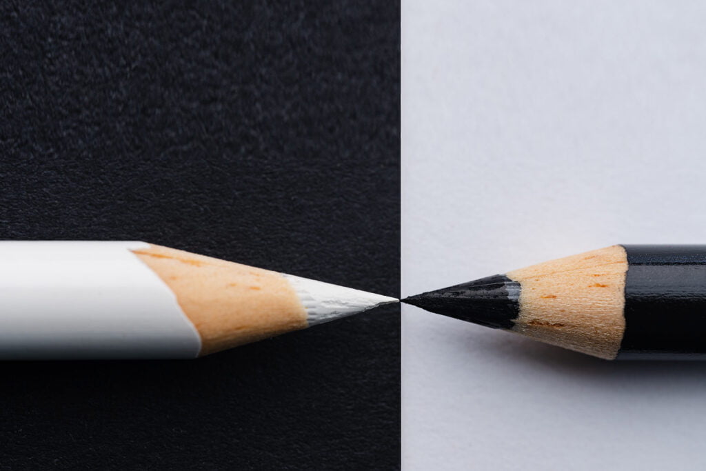
For example, if you have an image of a person on a white background with black text, it will stand out more than if the person was on a black background with white text.
You can also use contrast to create moods in your graphic design. Using variations of color, brightness, and saturation can help you achieve this.
For example, if you want to make something look exciting or happy, then choose bright colors like reds and yellows. If you want it to feel sad or scary, then use darker colors like blues and blacks.
Contrast can be created through many different means. You can use contrast through color, shape, texture, size, and directionality. You can also use lighting or space to create contrast.
9. Complement instead of contrast sometimes
complement is a good way to create contrast. To complement something, you use a color that’s opposite on the color wheel.
For example, if your design has a lot of yellow in it, then try adding some purple or blue to balance it out.

Complementary colors are colored opposites on the color wheel. For example, blue is complementary to orange.
Using complementary colors can provide you with a sense of balance in your design.
However, there is a risk that they will clash if they’re used in large quantities. If you do use them together, make sure to use each color only once per page or section so as not to overwhelm your viewer’s eyes with too much information at once.
Check out the trending article on 12 Best Graphic Design Trends that will skyrocket in 2023
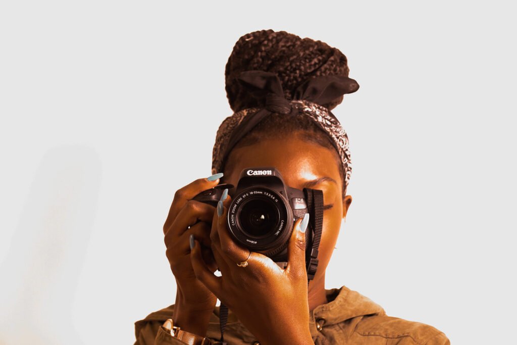
10. Take your own photos
If you can, take your own photos. There are many different types of cameras available today, and not all are created equal in terms of the quality of their output.
This is especially true if you plan on using photography as a graphic design tool and not simply as a means for sharing your images with friends or family.
Though it lacks certain features needed for professional photography, a camera phone can be used to take some great pictures over time.
DSLRs offer much more versatility than point-and-shoot cameras by allowing users to change lenses based on what they’re photographing at any given moment while mirrorless cameras provide high-quality images but lack the versatility offered by other types due mainly because they lack interchangeable lenses which make this type best suited for those wanting something portable with good quality without having too many bells & whistles attached which may make things complicated rather than productive
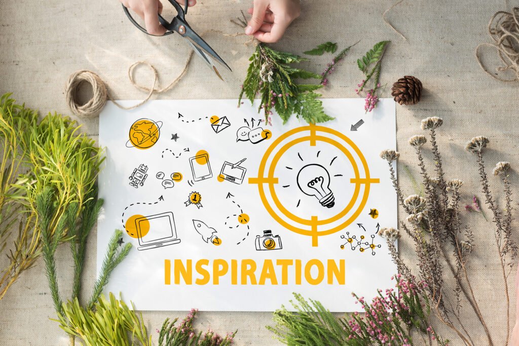
11. Let your creativity run wild!
Personal touches can help make your work stand out, whether it’s for a client or on your own.
Photography in design is a great way to show off your creativity, and it can also help you stand out from the crowd.
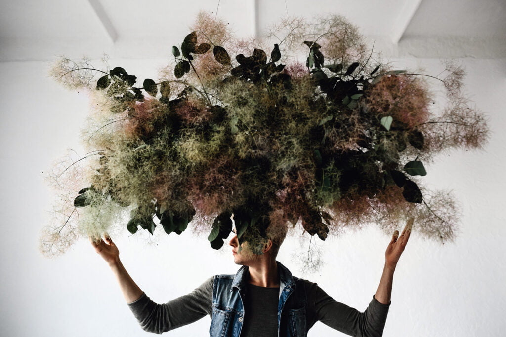
So let’s get creative! You don’t have to limit yourself to stock photos—there are plenty of ways you can use photography in graphic design that forces you out of your comfort zone.
Here are some tips to get you started:
- Use a photo as the background of your website or logo.
- Create a collage of photos and use them as an illustration for your website or blog post.
- Make a slideshow using photos from your phone, computer, or Instagram account.
- Create a composite of multiple photos.
12. Humanize your design
You can break the rules of design and create something beautiful. This is what makes graphic design so much fun!

By adding your own touch. Don’t be afraid to get creative and use photography in graphic design! Remember, you don’t have to use a photo as-is.
You can always edit it or create something new from it. The possibilities are endless when it comes to using photography in graphic design.
Conclusion
Let’s face it: we all love photography, whether we’re using it as a hobby or to create our own art. But sometimes it can be difficult to find a place for your photographs in graphic design projects.
The good news is that you can use photography in graphic design! You just need to know how. This article will provide you with the necessary steps.
You may not have the necessary skills, or you might not know where to begin. But if you follow these tips, you’ll be able to use photography in your graphic design projects with ease!
Recommended reading: 15 Books Graphic Designers Must Read Once in a Life
FAQs
How can photography be used in graphic design?
Photography is a powerful tool in graphic design. It can be used as an illustration or it can be used to create a mood. Photography is also very useful for capturing the essence of an event or place.
How do you combine photography and graphic design?
Combining photography and graphic design is a great way to create a cohesive product that is optimized for both visual and textual content.
You can do this by using a combination of photography and graphic design elements, such as color, texture, typography, and layout.
Should graphic designers learn photography?
Yes, graphic designers should learn photography.
Photography is an essential skill for graphic designers because it helps them to understand how light and shadow work together. It also gives them an understanding of color and composition, which can be applied to their designs.
Hello, thank you for the great blog today 샌즈카지노
20 mg toradol
Your article helped me a lot, is there any more related content? Thanks!