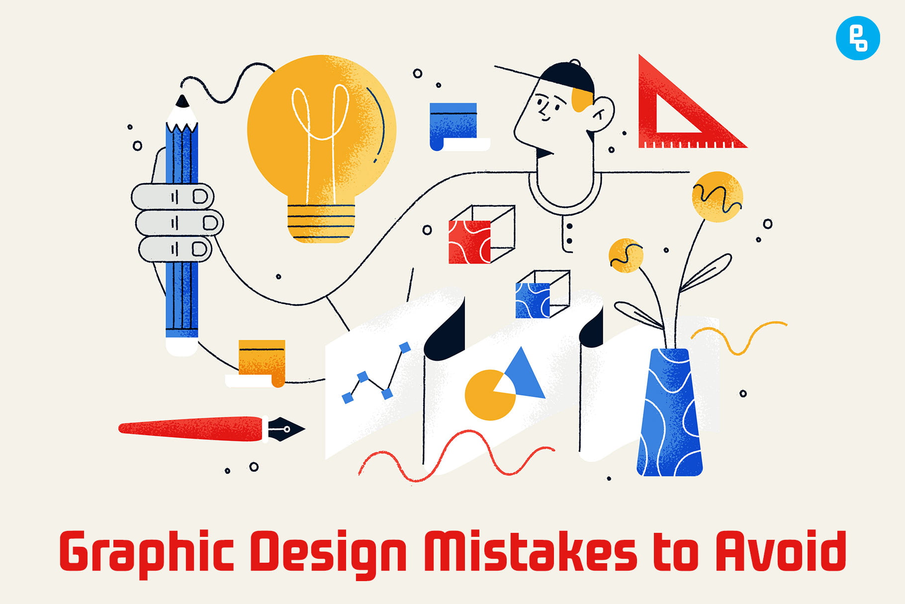
Graphic design is a skill that can take years to master, but that doesn’t mean you shouldn’t start learning as soon as possible. As a graphic designer, there are certain mistakes you’ll want to avoid at all costs.
You don’t have to be an expert in the field, but you should know what not to do when it comes to graphic design.
These mistakes can prevent your design from being effective and provide a poor user experience for your customers. Here are 12 mistakes every graphic designer should avoid:
How do mistakes affect your graphic design work?
Mistakes in graphic design are costly, and embarrassing and make you look unprofessional. These mistakes can also lead to the loss of faith in your client.
Mistakes can cost you your job, but they can also cost the client money and damage their reputation. It is important that you avoid making these mistakes at all costs.
As the designer, it’s your responsibility to ensure that all of your work is done correctly and professionally. It is also your responsibility to teach your clients what they need to know about design.
This way, you can prevent them from making mistakes and help them avoid making costly mistakes down the road.
There are many ways to avoid making mistakes, and one of the best ways is to hire a professional. A professional designer will help you make sure that everything is done correctly from start to finish.
Another way is by educating yourself on what not to do when it comes to design. By reading this article, you’ll learn about some common mistakes that designers make and how you can avoid them.
Mistakes You Must Avoid
1. Not Asking Questions
Asking questions is a vital part of the design process, but you need to ask the right ones at the right time.
The first step in asking questions is determining what kind of information you want from your client. This means understanding their goals and needs before you begin designing anything.
If they don’t know what they want, how can you expect them to communicate this with clarity? It’s also important that they understand all aspects of your role as a designer, especially if there are multiple people involved in making decisions about a project or campaign (like an entire marketing department).
You should spend some time explaining how things work before getting started so everyone knows where everyone else stands on things like deadlines and budgets–and why those deadlines exist in the first place!
2. Looking for too much symmetry
Symmetry is a good thing, but not when it’s overdone. Don’t use symmetry for every design element. For example, if you have an image on the left side of your page and text on the right side of your page, then don’t make both sides look exactly alike.
This can create confusion and make your design look unbalanced or unattractive.
Another problem with using too much symmetry is that it makes your design feel stiff and boring–like something from the 1950s!
Instead of creating a rigid layout where everything looks identical from one side of the page to another (or even within each column), try using some asymmetrical designs instead; this will give readers more interesting things to look at instead of just seeing more copies of themselves all over again… which sounds exhausting when I think about how much time it would take me just getting dressed in my morning routine alone!
You may also like, The Importance of Balance in Graphic Design (Ultimate Guide)
3. Choosing the Wrong Colors
A color is a powerful tool for communicating your message. It can be the difference between a great design and a mediocre one. Color can enhance the text, and images and even create moods and feelings in your audience.
Color also has the ability to highlight important information within your design, which is why it’s so important to choose wisely when selecting colors for your projects!
Choosing the wrong colors can be the difference between a great design and a mediocre one. There are many different types of color, each with its own purpose and meaning.
Choosing the right colors can be a challenge, but it’s an important part of your design.
Keep in mind that colors have different meanings in different cultures so avoid using colors that have negative connotations in other countries and cultures. For example, red is associated with anger or danger in Japan but not so much in the United States!
4. Lack of consistency
Consistency is key to a good design. It’s important that you use the same fonts, colors, and styles throughout your design so it looks like one cohesive piece.
Consistency helps users navigate your design, and it can help you create a recognizable brand.
Consistency extends beyond just the look of your website or marketing materials; it also includes how they function (e.g., making sure links work).
Lack of consistency can be confusing to users and can make your design seem disorganized. So, make sure you’re consistent with your font, color, and design style across all of your materials.
5. Designing for the Wrong Medium
While it’s important to think about the medium when designing, it’s also important to remember that not all designs are created equal. For example, a logo may look great on a website but terrible as a business card or billboard.
In this case, you would want to make sure that your design translates well from one medium to another before moving forward with any work on your project.
It’s also possible for designers who specialize in one medium–such as print–to become so focused on how their designs look at full size and ignore how they will appear smaller than life-size (or vice versa).
To avoid this problem altogether, make sure you test out all versions of your project with different-sized mockups so that all elements can be seen clearly regardless of their intended purpose or destination!
6. Choosing the wrong fonts
Choosing the wrong font can affect readability, design, message, and audience. It can also damage your brand.
When choosing a font, keep in mind that many designers are using free fonts online and downloading them without knowing how they’ll look in their designs.
The problem is that there are so many different types of fonts out there–some good for certain projects but not others–and if you don’t know what makes each one unique or how to use them properly (or even when), then you may end up making some costly mistakes with your design work.
7. Bad visual hierarchy
Visual hierarchy is the arrangement of visual elements in a way that suggests importance. It’s important because it helps users understand the message you are trying to convey.
Visual hierarchy can be achieved using contrast, size, and color.
- Contrast: Using different shades/colors or larger shapes will help create contrast between different elements of your design. This makes them stand out more if they’re placed next to each other which makes them easier for users to identify what’s more important than others (i.e., header vs footer).
- Size: Similar-sized items usually look like they belong together because we perceive them as being part of the same group (this is why companies often use similar fonts throughout their branding). However, if one item is much bigger than its counterparts then this suggests importance since we associate large sizes with being more noticeable than smaller ones
- Color: Similar colors can be used to add a subtle level of contrast. For example, if you have an orange background and want to add some text in white then it would stand out more if that text was placed on a blue background (which is very similar but not identical). This type of contrast makes the important items easier to identify since they’re visually distinguishable from other elements.
8. Copying Others’ Work
There’s nothing wrong with looking at the work of others and taking inspiration from it. However, if you’re just copying someone else’s work then this can be seen as lazy and unoriginal.
For example, if you’re creating a website for a new business then using a similar design to one of your competitor’s websites isn’t going to help you stand out from them.
If you’re going to copy someone else’s work, then try to do it in an original way. For example, if you’re copying the typography from another site then change it slightly by changing the font size or color.
This will make it easier for people to see that you’ve taken inspiration from other designers but have put your own spin on their ideas.
Don’t forget to check out our latest post on Important Theories and Concepts of Graphic Design
9. Failing to scale
In graphic design, scale is a very important consideration. It’s possible to create layouts that look good at one size but are ruined when they’re scaled up or down.
Designers need to take this into account when creating their artwork so that it will remain legible and attractive no matter how large or small it appears on the screen.
Scale is a huge part of the design, especially when designing for the web. If your website looks good on one screen size then it should also look good on all others.
If you only test your website on a small screen then how do you know that it will work well on larger ones?
If you’re designing a website for a small business or startup then it’s unlikely that you’ll need to worry about how your designs will look when they’re viewed on devices of different sizes.
However, if you’re designing for larger companies then this is something that needs to be taken into account.
10. Lack of readability
A lack of readability can be caused by a number of things: too many colors, fonts, and images; too much text; or just plain clutter. Poor design choices are also to blame for making your design hard to read.
If you want your audience to take in the message you’re trying to convey, then it’s essential that they can actually read what’s written on your page or poster.
This might seem like an obvious point but if you’re using multiple colors and fonts together (or even just one), then this could make it difficult for people with poor vision or color blindness who may struggle with distinguishing between certain shades of blue from green from red etcetera.”
The same goes for images. If you’re including a lot of photos, then make sure that they aren’t too small or blurry to read. If they are, then consider just using text instead and keeping your designs simple.”
11. Not using stock images correctly
Stock images are a great time saver. They can save you hours of work and make your designs look more polished. But they should be used in moderation, not as an alternative to doing the work yourself.
Stock images should be used to complement the design, not replace it. Your designs will look more original if you put some effort into them–stock images don’t make you any less creative!
Stock photos are also useful when illustrating concepts rather than just illustrating what we already know; for example: “A car is like an egg.”
It’s not about the quality of the image, it’s about how you use them. Stock images are a great way to save time and get ideas, but they should never be used as an alternative to doing the work yourself.
The quality of your design will suffer if you rely too heavily on stock photos.
12. Avoiding contrast
When you’re designing a graphic, the contrast between different colors is important. It can create visual interest and make your design pop out to viewers.
However, it’s easy to overdo it. Too much contrast can make your design look unprofessional and amateurish. It’s better to use subtle contrast when adding highlights or shadows to your design.
Contrast is the difference between two colors. It can be created by pairing two similar colors together (like black and white), or it can be achieved through complementary colors like red and green or blue and orange.
The best way to use contrast in your own work is by experimenting with different combinations until you find one that works for your project!
Conclusion
There are many other mistakes you can make as a graphic designer. If you want to avoid these, it’s important that you pay attention to every detail of your work and keep an eye out for any potential issues. The best way to do this is by asking questions before starting on any project so that everything goes smoothly from start to finish!
Recommended reading: Role of Computers in the Evolution of Graphic Design
FAQs
What are the most common mistakes in graphic design?
The most common mistakes in graphic design are:
1. Not enough contrast between the text and the background.
2. Fonts that look like they were designed by a child.
3. Lack of readability
4. Failing to scale
What problems do graphic designers face?
Graphic designers face a lot of problems, but one of the most important is creating something that is creative and unique. They need to be able to think outside the box and create designs that are not only beautiful but also make sense for the client or company they are working for.
What are the 5 cons of being a graphic designer?
Here are the top 5 cons of being a graphic designer.
1. Graphic designers have to work long hours, sometimes for free.
2. The hours are often irregular and inconsistent, so it can be hard to plan your life around this job.
3. Graphic designers are constantly dealing with people who don’t understand their profession and may even be rude or condescending about it.
4. Graphic designers have to work with clients who don’t always understand their needs or the importance of good design, and they need to keep a professional attitude while doing so!
5. Graphic designers often need to deal with clients who are demanding and ungrateful for their work, which can be frustrating and stressful!
What is the most challenging part of graphic design?
The most challenging part of graphic design is the ability to use your creativity and imagination in a way that connects with people. You have to be able to see what they see, understand what they need, and then create something that will make them feel like they’re not just looking at an advertisement, but rather experiencing something new.
How to avoid common mistakes as a graphic designer?
The most common mistake graphic designers make is using stock images.
Graphic designers should be aware of the fact that using stock images is not only a copyright violation, but it’s also a sign of laziness.
You can avoid this mistake by doing your own research and coming up with your own ideas for your designs.
3 thoughts on “12 Mistakes All Graphic Designers Must Avoid (Expert Advice)”