
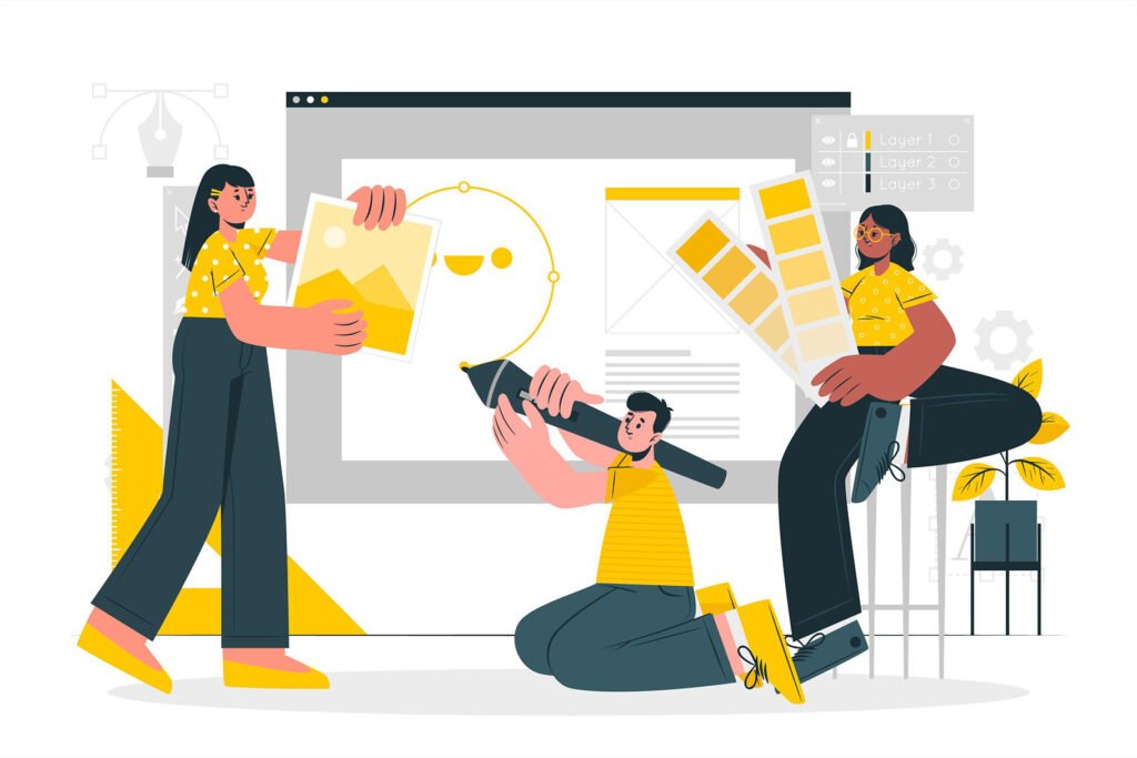
Graphic design is a field that encompasses the creation of visual elements like logos and images. Graphic designers use balance in their designs because it can have a huge impact on how people respond to them.
Balance makes it easier for people to read and interpret your message, which means more conversions for your business.
In this article, we’ll go over what balance is, why it matters in graphic design, and how you can achieve it through color, shapes, patterns, and other elements of visual design.
What is balance in graphic design?
In graphic design, balance is the visual equilibrium of two or more elements. It is achieved by the visual weight of elements. The visual weight of an element is determined by its size and shape, as well as its color.
The more visual weight an element has, the more it affects the overall balance.
For example, A large chunk of text in one corner of your layout will have a greater impact than small chunks scattered throughout your design (because they are less noticeable).
A blue square on top of an orange box will feel heavier than an orange square on top of a blue box (even though both squares may be exactly the same size).
When there are multiple pieces competing for attention within a piece of work–for example, several photos vying for space along with text blocks–you’ll want to pay close attention to how each item stacks up against others in terms of size and shape; then adjust accordingly so that everything feels balanced overall
Why does balance matter to graphic design?
Balance is a key factor in the design process. It helps to improve the overall look of a design, create a sense of unity, and establish harmony between elements.
Balance can also be used to create visual interest and appeal by creating contrast between different elements in your composition.
Achieving a balance among the components of a design is vital to its success. It helps to create unity within a composition and can be used to highlight certain elements while de-emphasizing others.
Balance can be achieved by positioning similar or complementary elements on either side of an axis, creating harmony between them.
Check out our latest post 12 Excellent Online Graphic Design Courses (2023)
What are the principles of balance in design?
When we talk about balance in design, we usually mean visual weight. A balanced design has elements that are weighted equally so that the overall composition appears stable and pleasing to the eye.
There are five principles of balance in design, each with its own set of rules and guidelines. Balance can be achieved by positioning similar or complementary elements on either side of an axis, creating harmony between them.
Objects: When designing, it’s important to decide what elements you want to include. For example, if you have an image on one side of your page and text on the other side, these are two separate objects. You can balance them by placing a related graphic element in between them (such as a button or an icon).
Colors (value, hue, saturation, transparency): Color can be balanced by pairing complementary colors, or hues that are opposite each other on the color wheel. For example, blue and orange are complementary colors because they’re opposite each other in the spectrum; however, they can also be used together to create a sense of balance within your design. You can also balance out your design by using similar colors (hues that are next to each other on the color wheel).
Textures (smooth versus rough): You can use a variety of textures to create balance in your design. For example, you can pair a smooth surface with a rough one (such as pairing glass with brick). You could also use different grades of materials (such as polished concrete and brushed metal), or vary the amount of detail on each surface (like using fine details on one side and bold, solid shapes on another).
Space: You can create a sense of balance by using similar amounts of space. For example, if you have two objects that need to be spaced apart from each other, make sure to leave the same amount of space between them as you would if they were side-by-side. You can also use the same type of space (open or closed) on both sides of your design (such as using open gaps between elements).
Still versus moving: You can use stillness or motion to create a sense of balance. For example, you can use the same amount of movement on both sides of your design, such as using fine details that move quickly across each surface (like a video screen showing scrolling text).
The 5 elements of balance in the design
The five types of elements are explained in the following sections. Each type has a different way of contributing to balance.
- Symmetrical balance
- Asymmetrical balance
- Radial balance
- Mosaic balance
- Discordant balance
1. Symmetrical balance

Symmetrical balance is the most commonly used type of balance in graphic design. It refers to an image that’s divided into two equal halves, with both sides having the same weight and scale.
Symmetrical balance can be achieved through various types of formal (or static) balance and active/passive dynamic equilibrium.
For example, if you have an image with text on one side of it and no text on the other side, this would be considered symmetrical because they’re evenly weighted across both sides of your design (it’s not just a single-sided composition).
2. Asymmetrical Balance

Asymmetrical balance is when the elements are not in a straight line. This can be achieved by using elements of contrast, like color and shape, or by creating a pattern with multiple shapes.
An example of asymmetrical balance would be placing one larger object next to two smaller objects (such as an apple next to two oranges).
Another way you could achieve this is through repetition: if you have three identical objects on one side of your design and then one different object on the other side, it will create an imbalance in your composition that makes it feel balanced overall!
3. Radial Balance
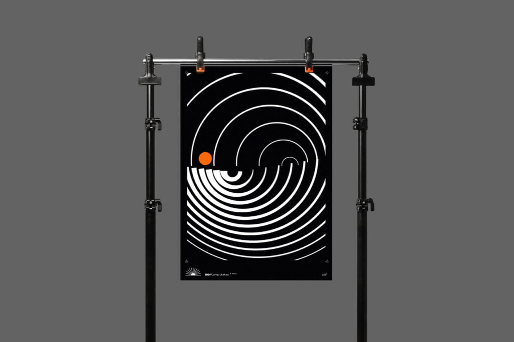
Radial balance is a type of visual balance that uses radiating lines to create a sense of harmony and unity. It’s often used in logo design, but you can also find it in posters, prints, advertisements, and other graphic design projects.
The basic idea behind radial balance is that you draw an imaginary circle around the center of your design (usually where something important will be placed).
Lines are then drawn from this central point outward toward various sections of your design–these lines should be spaced evenly along the circumference of your imaginary circle so they don’t overlap or crowd each other out too much when viewed from afar.
You may also like 10 Excellent Free and Paid Online Tools for Graphic Designers
4. Mosaic Balance
Mosaic balance is achieved through the repetition of a single element or pattern. This can be seen in the image above, where we have repeated the same circle shape throughout our design:
As you can see, this creates a sense of unity within our composition without being too repetitive or boring to look at. The eye will naturally follow these repeating shapes and create interest in your design by doing so!
5. Discordant
Discordant elements are those that do not belong to a particular design. They can be used to create a sense of drama and tension, but they are not used in every design.
Discordant elements are usually found in the periphery of a piece, rather than at its center.
Discordants have been used throughout history to create interesting designs that draw attention away from what might otherwise seem ordinary or even bland.
however, it’s important not to overuse them because then they will lose their impact on viewers’ eyes and brains–and thus become less effective at creating an emotional response from viewers!
Ways to achieve balance in design
Here are the five ways to achieve balance in design:
- Color
- Shapes
- Pattern
- Texture
- Contrast
1. Color
A color is a powerful tool for creating balance in design. When used properly, color can help to create visual interest, hierarchy, and composition. It can also be used to create contrast, harmony, and unity.
The main goal of any graphic designer is to create an appealing piece that engages the viewer on both an emotional level as well as a rational one.
Color plays an important role in achieving this goal because it influences how people respond emotionally when viewing an image or object–whether they feel happy or sad; calm or excited; energized or relaxed.
The right combination of colors will help you create balance within your work while maintaining its overall aesthetic appeal!
2. Shapes
Shapes are the building blocks of graphic design. They can be used to create balance in a design, and there are many different shapes that can be used in a design.
Shapes can be used in many different ways to create balance within your design. Shapes can also be used to create a pattern or texture.
For example, you can use a large shape on one side of your design and add smaller shapes on the other side to balance it out. You can also use different sizes of the same shape to create visual interest.
3. Pattern

Patterns are repeating designs. They can be used to create balance, harmony, and contrast in your designs.
Patterns can be used to create visual interest and balance, but they also have the ability to make your design look dated. If you choose to use a pattern, make sure that it’s not too large or small in scale.
Patterns should be used in moderation. If you want, you can use a pattern to create a focal point, but make sure that it’s not the only thing that stands out in your design.
Also read, Why is Sketching Important in Graphic Design? (Ultimate Guide)
4. Texture
The texture is the use of different materials to create visual interest. Texture can be used to create depth, dimension, and a sense of realism.
It’s also useful for creating a sense of movement or motion, as well as scale (for example, when you want something to look small).
Textures can also be used to create a focal point. For example, you could have a design that’s very plain, but add in some textures (like wood grain or marble) to help draw attention to the focal point.
Textures are very important to be aware of when you’re designing a logo. The right use of texture can make your design look more interesting, while the wrong one can make it look cheap or unprofessional.
5. Contrast
You can use contrast to make an element stand out, create depth, or even add balance to your design. Contrast is the difference between two things and it’s important because it creates visual interest.
For example, if you have a large block of text on a white background with no additional elements then the reader will find it difficult to focus on what you’re trying to communicate to them because there isn’t anything else competing for their attention.
On the other hand, if we add some images into this scenario then suddenly there are multiple elements vying for our attention so now we need some way of making sure that readers pay attention only where needed (i.e., at important points).
The easiest way of doing this is by using contrasting colors which brings us back full circle: when designing anything from websites to billboards through brochures – always remember that less really is more!
Conclusion
In conclusion, we can say that balance is a very important element in graphic design. It can make or break your design, so make sure that you keep it in mind when creating anything from logos to posters. The best way to achieve balance is by using the rule of thirds, but there are other ways as well. Just remember that if you want your design to look professional and clean, then you need to make sure that it’s balanced.
Recommended reading: Important Theories and Concepts of Graphic Design
FAQs
What is balancing in graphic design?
Balancing is the process of making sure that an object or image is evenly distributed in all parts of a page.
This can include balancing the visual weight of an image, type, or another design element with its surrounding elements.
What is the importance of visual balance?
Visual balance is the alignment of elements on a page to create a harmonious, aesthetically pleasing composition. It can be used to help guide the reader’s eye through the content, or to highlight certain elements.
What are the types of balance in graphic design?
Graphic design has many types of balance. The most common are symmetrical and asymmetrical balance. Symmetrical balance is when objects are balanced on both sides of a center point, while the asymmetrical balance is when objects are not evenly distributed around a center point.
How do you apply the balance in design?
Balance is the act of using symmetry and proportion to create a sense of stability in a design. A balanced design can be aesthetically pleasing and easy to understand, which is why it’s often used in logos, websites, and other graphic designs.