The color of your logo is one of the most important elements in its design. It not only affects how people feel about your brand but also how they perceive it.
This is why it’s so important to choose the right color combinations for your logo. The right mix can make your brand memorable, attractive, and professional.
On the other hand, choosing the wrong combination could result in customers associating your company with something unpleasant or unprofessional.
In fact, a company’s logo colors are usually the first thing that pops into their minds when they see it—before anything else.
A great example is Coca-Cola’s red and white color scheme; it might be one of the most recognized logos on earth (and for good reason). So what about other brands? Do you know which colors are associated with them?
Let’s find out! Here is a list of the top 12 famous brands and their logo color combinations.
What is Color Psychology?
Color is not just about what it looks like, but also about how it makes us feel.
Color psychology is the study of how colors affect our emotions, behavior, and physical well-being. It’s a powerful tool for influencing the human psyche.
We are biologically wired to respond to color; many studies have shown that certain hues can make us feel better or worse depending on the situation at hand or even our mood at any given moment (e.g., reds may increase energy levels).
Colors can communicate messages through various symbols such as flags and logos–the meanings behind these symbols vary across cultures–and they can influence our moods and perceptions of time and space (e.g., blues make us feel calm while greens give off an earthy vibe).
How does Color Psychology Affect Logo Design?
Color psychology is a powerful tool. It can affect your mood, emotions, and behavior. The colors you choose can change the way people think and feel about your brand.
For example, red is known for being a power color because it stimulates our minds and bodies; it makes us feel energized and alert. On the other hand, blue creates feelings of calmness–it’s often used in hospitals because it makes people feel safe (even if they’re not!).
You can use color psychology to create a sense of warmth or coolness by choosing warm or cool colors; you can also use certain hues to create balance or instability within your logo design by using complementary colors together.
Brands and Their Logo Color Combinations
1. Harley Davidson – Orange and black
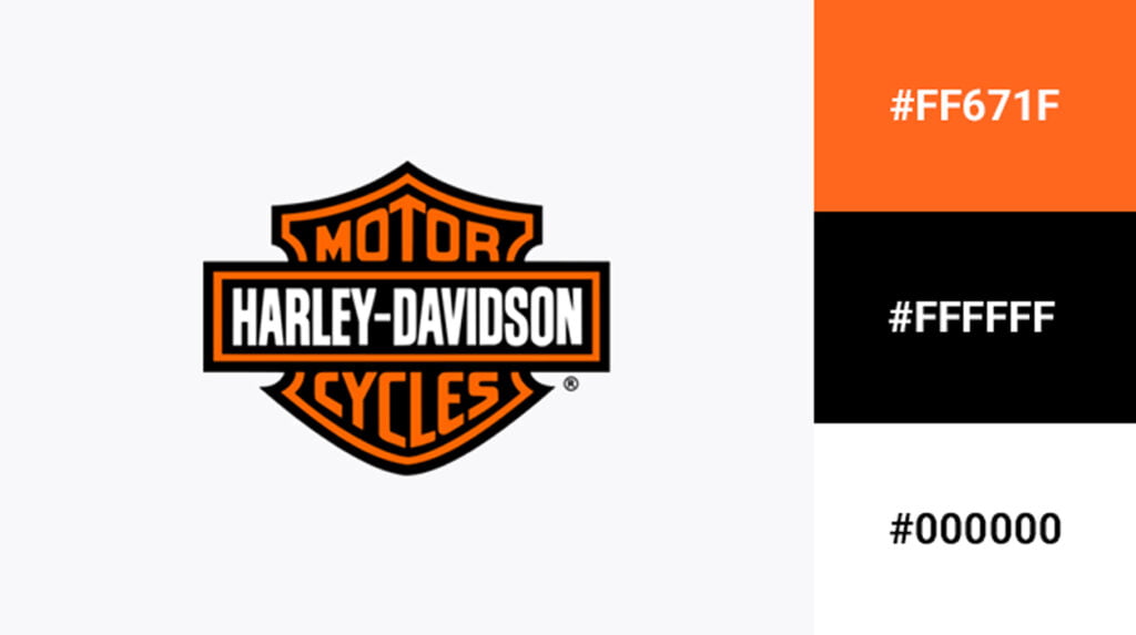
Harley Davidson is a motorcycle company that was founded in 1903. Harley Davidson is an American brand, headquartered in Milwaukee, Wisconsin.
The logo color combination of orange and black has been used by the company since its inception. The orange part of their logo represents fire while the black part represents power and strength.
The logo is very simple and can be easily recognized by people. The combination of the two colors looks so good that it’s hard not to notice it.
2. Coca-Cola – Red and white
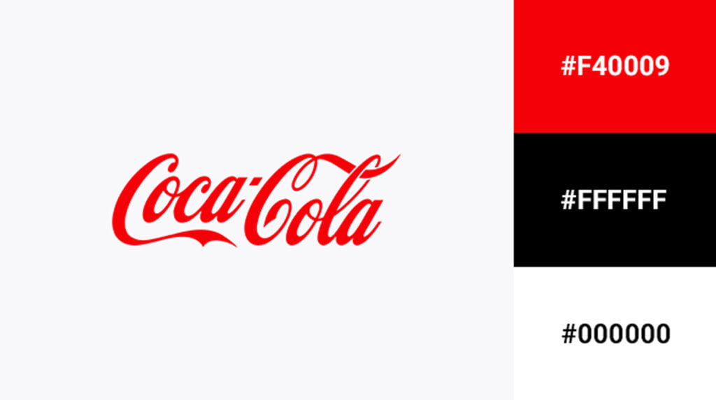
The Coca-Cola brand is one of the most recognized in the world. Its logo is a perfect example of how color can affect brand recognition, as it’s instantly recognizable even when stripped down to just its basic red and white elements.
The red used in Coca-Cola’s logo is a powerful color that represents love, passion, and energy–all attributes associated with this popular soda drink.
It also evokes feelings of warmth and comfort while creating an association between Coca-Cola products and good times with friends or family members (who often drink it together).
3. Burger King – Red, yellow, and blue
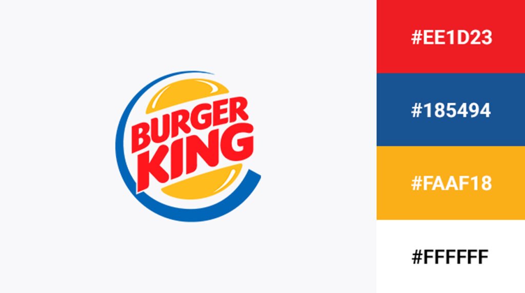
Burger King is a fast-food restaurant chain that was founded in 1954. Its slogan, “Have it your way”, embodies the brand’s philosophy of providing customers with their own customized experience.
The company has since grown to become one of America’s largest burger chains with over 15,000 locations worldwide.
For its logo, Burger King chose the colors red, yellow, and blue because these colors are associated with royalty (red) happiness (yellow), and energy/vitality (blue).
The brand’s logo is a circle that features a crown and three horizontal lines (two red, one yellow). The company uses this design to reinforce the idea that Burger King provides customers with their own customized experiences.
Checkout our most visited post about Top 10 Iconic Logo Designers and their Work (Expert Curation)
4. Baskin Robbins – Blue and pink
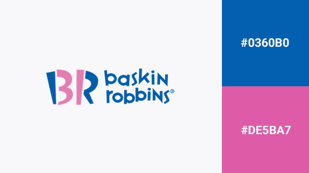
The Baskin Robbins logo is a combination of two complementary colors: blue and pink. Blue is a masculine color, while pink is considered to be feminine.
The combination of these two colors makes sense for a brand that appeals to both genders (and even more so if you consider that their products are also available in vanilla).
This type of branding strategy has been used by successful companies like Victoria’s Secret, which uses hot pink as its primary brand color; McDonald’s, whose logo features bright yellow arches; and Coca-Cola with its classic red script font over white background.
5. FedEx – Purple and orange
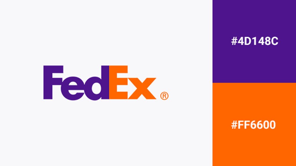
Founded in 1971, FedEx is a global delivery services company that provides fast and reliable delivery of packages.
With a fleet of over 500 aircraft, FedEx can deliver packages to more than 220 countries and territories around the world. The company’s logo has always been purple and orange since its inception.
Purple is a color that is associated with royalty, luxury, ambition, and power. Orange, on the other hand, represents energy, creativity, and enthusiasm.
So, when these two colors are combined together they create an image of power mixed with creativity which is what you want your brand to convey when customers see your company logo or advertisement!
6. Ikea – Blue and yellow
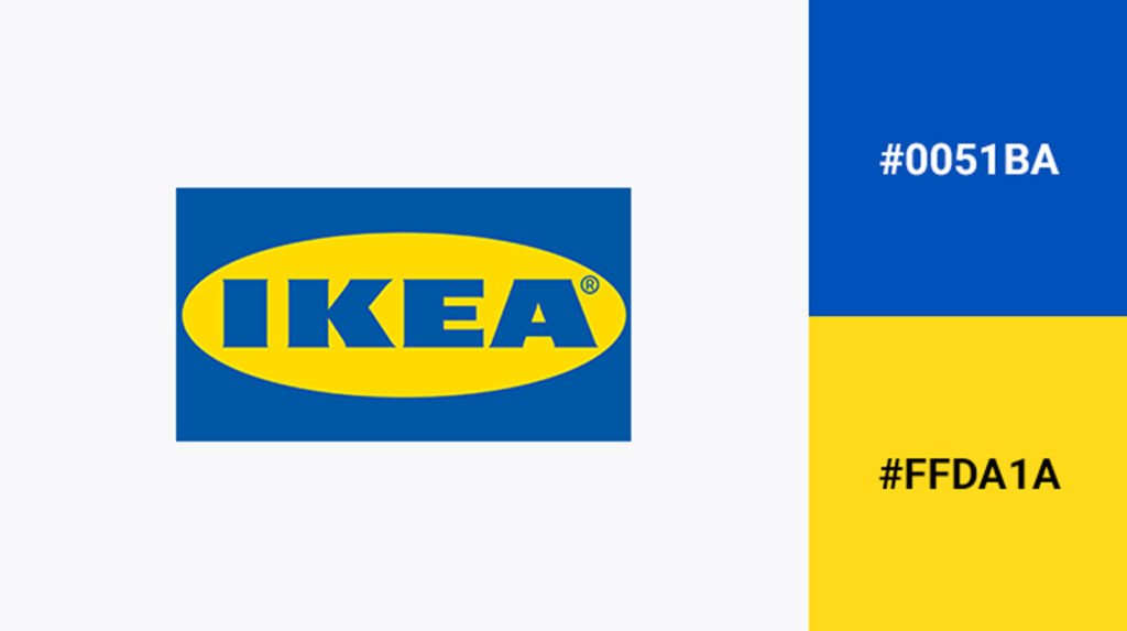
The blue and yellow colors of the Ikea logo are a classic color combination. They’re also the colors of the Swedish flag, which makes sense considering that Ikea was founded by Ingvar Kamprad, born in Sweden.
The blue and yellow colors have been used consistently since day one–you can see them in their first catalog from 1958 (pictured below).
The colors are very bright and eye-catching, which is great for a brand that sells products that need to be noticed. Plus, the colors create a sense of simplicity and cleanliness which is also appealing to customers.
7. PayPal – Light and dark blue
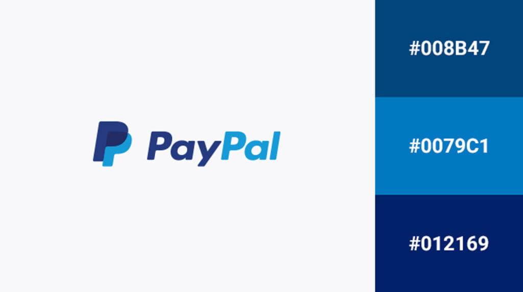
PayPal is a global e-commerce business that allows people to make payments and money transfers through the Internet. The company was founded in 1998 by Peter Thiel, Max Levchin, and Luke Nosek.
In 2002, it became a wholly owned subsidiary of eBay but was spun off as an independent company three years later as part of a merger with its parent company’s online payment system called X.com (which had been founded by Elon Musk).
Today, PayPal serves 197 markets around the world with more than 100 million consumers having checked their accounts at least once in 2017 alone!
The color combination of the PayPal logo is Light and dark blue. The symbol of PayPal is an arrow pointing down, with a circle around it. The company’s name is written in small letters above the arrow pointing down.
These colors represent the company’s focus on the future and innovation. The arrow is pointing towards an open box, which represents that PayPal makes it easy for customers to send and receive money through its services (the “open box” could also represent the company being open to new ideas).
8. Starbucks – Green and white
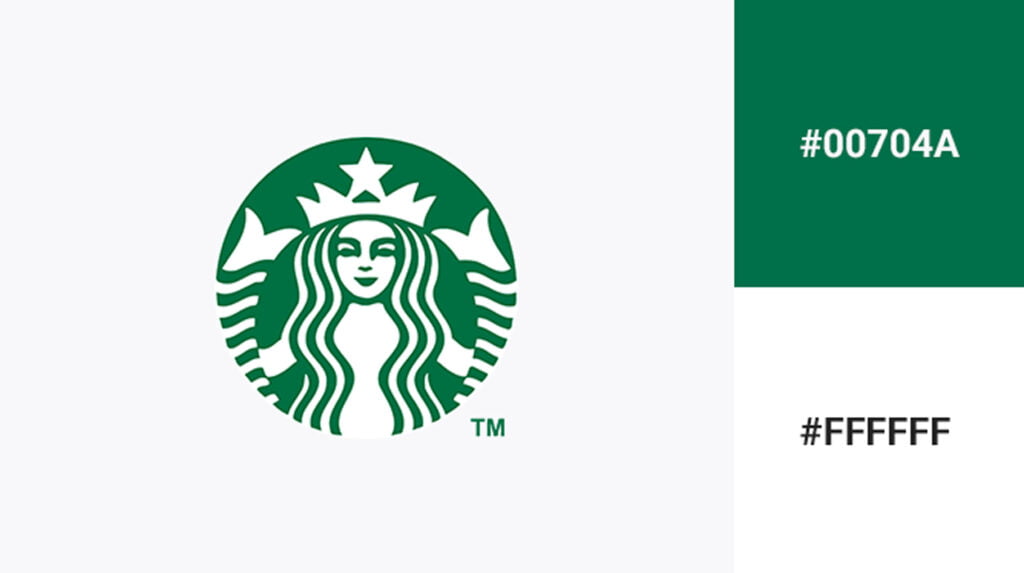
Starbucks has been around since 1971, but the logo has only been around since 1987. The green in Starbucks’ logo is associated with nature, health, and growth while white represents purity, cleanliness, and safety.
The Starbucks logo is a simple, yet effective way of representing what the company does. The green and white color schemes are also very easy on the eyes (which makes it easier for customers to read).
These two colors together create a sense of harmony and balance–a powerful combination that’s reflected in their brand name as well. Green is also the most popular color in the world!
9. Amazon – Black and orange
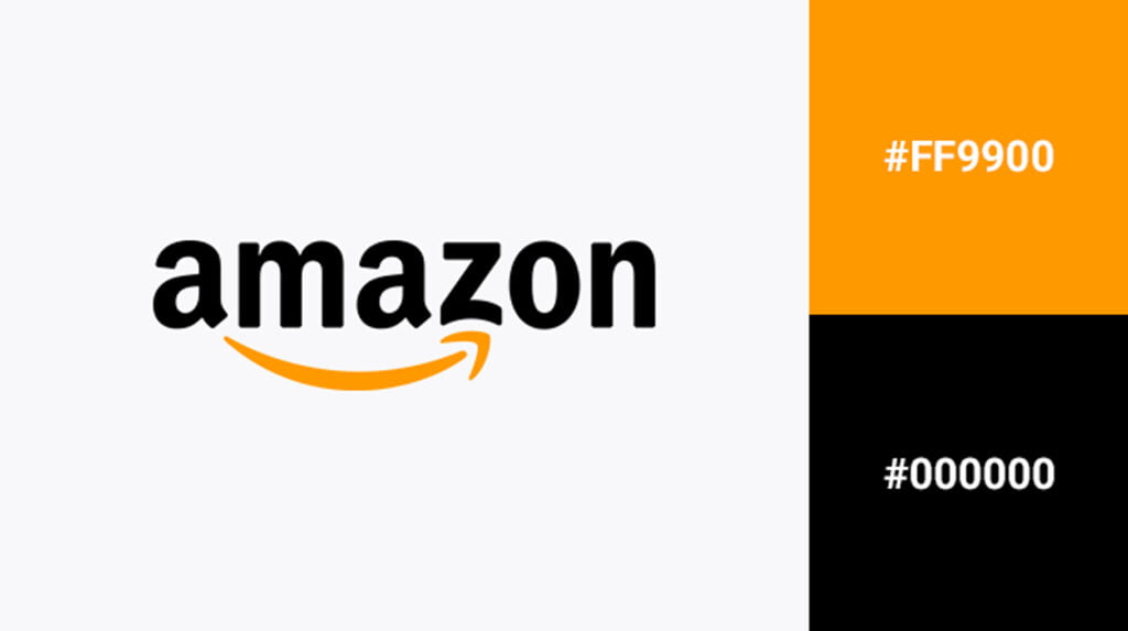
Amazon’s logo is black and orange. The brand is known for its customer-centricity, and the logo was designed by a graphic designer named Paul Rand.
The Amazon logo is a letter A with the arrow pointing right, which represents speed and forward thinking.
The color combination of the amazon logo is black and orange which is a combination of two warm colors. Warm colors are associated with passion, enthusiasm, and energy.
The logo uses a simple yet effective design that is easily recognizable by customers.
Don’t forget to read Top 12 Best Books for Logo Designers in 2023
10. Mastercard – Orange, red, and black
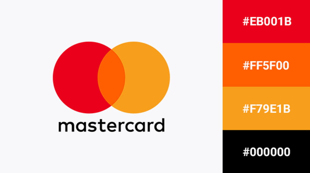
Mastercard is a brand that provides financial services and products. The Mastercard logo is a combination of orange, red, and black.
The company’s logo has three circles that represent the global reach of Mastercard. The circles have a gradient effect and each circle has different shades of orange, red, and black. The logo also uses the font Century Gothic which is commonly used by many brands.
The orange represents creativity and imagination while the red represents passion and energy. The black represents power and strength.
11. Nikon – Black and yellow
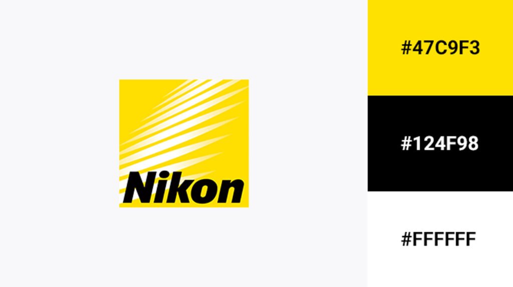
The Nikon logo is black, yellow, and white. The logo uses a combination of two colors that are opposites on the color wheel to create an effect that looks like a camera lens.
The black and yellow colors were chosen because they convey reliability and precision, which are qualities associated with professional photography equipment.
The logo also uses the font Helvetica which is commonly used by many brands. The black represents power and strength while the yellow represents optimism and energy.
12. BMW – Blue, black, and white
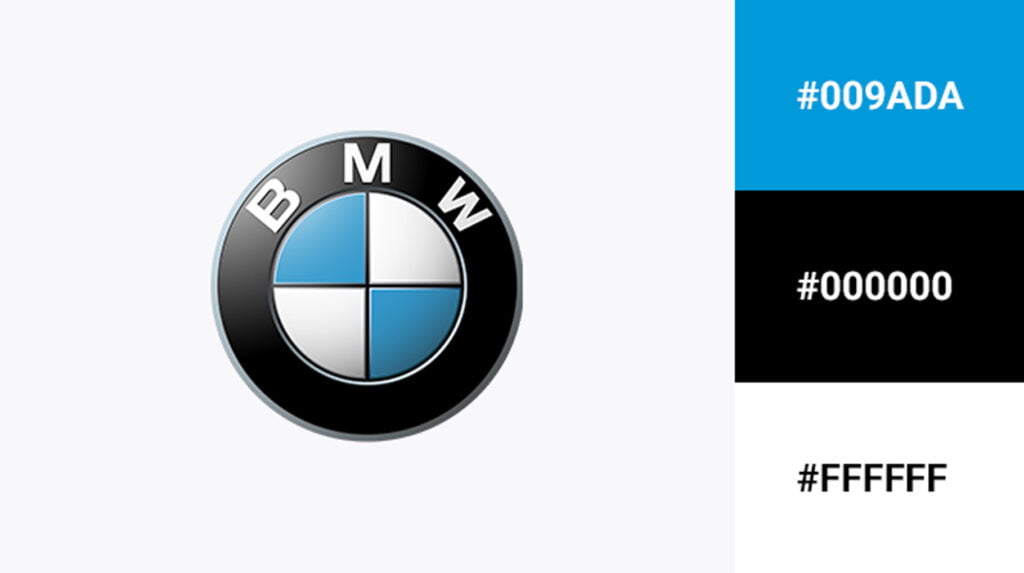
BMW is a German luxury automaker that has been producing vehicles since 1916.
The company’s logo is a circle with a blue background and white lettering, which can be seen on the front of its cars as well as on its website.
The color combination of blue, black, and white in the BMW logo is very effective because it makes the brand stand out and look more modern than its competitors.
BMW also uses the color black in its logo, which is commonly associated with power, luxury, and strength.
Conclusion
Color is an essential element of branding, and choosing the right colors can have a significant impact on your company’s image. If you’re thinking about changing your logo or creating a new one, consider what message you want to convey with it, and then choose some colors that will help you achieve that goal.
This article is a great example of how colors can affect your brand. It’s also important to note that not all brands use the same color combinations, so it’s important to do some research before choosing colors for your logo or company name.
Recommended Reading: 15 Clean Logo Design Templates for a Professional Look
FAQs
Which color combination is best for the logo?
The best color combination for a logo is one that blends together well and complements the product or service it represents. If you’re trying to convey a message, it’s often best to choose colors that will reinforce your message without distracting it.
What makes a logo more attractive?
The color of a logo is one of the most important factors in its attractiveness.
If you want your logo to be attractive, you need to choose colors that are easily recognizable and appealing.
What color catches the eye first?
The color that stands out and is most noticeable to the human eye is red. The reason for this is that red stimulates the retina more than any other color. In addition, red is a warm color and therefore catches attention faster than cool colors like blue or green.
How does color psychology affect logo design?
Color psychology is a branch of psychology that studies the effect of colors on human behavior and emotion. It’s important to understand the role of color in logo design because it can be used to create a strong connection between your brand and its audience.
3 thoughts on “Top 12 Famous Brands and Their Logo Color Combinations”