The shape of a logo is one of the most important elements, as it can make or break how your brand is perceived. A successful logo design should be versatile enough to fit all kinds of media, from print to web and beyond.
In the constantly shifting world of branding, a logo’s power extends beyond mere aesthetics. It acts as a silent ambassador for the brand that conveys its essence to audiences.
Enter the exciting world of “The Psychology of Shapes in Logo Design,” a field that explores how different shapes can influence consumers.
This ultimate guide embarks on a journey to decode the intricate relationship between shapes and human psychology, unraveling the symbolic language that shapes employ in the realm of logos. From the stability of squares to the dynamism of triangles, we explore how designers strategically wield shapes to evoke specific emotions and convey nuanced messages.
In this article, we’ll explore the ever-expanding field of logo aesthetics—from the perspective of both designers and psychologists.
The Psychology of Shapes
1. Understanding Basic Shapes
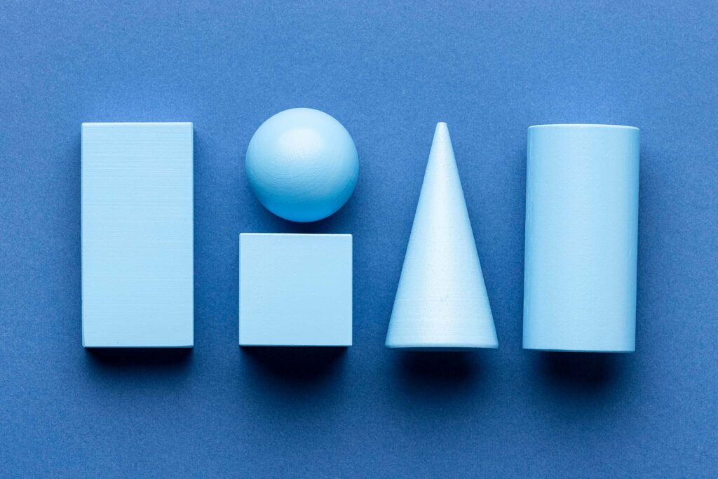
In logo design, the strategic use of basic shapes plays a pivotal role in conveying nuanced messages to the audience. The circle, as a fundamental geometric form, embodies unity, continuity, and perfection.
Its endless, rounded nature fosters a sense of completeness, making it a popular choice for brands aiming to establish trust and inclusivity. Prominent examples include global corporations like Target and BMW, whose circular logos resonate with consumers on a subconscious level, fostering positive associations.
Contrastingly, the square and rectangle represent stability, balance, and order. These shapes communicate a sense of reliability and structure, making them suitable for brands seeking to project a steadfast and organized image.
Companies like Microsoft and Google have effectively harnessed the stability inherent in these shapes, reinforcing their commitment to reliability and systematic innovation.
Understanding the psychological implications of basic shapes allows designers to craft logos that resonate with specific emotions and perceptions.
By leveraging the inherent symbolism of circles, squares, and rectangles, brands can strategically communicate their core values and establish a lasting connection with their target audience. The mastery of these fundamental shapes serves as a cornerstone for successful logo design, offering a timeless foundation for brand identity in the ever-evolving visual landscape.
2. Triangles and Their Impact

Triangles hold a profound psychological impact on logo design, embodying a dynamic and symbolic significance that resonates with consumers on a subconscious level.
As a shape associated with stability, progression, and energy, triangles evoke a sense of purpose and direction. Psychologically, they symbolize both balance and tension, making them a compelling choice for brands seeking to convey a harmonious yet forward-thinking image.
The sharp angles of triangles often suggest a sense of urgency and motion, capturing attention and infusing logos with a dynamic spirit.
This geometric shape is known to stimulate feelings of excitement and drive, making it an ideal choice for brands in industries such as technology, innovation, and adventure. Additionally, the triangular form is deeply ingrained in cultural and historical symbolism, further enhancing its communicative power.
Examining successful logos utilizing triangles reveals a strategic use of this shape to convey specific brand messages. By understanding the psychological nuances associated with triangles, designers can harness their impact to create memorable and impactful logos that resonate with consumers on a visceral level.
In essence, the use of triangles in logo design is a deliberate and effective choice, tapping into the intricate interplay between shape and psychology to shape brand identity.
You may also like The Power of Minimalism in Logo Design (Less is More)
3. Curves and Flow in Logo Design
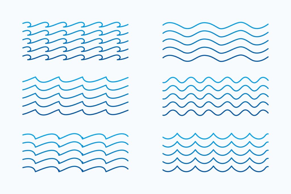
Curves play a pivotal role in logo design, wielding a unique influence that extends beyond mere aesthetics. The inherent softness and fluidity of curved shapes evoke a sense of approachability, friendliness, and comfort.
In the psychological realm, curves are associated with harmony and organic motion, creating a visual language that communicates a brand’s welcoming and human-centric attributes.
In logo design, the strategic use of curves can convey a brand’s personality and establish an emotional connection with the audience. The gentle arcs and rounded forms elicit feelings of calmness and positivity, making them particularly effective for brands in industries such as hospitality, healthcare, and lifestyle.
Moreover, the flow created by curved elements guides the viewer’s eye in a natural and harmonious manner, enhancing the overall visual experience.
Balancing curves with other design elements is crucial for optimal impact. Combining curves with straight lines or geometric shapes can create a harmonious contrast, adding depth and complexity to the logo.
The intentional incorporation of curves in logo design is a nuanced art, allowing designers to craft visual narratives that resonate with the desired emotions and perceptions, ultimately contributing to a brand’s distinct identity and memorability.
4. The Power of Geometric Patterns
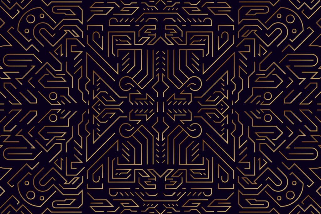
The strategic incorporation of geometric patterns in logo design adds a layer of visual sophistication and depth, making it a powerful tool for brand identity. Geometric patterns, characterized by symmetrical and structured arrangements, create a sense of order, precision, and balance.
Brands leverage these patterns to convey a message of reliability, professionalism, and meticulous attention to detail.
One significant advantage of geometric patterns in logos is their versatility. Whether minimalist or intricate, these patterns can be tailored to suit diverse industries and brand personalities.
The repetition of geometric shapes establishes a visual rhythm, fostering memorability and brand recognition. This is exemplified by iconic logos such as those of FedEx and IBM, which skillfully employ geometric patterns to convey a sense of efficiency and trustworthiness.
The psychological impact of geometric patterns lies in their ability to evoke a range of emotions. While symmetrical patterns communicate stability and order, asymmetrical arrangements can infuse a logo with energy and creativity.
Designers harness this power to craft logos that resonate with the target audience and align with the brand’s core values.
In essence, the use of geometric patterns in logo design transcends mere aesthetics; it is a deliberate choice to communicate specific brand attributes and create a lasting visual impression.
As the design landscape evolves, geometric patterns remain a timeless and effective element in shaping compelling brand identities.
Read our trending article on How to Price Logo Design Services (Ultimate Guide)
5. Case Studies: Analyzing Famous Logos
Delving into case studies of renowned logos offers invaluable insights into the strategic use of design elements and their profound impact on brand perception.
In this exploration, we’ll focus on two iconic logos: Apple Inc. and Nike, dissecting their design choices and the psychological resonance they have achieved.
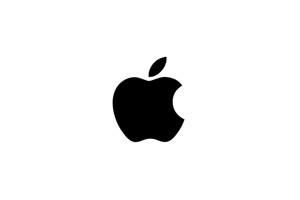
Apple’s logo, a minimalist apple with a bite taken out, utilizes the circle, a shape symbolizing unity and perfection. The rounded edges evoke a sense of approachability and innovation, while the missing bite adds a subtle element of irreverence and challenging conventions.
The result is a logo that not only reflects the brand’s commitment to user-friendly technology but also fosters a personal connection with its audience.
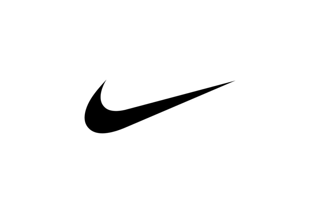
On the other hand, Nike’s swoosh, a dynamic checkmark, employs the power of simplicity and motion. The swoosh’s sweeping curve imparts a sense of speed and forward momentum, aligning perfectly with Nike’s brand ethos of athleticism and progress.
This minimalist approach not only facilitates instant brand recognition but also triggers a visceral response, associating the logo with the determination and dynamism inherent in sports culture.
These case studies exemplify how meticulous attention to shape, symbolism, and cultural context can elevate a logo beyond a mere graphic, transforming it into a powerful emblem that resonates with consumers on both emotional and intellectual levels.
6. Cultural Influences on Shape Perception

Cultural influences strongly impact people’s perception of logo design, particularly concerning the use of shapes.
The intricate relationship between shapes and cultural symbolism requires a nuanced understanding by designers to ensure logos effectively resonate with diverse audiences. Different cultures ascribe distinct meanings to shapes, and acknowledging these nuances is essential for crafting logos that communicate universally.
When delving into the impact of cultural influences on shape perception, designers must consider the historical and traditional significance attached to various geometric forms. Shapes that may evoke specific emotions or connotations in one culture might carry entirely different meanings in another.
Sensitivity to these cultural nuances is crucial to avoid unintentional misinterpretations and ensure that logos are universally inclusive.
Successful examples of logos adapting shapes for different cultures abound, where brands have demonstrated cultural intelligence by incorporating elements that resonate positively with diverse audiences.
This sub-topic emphasizes the necessity of conducting thorough research on the target demographic’s cultural background to create logos that not only aesthetically appeal but also foster a sense of connection and understanding.
By acknowledging and integrating cultural influences, designers can navigate the intricate landscape of global branding, fostering positive associations and resonating with consumers on a deeper, culturally relevant level.
Also, read 15 Famous Logos With Hidden Meanings You Never Knew
7. Guidelines for Shape Selection in Logo Design

Selecting the right shapes in logo design is a critical process that goes beyond aesthetics, requiring a thoughtful understanding of a brand’s identity and its desired impact on the audience. The guidelines for shape selection play a pivotal role in creating a logo that effectively communicates a brand’s personality and values.
First and foremost, designers must delve into the essence of the brand, identifying its core attributes and unique selling propositions. Each shape carries distinct psychological connotations, and aligning these with the brand’s message is paramount.
For instance, a brand emphasizing stability and tradition might find resonance in geometric shapes, while a brand focused on innovation and dynamism may lean towards more angular or abstract forms.
Consideration of the target audience and demographics is equally crucial. Understanding the preferences and cultural associations of the intended consumers ensures that the chosen shapes resonate and engage effectively.
Furthermore, balancing creativity with timeless design principles contributes to the longevity of the logo. Striking this equilibrium ensures that the logo remains relevant, avoiding the pitfalls of fleeting design trends.
In essence, the guidelines for shape selection serve as a compass for designers, navigating the intricate interplay between form and meaning to craft logos that not only stand out visually but also forge a lasting connection between the brand and its audience.
8. Future Trends in Logo Design Shapes

Anticipating the future trends in logo design shapes involves a dynamic exploration of evolving consumer preferences and design aesthetics.
As design landscapes continually shift, logo designers must stay attuned to emerging patterns to create logos that remain relevant and resonate with contemporary audiences.
One promising trend lies in the exploration of unconventional geometric shapes. Departing from traditional circles and squares, designers are increasingly experimenting with asymmetry and irregular polygons, providing a fresh and distinctive visual language. These novel shapes contribute to a brand’s uniqueness, fostering a sense of innovation and modernity.
Furthermore, the integration of augmented reality (AR) and virtual reality (VR) technologies is poised to redefine logo design. As these technologies become more prevalent, logos are evolving into interactive, three-dimensional experiences, engaging consumers in ways previously unexplored.
The incorporation of dynamic shapes that respond to user interactions within these digital environments reflects a paradigm shift in the way brands connect with their audiences.
In this era of rapid technological advancement, the future of logo design shapes also embraces minimalist and adaptive designs. Streamlined, versatile shapes ensure optimal visibility across various digital platforms and devices, aligning with the demand for simplicity and scalability in modern branding.
As designers navigate this exciting landscape, embracing these evolving trends ensures that logos remain not just visually striking but also forward-thinking and adaptable to the changing dynamics of the design industry.
Conclusion
In conclusion, the exploration of the psychology behind shapes in logo design reveals a nuanced and powerful tool for brand communication. The careful selection of shapes, as discussed in this comprehensive guide, goes beyond aesthetic considerations, delving into the realm of human perception and emotion.
From the stability of circles to the dynamism of triangles, each shape carries a unique psychological impact that can shape consumer attitudes and brand identity. Designers are encouraged to leverage this knowledge thoughtfully, considering cultural influences and emerging trends.
As the logo design landscape evolves, the understanding of shape psychology stands as a timeless principle, empowering designers to create logos that not only captivate visually but resonate emotionally, fostering lasting connections between brands and their audiences.
Recommended Reading: The Role of Simplicity in Logo Design (Industry Secrets)
FAQs
Q: Why is the psychology of shapes important in logo design?
A: The psychology of shapes is crucial in logo design because shapes convey subconscious messages, influencing how consumers perceive a brand. Understanding the psychological impact of shapes allows designers to strategically communicate a brand’s values, personality, and goals.
Q: How can I choose the right shape for my brand’s logo?
A: Selecting the right shape involves aligning the shape’s psychological associations with your brand’s identity. Consider your brand’s values, target audience, and industry. For instance, circles may convey unity and community, while triangles evoke energy and progression.
Q: Can I combine multiple shapes in a logo?
A: Yes, combining shapes can create a nuanced and rich visual language. However, it’s crucial to maintain balance and cohesion. Ensure that the combined shapes reinforce your brand message and don’t create conflicting or confusing meanings.
Q: Are there cultural considerations in shape selection?
A: Absolutely. Cultural influences play a significant role in shaping perception. When designing for a global audience, it’s essential to research and understand how different cultures interpret and respond to various shapes to avoid unintended meanings.
Q: How can I stay on-trend while ensuring a timeless logo design?
A: While trends come and go, focusing on fundamental design principles and understanding the enduring psychological impact of shapes helps create a logo that stands the test of time. Blend contemporary elements with timeless design for a balance of relevance and longevity.
1 thought on “The Psychology of Shapes in Logo Design (Ultimate Guide)”