
Do you wonder about the hidden stories behind famous logos? Prepare to be amazed as we explore the world of secret symbolism—with 15 renowned brands.
In this blog post, we uncover the hidden meanings and references hidden in some of history’s most famous logos.
From subtle clues to clever connotations, we explore how these brands have used the visual elements of their design—from logos and fonts to color schemes and product placement—to convey deeper messages.
We’ve uncovered the fascinating stories behind 15 famous logos. Get ready to see them in a whole new light as we unravel their secrets: Join us on this captivating journey—we reveal these hidden meanings so you don’t have to!
1. FedEx
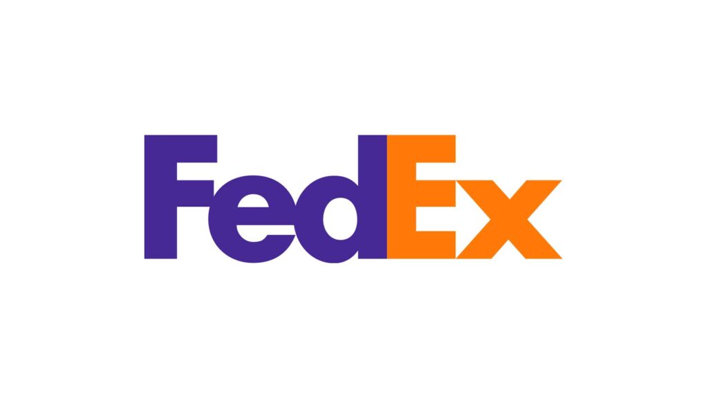
The FedEx logo, with its bold orange and purple typography, is a design classic—and contains a cleverly hidden message. Upon closer inspection, the logo reveals an astonishing fact about this company.
The negative space between the letters “E” and “x,” combined with the arrow-like shape they form, symbolizes EverEx’s core values of speed, efficiency, and forward progress.
This clever design makes use of negative space to display the FedEx logo’s speed, reliability, and attention to detail.
2. Amazon
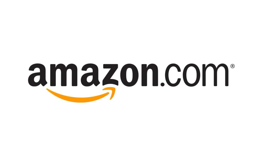
Upon closer examination, one can see that Amazon’s logo—which seems to be simply a depiction of the company’s name—is actually hiding something more clever.
The yellow arrow, starting from the letter A and extending to Z, embodies Amazon’s commitment to providing an extensive range of products: From A-Z.
This groundbreaking innovation communicates to customers the company’s dedication to delivering a comprehensive online marketplace. It also implies that Amazon aims to make its customers smile by supplying them with an abundance of products at competitive prices
The message in this ad captures the essence of Amazon’s mission and reinforces its role as a one-stop shop for all things.
3. Baskin Robbins
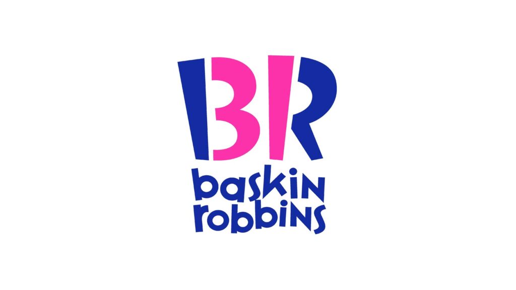
The Baskin-Robbins logo, with its iconic use of pink and blue colors, holds a hidden message within its design.
The brand’s name is featured in playful typography, but on closer inspection, one can make out the number “31” cleverly integrated into each letter.
Baskin-Robbins has long prided itself on its extensive selection of ice cream flavors, offering customers a different taste for each day of the month. The “31” in its logo is a whimsical reminder that no matter what your mood or occasion—from vanilla to coffee chip and everything in between—the chain’s got you covered.
This clever touch showcases the brand’s attention to detail and adds an element of discovery for customers who notice it, further enhancing its appeal.
You may also like How Negative Space in Logo Design Makes a Brand Strong
4. Unilever
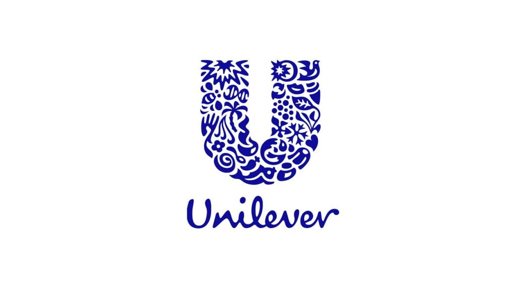
The logo of Unilever, a multinational consumer goods company, contains a powerful message that reflects the core values its brand represents.
At first glance, the logo appears to be made up of simple shapes that form an interconnected emblem. However, a closer look reveals that each shape represents one or more diverse symbols—such as hands, birds, and waves.
These symbols represent the Unilever brand’s commitment to improving people’s lives, health, and overall well-being; they also reflect the unity and collaboration among different brands under its umbrella.
The rounded, minimalist design of this logo reflects Unilever’s commitment to creating sustainable solutions for a wide range of challenges facing the world today.
5. Toyota
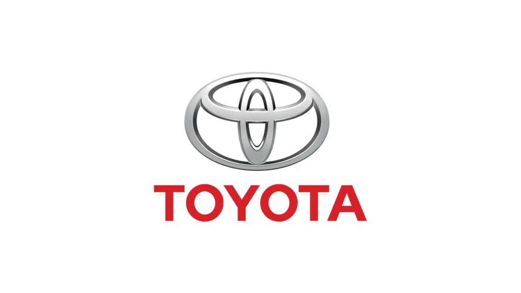
Toyota’s logo is a distinctive symbol that embodies the company’s philosophy and aspirations. It consists of three overlapping ellipses arranged in such a way that they form the letters “T” and “Y”.
The design of the logo reflects the strong bond between the brand and the customer.
The outside ellipse represents the world embracing Toyota, while the inner one depicts its progressive mindset and innovative spirit.
Moreover, the logo’s overall shape conveys a sense of movement—indicating Toyota’s continuous pursuit of progress and advancement. This hidden message beautifully encapsulates the company’s commitment to quality, reliability, and forward-thinking mobility solutions.
6. Pinterest
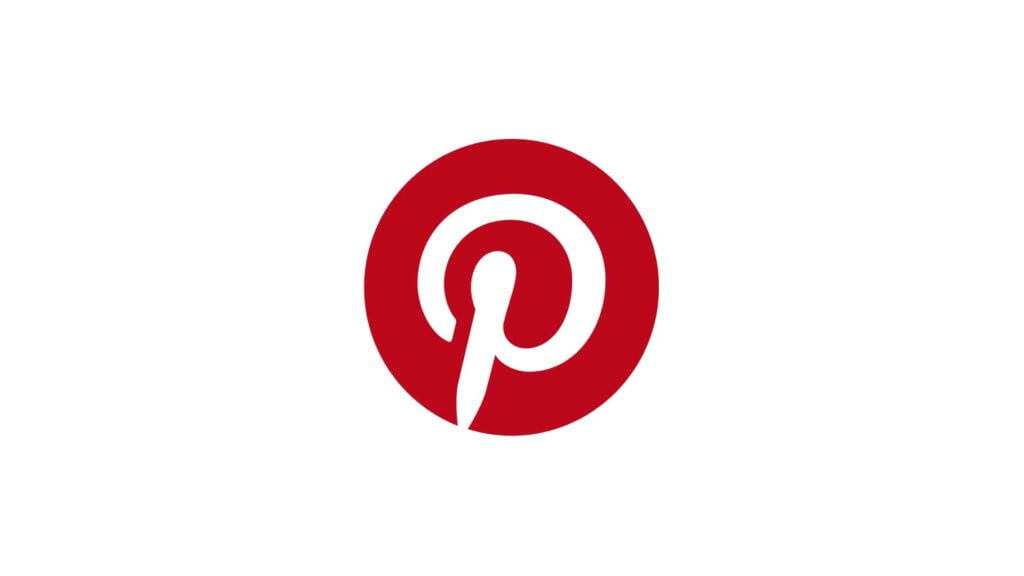
Pinterest’s logo, a lowercase “p” in bold red, might seem like an odd choice for the social media platform—until you notice its hidden message.
However, upon closer inspection, the negative space within in letter forms an elegant and subtle image of a pin. This creative integration represents Pinterest’s core functionality—where users “pin” images and ideas to their virtual boards.
The hidden pin symbolizes the platform’s mission to serve as a digital bulletin board, enabling users to discover and save posts from other users.
This design choice reflects Pinterest’s goal of creating a visually appealing experience for its community of users.
7. Beats
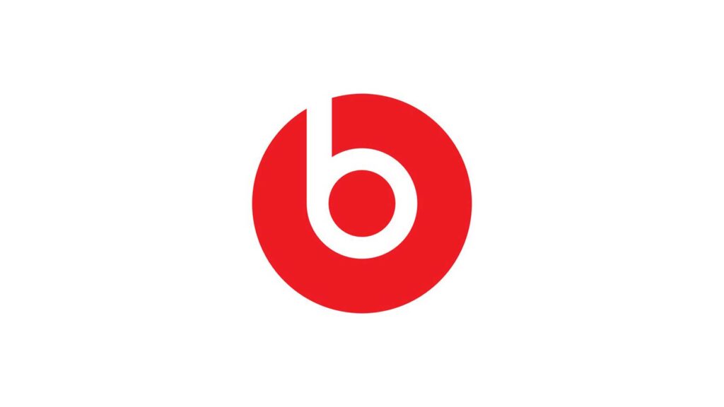
The logo for Beats, the renowned audio brand, has a subtle yet impactful hidden message that resonates with its identity and mission. At first glance—looking only at the “b” inside of a circle—the logo appears to be an incorrect lowercase version of itself.
However, when you look more closely at the letter “b” in the Beats headphones’ logo, it looks like a person wearing earphones. This clever design element represents how their products deliver high-quality audio experiences through immersive sound.
This logo conveys the brand’s dedication to crafting products that allow individuals to immerse themselves in the world of music, enhancing their personal enjoyment and connection with sound. It also reflects a commitment to excellence and innovation.
Check out our latest article on Importance of Functionality in Logo Design (The Ultimate Guide)
8. NBC
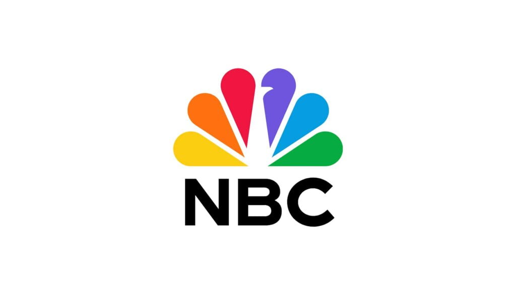
The peacock is a symbol of elegance, and its breathtaking feathers represent the powerful impact NBC’s programming has on viewers all over the world.
The peacock design holds a deeper meaning. Each of its feathers represents one of the six divisions that NBC used to organize its programming at the time—news, sports, entertainment, and stations/network production.
The network’s diverse slate of programming exemplifies its dedication to providing viewers with a variety of quality entertainment.
The network’s dedication to delivering compelling television experiences is on full display in its commitment to diversity.
9. Cisco
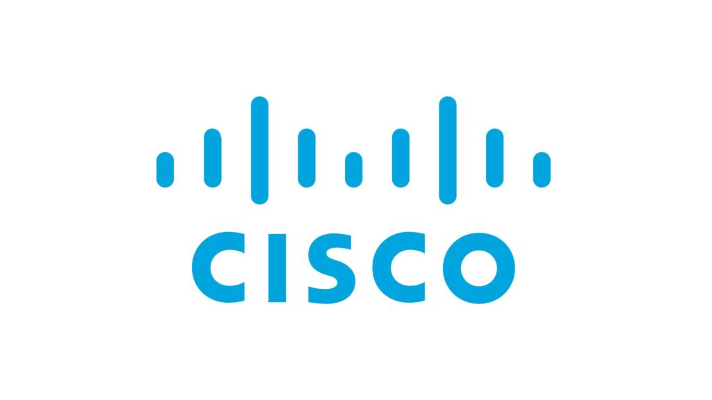
Cisco’s logo, a simple representation of the company name in blue lettering at first glance, actually embodies its commitment to connectivity and networking.
A closer look at the logo reveals that it can be interpreted as an inverted “C” with a bridge in its negative space.
This design element is a tribute to Cisco’s roots, celebrating the company’s mission to connect people, technology, and information.
Executed in a minimalist style, the logo reflects Cisco’s role as a facilitator of connections—enabling seamless communication and technological integration.
With this cleverly crafted image, Cisco beautifully captures its vision while reinforcing its position as one of the world’s leading networking solutions providers.
10. Levi’s
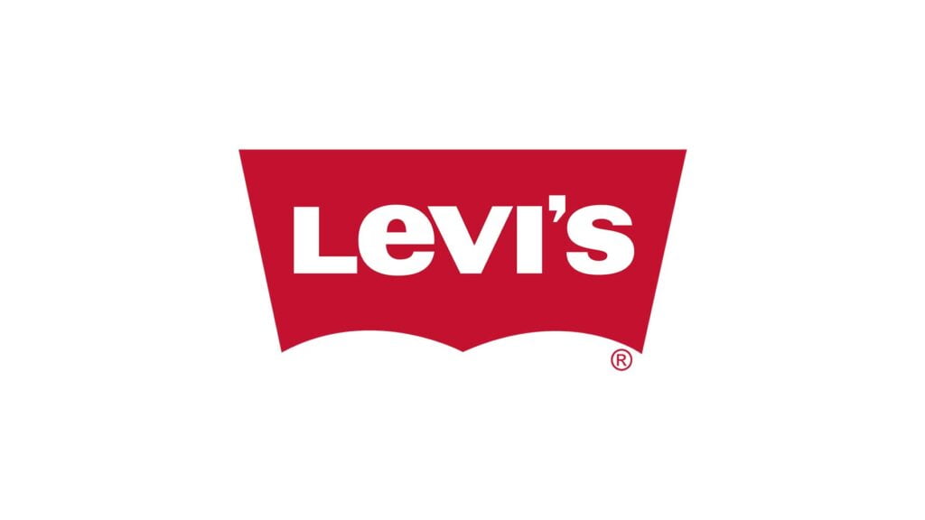
The Levi’s logo, which is one of the most iconic in fashion, contains an ingeniously hidden message: The word “Levi’s” appears bold and uppercase at first glance—but if you look closely there are slight variations on each letter that make up the brand name.
However, a closer look reveals that the letter “E” and the letter “V” are slightly offset from each other—creating an optical illusion: if you focus on one of these letters, it appears to be floating above its peers (which creates what’s known as red-tabbing).
For over 140 years, this reddish wash tab has been a symbol of the American brand’s high-quality products.
Levi’s commitment to quality craftsmanship, heritage, and enduring style is reflected in its logo.
11. Formula 1
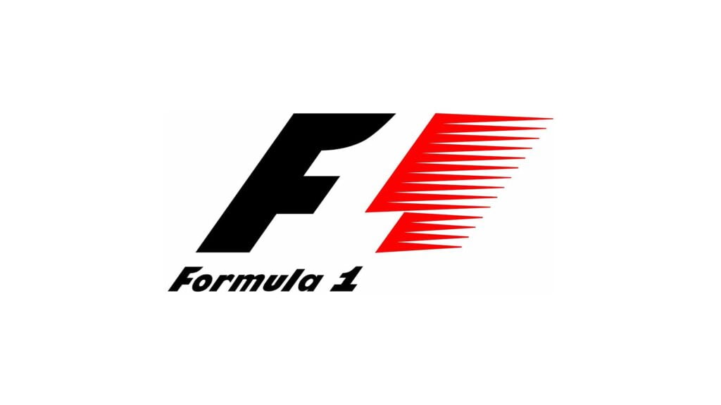
The logo of Formula 1, the preeminent racing league in the world, incorporates a hidden design that captures its essence. At first glance, it features a bold and dynamic “F” nestled between two larger numbers—”1″.
However, upon closer inspection of the empty space between the letters “F” and “1,” it appears that a speed arrow has been subtly embedded in them.
The arrow hidden in this logo symbolizes the adrenaline-fueled speed and excitement that characterizes Formula 1 racing. It represents the relentless pursuit of velocity, precision, and innovation—qualities embodied by every F1 team on Earth.
This logo captures the essence of Formula 1, showing that it’s more than just a sport—it is also a cultural phenomenon.
Also, read How To Copyright and Trademark a Logo (Step-by-Step Guide)
12. Toblerone
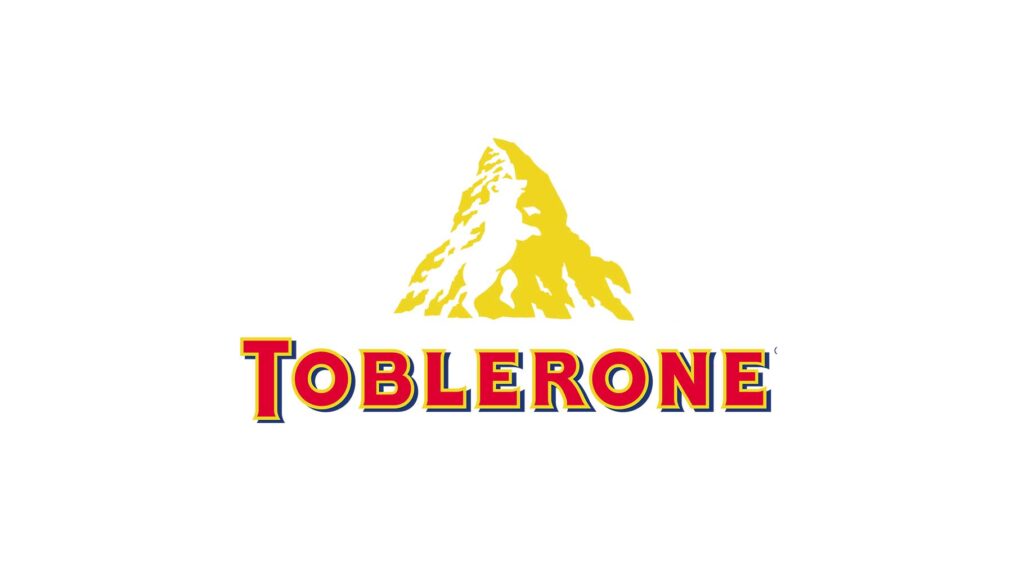
Toblerone’s logo, which features a mountain-shaped chocolate bar, is filled with delightful little tricks like this.
A closer look at the logo reveals an enchanting detail—the negative space within the mountain peak cleverly conceals a stylized image of a bear.
This surprise tribute to the city of Bern, Switzerland—nicknamed the “City of Bears”—is a subtle nod to Bérn’s origins and adds an element of delight for those who discover it.
The design of the Toblerone logo reflects its commitment to quality, craftsmanship, and the rich cultural heritage from which it derives.
13. Tour de France
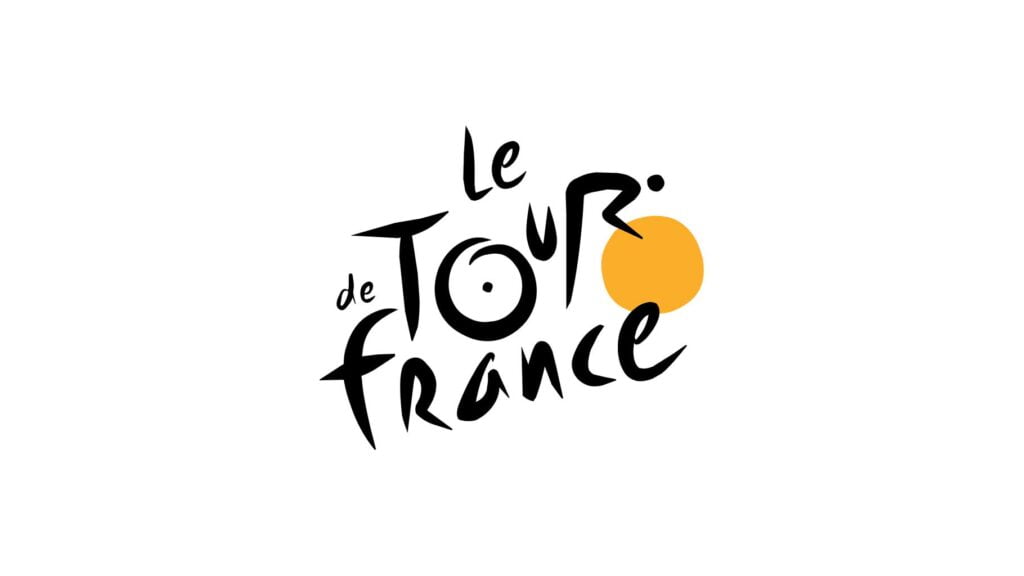
The logo of the Tour de France, one of the most prestigious cycling races in the world, holds a compelling hidden message. At first glance it may seem like an unremarkable yellow circle with black lettering that reads “Tour de France”, but there’s actually more to this design than meets the eye!
However, upon closer examination, it’s clear that the letter “R” in “Tour” has been transformed into a cyclist.
This subtle fusion of the bike race with its host country represents both the heart and soul of this sporting event, encapsulating the endurance, determination, passion—and athleticism!—of those involved.
The hidden message in this logo adds an element of discovery and symbolism, re-enforcing the excitement that surrounds the Tour de France.
14. LG
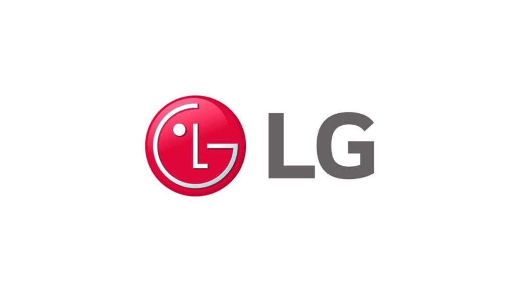
The logo of LG—a leading technology company that is renowned for its commitment to innovation and customer-centric approach – carries a subtle yet meaningful hidden message. At first glance, the logo features red letters “L” and “G”. However, upon closer examination, one will find another meaning within:
In LG’s logo, the letters “L” and “G” are intertwined to form a stylized smiley face. This represents LG’s dedication to creating products and experiences that make people happy—a theme they’ve maintained throughout their 125 years as an electronics company.
The concept, which embodies LG’s focus on human-centric design and the aim to enhance the quality of life through innovative technology, adds positivity and delight—subtly communicating its mission by equipping smart appliances with emotional intelligence.
The LG logo represents the brand’s identity and values, elevating its visual representation beyond just a combination of letters.
15. Audi
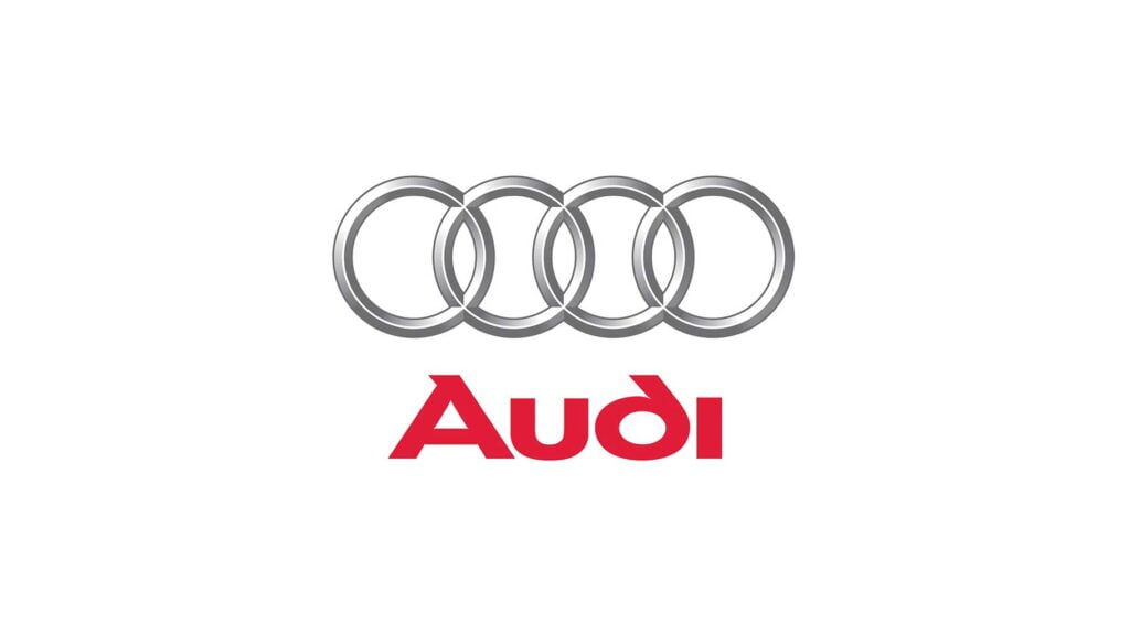
The Audi logo, with its four interlocking rings, is an enduring symbol of the carmaker’s commitment to engineering excellence.
The logo initially looked like four interconnected rings, representing the merging of four automotive companies – Audi, DKW, Horch, and Wanderer. But this iconic design carries a deeper meaning: the building blocks of life.
The rings represent Audi’s core values: advanced technology, innovative design, superior performance, and the commitment to constantly exceeding customer expectations.
Audi’s dedication to innovation and providing exceptional customer experiences is elegantly expressed through this message.
The Audi brand identity serves as a powerful symbol of the company’s heritage, expertise, and unwavering pursuit of excellence.
Conclusion
After considering the stories behind some of the world’s most popular logos, we have gained a deeper understanding of how brands are created and marketed. We have discovered the clever and thought-provoking messages hidden in these iconic logos.
A closer look at logos reveals a wealth of hidden meanings, ranging from obvious references to company values and cultural icons to subtle nods about product features. Logos are more than just attractive symbols—they can also convey hidden messages to consumers on a subconscious level. So whenever you come across one, take the time to look beneath its surface and uncover some of that company’s history.
Recommended Reading: The Evolution of Logo Design in the Digital Age
FAQs
Q: Why do famous logos have hidden meanings?
A: Famous logos often incorporate hidden meanings to create a deeper connection with their audience. These hidden messages serve multiple purposes, including reflecting the brand’s values, communicating its story, and sparking curiosity and intrigue among consumers. They also allow brands to differentiate themselves and stand out in a crowded marketplace.
Q: Are hidden meanings in logos intentional or coincidental?
A: In most cases, hidden meanings in logos are intentional. Designers strategically incorporate these hidden elements to enhance the brand’s identity and create a memorable and engaging experience for consumers. However, it’s worth noting that sometimes people may interpret meanings that were not originally intended by the designers, leading to coincidental interpretations.
Q: How can hidden meanings in logos impact consumer perception?
A: Hidden meanings in logos can have a significant impact on consumer perception. They can evoke emotions, create a sense of intrigue, and establish a deeper connection with the brand. When consumers discover these hidden messages, it can enhance their perception of the brand’s attention to detail, creativity, and thoughtfulness in its design choices. It can also foster a sense of loyalty and engagement as consumers feel a part of the brand’s story.
Q: Can hidden meanings in logos change over time?
A: Hidden meanings in logos can evolve over time, particularly as brands adapt to new trends and cultural contexts. As societal values and consumer expectations shift, brands may modify or update their logos to convey different messages or incorporate new hidden elements. Additionally, as people become more aware of hidden meanings through research and analysis, the interpretations of these logos can change and evolve within the public consciousness.
Q: Are hidden meanings only found in famous logos?
A: While famous logos often garner more attention and scrutiny, hidden meanings can be found in logos of various brands, regardless of their level of fame. Many companies, both large and small, incorporate hidden messages to add depth and intrigue to their logos. Exploring lesser-known logos can be equally rewarding, as it unveils the creativity and storytelling present in their designs.
1 thought on “15 Famous Logos With Hidden Meanings You Never Knew”