
In today’s fast-paced world, clarity and simplicity are key elements that capture attention and leave a lasting impression.
Minimalist logos, which convey a brand’s essence with elegance and impact while using fewer elements than traditional logos, have become popular in recent years.
Minimalist logos don’t clutter the mind or confuse viewers—they’re easy to remember and associate with a brand. In this article, we explore how minimalism affects viewer perception, making it easier for people to understand your message.
Whether you’re a designer seeking inspiration or a business owner looking to refine your brand identity, this exploration of minimalism in logo design will provide valuable insights—and practical tips!
Let’s bring our focus back to the fundamentals of logo design, and use minimalism as a tool to create visual impact.
What is Minimalism in Logo Design?

A minimalist approach to logo design focuses on simplicity, clarity, and the strategic use of negative space. Minimalism is a design philosophy that seeks to pare down the elements of an object or composition to their simplest form.
The minimalist design embraces the concept of keeping things simple, ensuring that every element is necessary.
Minimalist logos use clean lines, geometric shapes, and a limited color palette—allowing for timelessness and versatility. Minimalist logo design involves the strategic use of negative space.
Negative space, or the spaces within and around logo elements such as letters and shapes, can be used to create visual illusions that add depth. One reason that minimalist logos work well is because of their simplicity. They’re easily recognizable and memorable, making them appropriate for many different kinds of businesses or organizations.
Nike, Apple, and Google are among the world’s best-known brands that have embraced minimalism in their logos—and solidified their effectiveness as a strategy for creating iconic visual identities.
In summary, a minimalist logo is one that uses simplicity in its design rather than clutter. It ensures that a brand’s message is communicated to customers in an appropriate and engaging manner so as to maximize the effectiveness of a firm’s marketing strategies.
The Psychology of Minimalism in Logo Design
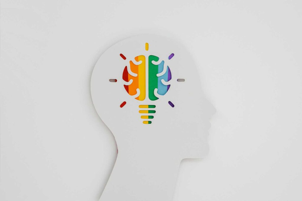
The psychology of minimalism in logo design helps shape brand perception and consumer response. Simplicity, inherent in minimalist designs, has a profound impact on the way individuals perceive and process visual information.
Minimalist logos can reflect elegance, sophistication, and professionalism. Minimalist logos utilize clean lines, sparse elements, and ample white space to create a visually balanced composition.
The result is an intentional reduction of visual clutter that draws attention to the core message or essence behind the brand itself
Studies show that people tend to perceive minimalist designs as being more trustworthy, modern, and memorable than those with complicated designs.
Minimalist logos are stripped down to the core of what they represent and evoke a strong response in viewers. This design approach allows the logo to adapt easily without losing its impact.
It’s no secret that minimalist design can be powerful. Brands such as Apple, Nike, and FedEx leverage their simple logos to achieve instant brand recognition—and convey a sense of innovation, quality, and reliability in the process.
In order to design a minimalist logo, designers should focus on reducing the brand’s essence down to its most fundamental elements.
A well-designed logo should incorporate shape, line, and space to create a visual image that is striking, memorable, and evokes the desired emotion.
Also, read 15 Famous Logos With Hidden Meanings You Never Knew
Communicating Brand Essence through Minimalist Logos

Minimalist logos communicate a company’s brand essence by stripping away distractions to reveal the core values that define its personality.
A minimalist logo is able to communicate a brand’s essence in an economical and straightforward way. Minimalist design techniques can help a logo convey the feeling that its owner wants to project.
A minimalist logo is made up of simple, essential elements that express the brand’s identity.
Minimalist logos use symbols, typography, and negative space to communicate a brand’s essence. Symbols can represent key attributes or ideas associated with the brand while typeface choices convey tone and personality.
Negative space can be used to create subtle and powerful visual messages that reinforce a brand’s values or tell a compelling story. Coca-Cola, McDonald’s, and FedEx have used simple logos to convey their brand essence in a clear, powerful way.
For example, the Coca-Cola logo with its bold red color and recognizable typeface is instantly associated with happiness and refreshment. Meanwhile, McDonald’s golden arches symbolize its worldwide presence.
Businesses can develop a distinctive, memorable image by creating simple logos that express their core values.
Through simplicity and thoughtful design, minimalist logos can be powerful tools for communicating a brand’s essence.
The Benefits of Minimal Logos

Minimal logos offer many advantages over more ornate designs, including simplicity and the creation of a strong brand identity.
Firstly, Minimal logos create powerful impressions on viewers by stripping away unnecessary details and focusing on key elements.
By creating memorable, instantly recognizable images that make brands stand out from the crowd, minimal logos have the potential to become iconic—increasing brand visibility through repeated exposure to their audience members
Secondly, minimalist logos are versatile and adaptable. Their clean and uncluttered designs enable them to be reproduced across various mediums: from small icons used online or on smartphones; up to billboards used outdoors in major cities.
Because they’re not tied to any one trend or time period—minimalist design has been around for decades!
Thirdly, minimal logos project a professional and sophisticated image. They communicate confidence and elegance—and position the brand as forward-thinking and trustworthy.
Minimal logos are also highly effective in today’s digital age, as their simplicity allows for quick loading times, easy scalability across platforms—including websites and mobile apps—as well seamless integration into social media profiles.
Fouthmore, Minimal logos are more distinctive and eye-catching in saturated markets. Their simplicity helps brands to stand out from competitors.
Making an Impact with Minimalist Typography
Minimalist Typography in logo design involves using typography to create an aesthetically pleasing, minimalist-looking final product.
The way typography is used can make a big difference in how a brand is perceived, making it important that the type you use reflects your company’s personality and priorities.
Typography in minimalist logo design is often characterized by clean, simple letterforms that are reminiscent of geometric shapes.
The use of these typefaces helps to reinforce the minimalist look and feel of the logo, ensuring that it is legible in smaller sizes. The typography should help convey key aspects of your brand’s values or target audience.
Minimalist typography in logo design boosts legibility. The simplicity of the typeface allows for clear readability even at small sizes or in challenging viewing conditions—so your client’s brand can be easily understood and recognized by anyone.
Minimalist typography allows for creativity and experimentation, as well. A designer can use negative space—the empty space between characters or inside letters (rather than the shapes of individual letters)—in ways that create stunning logos.
Minus the graphic elements that would normally fill in this blank space, what’s left creates a striking visual image.
A key advantage of minimalist typography in logo design is its versatility. Minimalist typefaces can be easily scaled to different sizes and used for various applications, ensuring consistency across branding efforts.
The typography on digital platforms, print materials, and signage is uncluttered yet easy to read.
You may also like The Evolution of Logo Design in the Digital Age
Clever Use of Negative Space in Minimalist Logos
A minimalist logo is often composed of geometric shapes that work together to form a cohesive design.
Negative space can be used to create hidden meanings and other visual illusions that add depth, intrigue, and impact to minimalist logo designs.
When using minimalistic logos, it’s possible to create dual imagery or hidden symbols by placing objects in unused space.
Clever use of negative space can reveal secondary elements that reinforce the brand’s message or add an extra layer of meaning. This engages viewers and adds a sense of discovery and intrigue to their experience with your company.
Negative space plays a significant role in minimalist logos. By strategically placing elements and leaving areas of negative space, designers create a harmonious interplay between the logo’s components. This balance makes the logo more appealing to the eye and memorable.
Negative space—the empty areas in a design that are left when the main elements have been removed—can also contribute to the simplicity and clarity of a minimalist logo. By removing unnecessary elements and relying on effective use of negative space,
A logo’s simple design helps it to be remembered easily, thereby allowing the company’s message to reach its intended audience more quickly.
A well-known example of negative space being used in logo design is the FedEx logo, where an arrow is formed between its “E” and “x,” signifying speed.
The World Wildlife Fund’s iconic logo features a hidden panda in black and white shapes.
Minimalism and Versatility: Adapting Logos for Various Platforms

Minimalist logos are able to take on different forms and look good in any setting. Minimalist logos can be scaled up or down without losing their impact, ensuring consistent brand representation and recognition.
In today’s digital age, minimalist logos are all the rage. They’re easy to scale up or down and work well on social media sites and apps like Facebook—where space is limited.
Minimal logos remain legible in all sizes, offering a consistent brand experience for users. Minimal logos are particularly suitable for print materials such as business cards, brochures, and packaging.
Minimalist logos can be used in a variety of ways, including signage, billboards, and three-dimensional applications like product packaging.
The simplicity of the design allows it to be easily integrated into a variety of physical environments like a website, print materials, and even physical signage. Minimal logos are also easy to remember, making them ideal for promoting your brand.
Minimalist logos are versatile—they can be seamlessly integrated across touchpoints, creating a cohesive brand identity and reinforcing your brand recognition. Minimal logos, when used consistently across all of an organization’s marketing materials and in-person appearances, create a powerful brand identity.
Check out our trending post about How Negative Space in Logo Design Makes a Brand Strong
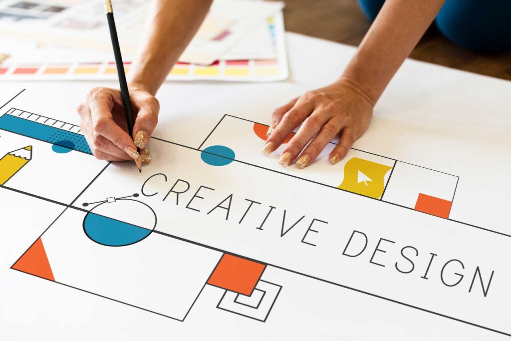
Tips for making a minimal logo design

Creating a simple yet effective logo requires careful planning and attention to detail. Here are a few tips to help you make the most of your experience:
1. Distill the Essence: Identify the most important attributes of your brand, and then simplify them into one or two words that capture their essence.
2. Simplify Shapes: A clean and simple geometric shape conveys your message more effectively than a design with many confusing elements.
3. Strategic Typography: Select a typeface that is compatible with the logo’s aesthetic and reinforces your brand’s identity. Be sure it is readable in all sizes.
4. Embrace Negative Space: Use negative space to create hidden meanings and dual imagery, or to increase the visual interest of a work. Consider how various elements interact with each other’s spaces as well as their own.
5. Limit the Color Palette: A restrained color palette will enhance the minimalist aesthetic of your website. Color choices should be in line with your brand identity and evoke the desired emotions from users.
6. Maintain Scalability: Make sure that your logo will be recognizable and retain its impact no matter what size it is. Test the logo on various mediums to make sure it’s versatile enough for every use.
7. Seek Feedback: Talk to stakeholders and potential customers about the design to get their input. Iteration and feedback can lead to improvements in your final result.
8. Consider Adaptability: Think about how the logo will look in different contexts and on various media, such as websites or printed materials.
The key to a minimalist logo is simplicity, clarity, and purposeful design. The following tips will help you create a successful minimal logo that stands out from the crowd.
Conclusion
Minimalist logos possess a power that is undeniable. The principle of “less is more” has proven to be an effective way of creating impactful and memorable brands by distilling their essence into the most essential elements—communicating with clarity, and evoking emotion Minimalist designs are versatile and can be easily adapted to different platforms or mediums. Their clean lines contribute to this legibility, ensuring consistent brand recognition no matter where your logo is displayed: digital screens, print materials—even physical signage!
Minimalist logos evoke feelings of trust and sophistication, making them a popular choice for brands that want to exude elegance and timelessness.
Furthermore, minimalist logos use strategic placement of negative space and typography to create depth or intrigue. This clever way of using design elements engages the viewer and fosters a sense of discovery—the overall brand experience is enhanced because consumers feel like they’re getting something extra out of the logo. In a crowded and visually overwhelming marketplace, minimalism stands out. By harnessing the power of simplicity, brands can create minimalist logos that stand the test of time—communicating their core message effectively with each stroke or line.
Recommended Reading: How to Price Logo Design Services (Ultimate Guide)
FAQs
Q: What is the main benefit of using minimalism in logo design?
A: The main benefit of using minimalism in logo design is its ability to create a strong and impactful visual identity. Minimalist logos are memorable, versatile, and timeless. They convey the brand’s essence with clarity and simplicity, making them easily recognizable and memorable for the target audience.
Q: How does minimalism enhance the versatility of a logo?
A: Minimalist logos are highly versatile due to their clean and uncluttered designs. They can be easily scaled and adapted to various sizes and mediums without losing their impact or legibility. Minimalist logos can seamlessly transition from digital platforms to print materials, signage, and even three-dimensional applications. This versatility ensures consistent brand representation across different touchpoints.
Q: Are minimal logos suitable for all types of businesses?
A: Yes, minimal logos can be suitable for a wide range of businesses across industries. The key is to capture the essence of the brand and convey it effectively through minimalist design elements. Whether it’s a technology company, a fashion brand, or a healthcare organization, minimalism can be applied to create a visually appealing and impactful logo.