Logos are an important part of your brand. They have to be memorable, unique, and professional. There are so many factors that go into making a good logo. The options for logos are many. You must consider what message you want your logo to convey, whom it will appeal to and how well it represents the business itself.
For example, if you want to create a logo for a company that sells organic food, you wouldn’t want to use a simple design. Instead, you would want one that shows how fresh and healthy the food is.
What is a Logotype?
A logotype is a symbol or emblem that represents a brand or organization. The most common type of logotype is a word mark, which consists of the name of the brand in text rather than an image.
Logotypes are often accompanied by a slogan, which is a brief phrase that conveys an idea or purpose related to the brand’s philosophy and values. A company’s logo typically appears on all its products and marketing materials.
Logotypes can be designed to be simple and straightforward—such as Apple’s apple with a bite taken out of it—or more complex and elaborate—such as Coca-Cola’s script with red background and white ribbon around the lettering.
Here we’re going to go over 10 types of logos and show you some examples so that you can choose one for your brand!
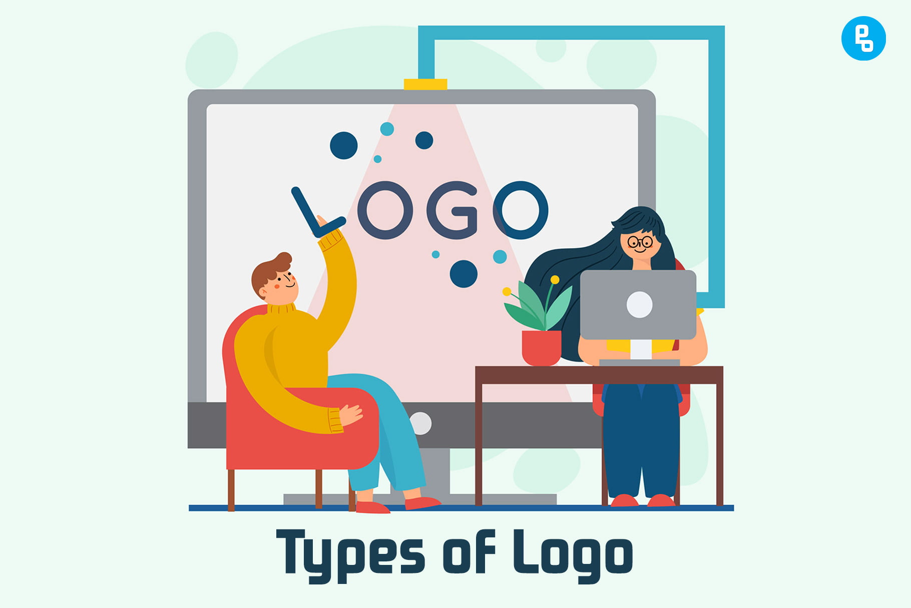
Types of Logos
1. Wordmark
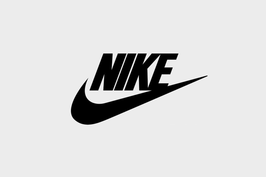
If your brand is based on a name, then you can use a wordmark. Examples of brands with names include Nike and Apple.
Wordmarks are also useful when you want to convey a specific message or make a statement through the design of your logo. For instance, Google’s simple “G” symbol is instantly recognizable as denoting the search engine giant (even when it appears in Japanese).
Lastly, wordmarks can be memorable; this is especially true if they have been used for many years. Even though Coca-Cola has changed its logo many times over the course of its history—including recently—the original script-style text logo created by Frank Robinson in 1885 remains firmly lodged in people’s minds as one of the most famous logos ever created!
2. Letterform
The letterform logo is the most common and recognizable type of logo. It’s simple to create, easy for consumers to recognize, and can be customized to fit your brand.
A letterform logo is a combination of letters, numbers, and symbols that form a unique design. When creating this type of logo, it’s important to choose an appropriate font for your brand. It should feel modern and timeless at the same time, with a look that reflects your business goals.
There are many ways to use letterforms in your logo design:
- Letters can be stacked or set side by side with other letters or numbers.
- Letters can be used on their own or in combination with symbols, icons, images, and more.
3. Brandmark
A brandmark is a combination of your company or organization’s name and its logo. Brandmarks are often used in place of logos, but they can also be used as standalone designs. They’re commonly used as trademarks, which are legally required to be registered with the U.S. Patent and Trademark Office (USPTO).
A brandmark is a great way to represent your company or organization. It’s also a simple way to use your logo design in social media avatars, profile pictures, website headers, and more.
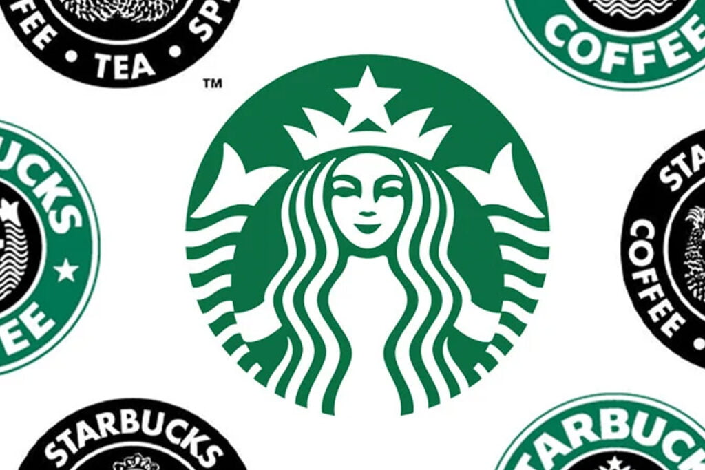
Brands that use a brandmark include Apple, Nike, Uber, Starbucks, and Google.
4. Emblem
The emblem is a type of logo that uses a symbol to represent the brand. The most common examples include the American Flag, the Red Cross, and the Olympic Rings. Emblems are popular choices for businesses that want to convey their values and mission in addition to their name or product.
The most common types of emblems include:
- A symbol that represents a single word or phrase (like Nike’s swoosh)
- A logo that uses the name of your business (like the Olympic Rings)
- A design that uses a brandmark and an icon (like Uber’s former logo)
An emblem can be either abstract or figurative—it doesn’t have to be an image of something (although it can). For example, Nike’s famous “swoosh” logo is an abstract symbol; however, many emblems are more literal in nature. The Michelin Man is an example of this type of logo: he’s not an actual person but has become so iconic that we think he is one!
5. Combination Mark
A combination mark is a logo that incorporates more than one element. These can include an icon, text, and a symbol. The most common combination mark is a logo that features an icon and text.
For example, the Apple logo uses an apple with a bite taken out of it and the company name underneath. This type of logo is great if you want to convey a message in addition to your brand identity; however, it can be difficult (if not impossible) to trademark.
Combination marks are versatile and can be used in many different ways:
- To emphasize the name of your business or event—for instance, by making it larger than the rest of the logo design
- To add personality to your design—combining two elements together can give an unexpected twist on an otherwise traditional style
Checkout our article on 12 Logo Redesigns of Big Brands That Changed Their Identity Forever
6. Mascot
An effective mascot is an important part of your brand identity. It’s a symbol that can be used in many different ways to create a strong and memorable image. Mascots have been around for centuries, from the ancient Romans’ winged horse Pegasus to the phoenix rising from its ashes for Coca-Cola, or Ronald McDonald for McDonald’s.
A good mascot has several things going for it:
- It evokes emotion—whether positive or negative
- It stands out against competitors
- It is unique and memorable
7. Pictorial Marks
Pictorial logos are visual representations of your brand. They can be symbols, icons, or illustrations that share meaning about a company’s attributes and character. Pictorial logos have been around for centuries and have become just as recognizable as text-based logos today.
Benefits of pictorial logos:
- They are easy to remember because they make use of colors, shapes, and other symbols to communicate key messages about your brand in an instant.
- A picture is worth a thousand words: Well-designed pictorial logos require less text to explain their message than some wordy alternative logo options (such as acronyms).
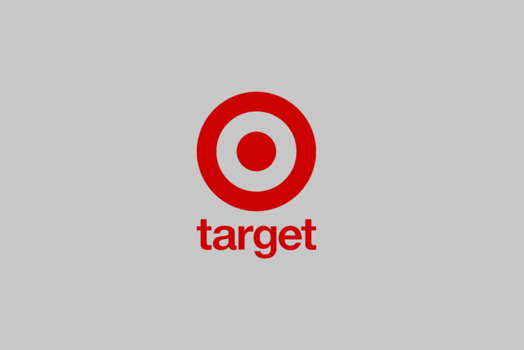
Examples of successful pictorial trademarks include Nike’s swoosh®, Target’s Bullseye®, McDonald’s Golden Arches®, and Coca-Cola’s contour bottle shape design.
8. Abstract Logo Design
An abstract logo design is a great way to convey a feeling or emotion, especially if your brand’s purpose revolves around creating an experience for the customer. Abstract logos are typically more memorable than literal ones, too.
They can also be more versatile and adaptable over time as your brand evolves, which makes them an excellent choice for companies that have multiple product lines or target audiences who have varying needs.
On the other hand, abstract logos are often more difficult to design because there are no concrete rules when it comes to creating an effective one. This means designers need creative freedom in order to create something eye-catching and cohesive with their client’s brand identity;
So if you’re looking for something simple but striking—you probably best stick with one of our other recommendations!
9. 3D Logos
3D logos are a great way to create an impact. 3D logos can be used as a stand-alone logo or as part of your company’s overall branding strategy.
Some of the most popular 3D logos include:
- The “M” shape, where the letter M is formed by two intersecting lines that resemble an upside-down letter V. This type of logo is often used in business and finance industries, but it could also be used to represent other types of organizations or companies.
- The three-dimensional symbol looks like an envelope with its mouth open, with text scrolling out or into it (depending on how you look at it). This type works best when combined with another element like color or imagery on top (or inside!) the envelope; otherwise, it will appear flat and dull compared with other more complex designs such as those listed above!
Checkout our article on 10 Logo Color Combinations to Make your Design Stand Out
10. Typography-based Logo
Typography-based logos can be used for any type of company, industry, and size of business. They are especially useful for businesses that have a name that is easily recognizable or could be made into a logo.
Typography-based logos can be easily created using a simple program like Canva or even Microsoft Word. You can also find many professional designers who specialize in creating logos using this method by searching online.
A typography-based logo uses the company’s name as its main element, with letters in different fonts and colors making up the design. These logos often use negative space to create an image or add additional meaning to the text—for example, by using one letter as an arrow pointing towards another letter (think: Apple).
Choose a logotype that fits your brand personality
Choosing a logotype that fits with your brand is important because it’s the first impression consumers will have of your business. A logo can help you stand out from competitors, but it’s also important to consider which type of logo will work best for your company.
For example:
- If you own a tech startup that makes apps and software, using a wordmark might be better than using an icon or symbol.
- If you own a fashion store or clothing brand, consider using an icon or symbol instead of text-based logos.
Regardless of what kind of logo best aligns with your business, there are some things all companies should keep in mind when designing their brand identity: choose something simple and memorable; select color schemes that match current trends; use fonts that are easy to read on screen; etc.
Conclusion
We hope this article helps you make a more educated choice when designing your brand’s logo. If you’re still unsure about which type is right for you, we encourage you to consider all of these options and then test them out. Try creating several different types of designs with them until one really stands out to you—it just might be the perfect fit!
Recommended Reading: How to Design a Logo to Make it Stand Out (Step-by-Step Guide)
FAQs
How to choose a logotype for the Brand?
When choosing a logotype for your brand, it’s important to think about the message you want to convey. The logotype should be simple and easy to read in a variety of media and formats. It should also reflect your company’s mission and personality.
What type of logo is trending?
Currently, the most popular logotype is the minimalist logo. Minimalist logos are simple and clean, with a focus on typography and a limited number of colors.
What are the different types of logo trends in 2023?
The logo trends for 2023 are:
1. Simple logos with subtle graphics
2. Animated logos
3. Logos with hidden meaning
Very nice post. I just stumbled upon your blog and wanted to say that I’ve really enjoyed browsing your blog posts. In any case I’ll be subscribing to your feed and I hope you write again soon!