Typography is the most important element in any design. It is part of a project that makes it look good or bad, and you want your design to always look good.
In Typography, following the elements are very important because they help to build the foundation of your design. They allow you to communicate with your audience and tell them what you want them to feel or think about the project.
Typography is not just about choosing a font and sticking to it, though—it’s also about how you use that font. In this article, we are going to discuss 7 essential elements of typography every designer must know about:
What is Typography?
Typography is the art of arranging type to make words, sentences, and entire texts visually appealing.
The arrangement of type involves selecting typefaces (the different styles), point sizes (the size in points), line lengths (the height of lines), line-spacing or leading (the distance between baselines), and adjusting margins.
Typography also involves choices about letter case and word spacing as well as discretionary ligatures that can be applied for decorative purposes.
Typography has been defined as “the art of arranging type.” Type design has traditionally been considered a separate field; however, with digital technology becoming more prevalent in all areas of design practice today there has been an increasing overlap between these two disciplines.
Why is Typography important in Design?
When text is prepared for a particular purpose or audience, it may be designed by considering its physical characteristics such as size and legibility.
Typography is an important aspect of design and one that designers should consider when creating a piece. It can be used to create a hierarchy between elements on a page, emphasize certain points or create a mood for the reader.
The term typography also refers to the style with which one outset or arranges words into lines of writing; this is known as lineation or “justification”, depending on whether spaces between words are justified (made even) or ragged-right (left uneven).
Typography deals with all aspects of print design including printed material such as books/magazines/newspapers; advertising campaigns including billboards & posters; business cards etc.
Elements of Typography
1. Alignment
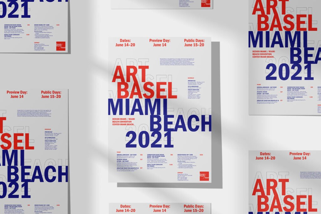
Alignment is one of the most important aspects of typography. You may think that it’s just about getting your text to line up properly, but alignment can actually add meaning to your designs and help convey a message to readers.
There are four types of alignment: left-aligned (also called ragged right), centered, justified (also called full justification), and right-aligned (also called fully justified).
Each type has its own uses depending on what kind of design you’re making–for example, left-aligned text works well in blocks of body copy while the centered text is great for headlines or titles that need extra emphasis.
It’s important to understand these differences so that you can choose the right kind when working on projects with clients who might not know much about typography yet!
2. Hierarchy
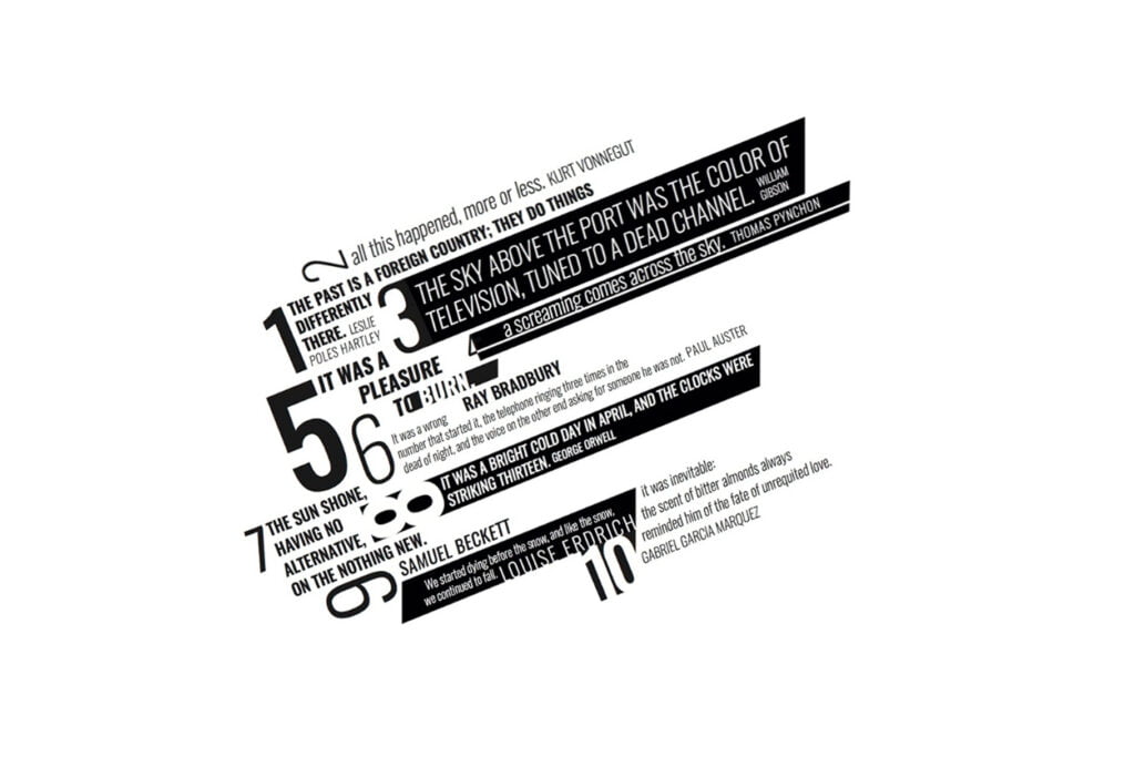
Hierarchy is the organization of content on a page. It’s important to have a clear hierarchy because it helps users navigate through information, find what they need and understand your message.
There are a few different ways to make content more organized, including:
- Using different font sizes, weights, and styles (e.g., bold or italicized) to emphasize certain words or phrases
- Using whitespace between paragraphs and sections to create a visual separation between them
The first step in creating a hierarchy is to identify what should be emphasized within the design: text or images. Where do you want users’ attention focused? Once you’ve answered those questions, choose an appropriate font family (and size), color scheme, and spacing between elements so that each item stands out clearly from its neighbors but doesn’t overpower them either.
3. Readability
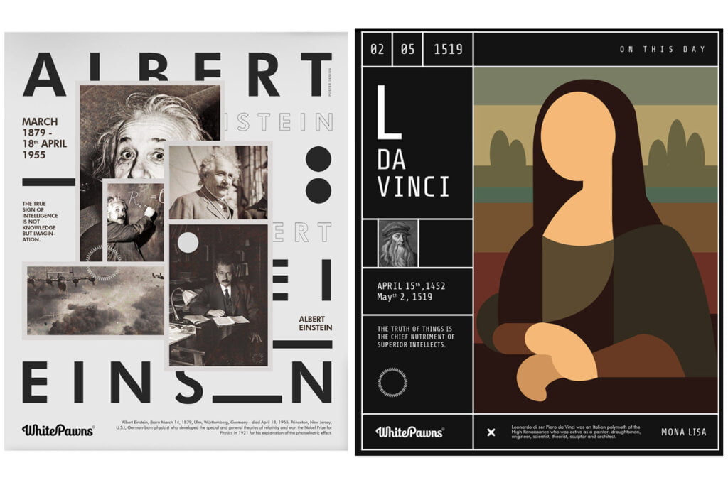
Font size: The larger the font, the easier it is to read. However, you don’t want to go too large because that can make your design look cluttered and detract from its overall aesthetic.
Line length: Longer lines of text are easier on the eyes than shorter ones because they take less time for our brains to process them as we read them (and longer lines mean more space between words).
However, if you make them too long then your reader might lose interest or become bored with having to scroll down so far just to get through one sentence!
Try starting out with a medium-length line length and see how that feels before deciding whether or not it needs adjusting further down the road — maybe even try using different lengths throughout different parts of your site/app so people don’t get bored staying with one format all day long.
Check out trending post on 12 Typography Books That Will Make You A Better Designer
4. Typeface
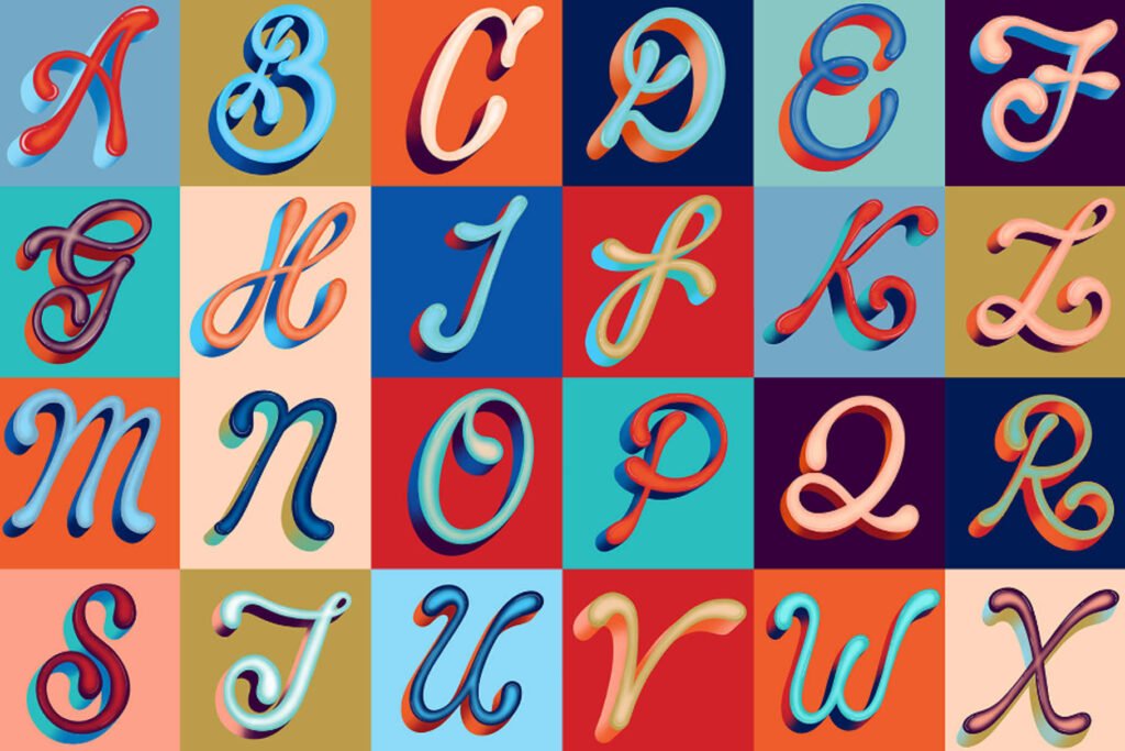
Typeface is the design of a typeface, which may be a family of typefaces, in particular, a group of letters, numbers, and punctuation marks shared between several fonts. The design can be based on calligraphy or handwriting.
The design can be based on calligraphy or handwriting. The typeface design is closely connected to the style, weight, and size of a font.
Typefaces are designed and created using software such as Adobe Illustrator and InDesign.
The term typeface is also used to refer to a complete set of characters in a particular typeface. For example, Times New Roman is a specific typeface but is also the name of a complete set of characters that includes all variations such as bold and italic.
Typeface is also the term used for the design of a specific letter or character. For example, Helvetica is a typeface but Helvetica Bold is also its own typeface.
5. Contrast
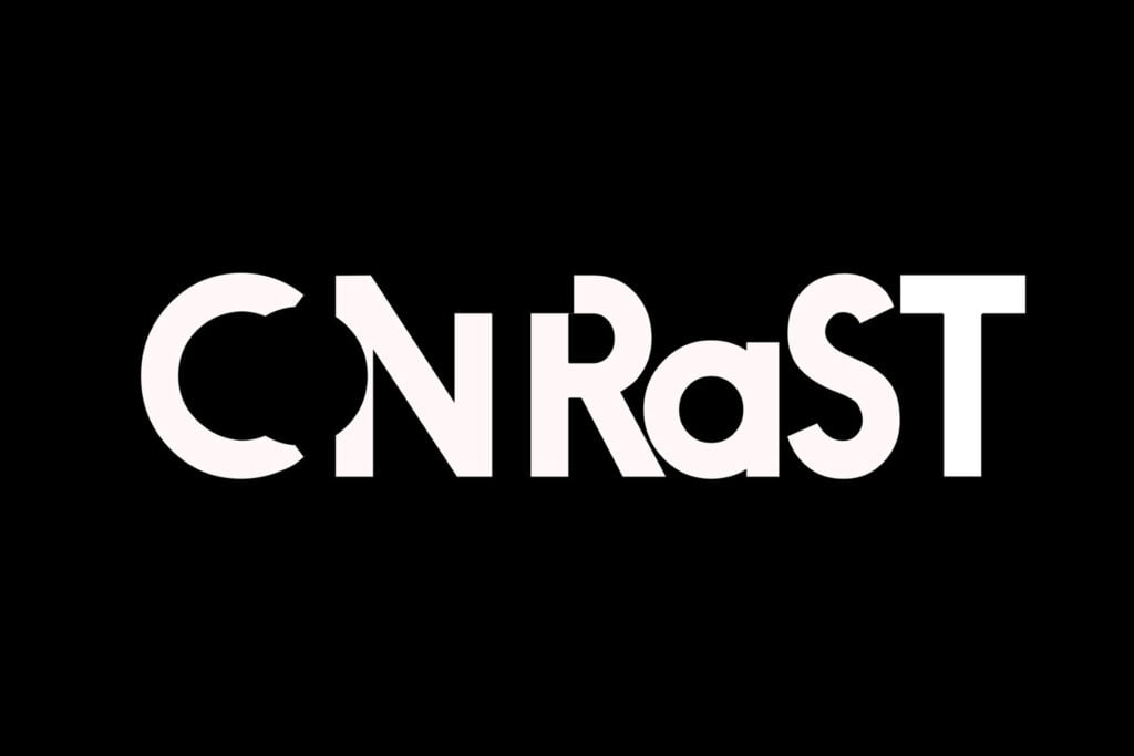
Contrast is the difference between two or more elements. Contrast can be used to make text stand out, create a hierarchy and direct the eye around the page.
Contrast can be created by using open spaces on the page, such as whitespace. The use of whitespace can increase readability because it makes it easier for readers to focus on what they’re trying to read without being distracted by other elements on the page.
Contrast can also be created by using different elements on the page, such as color and size.
For example, if you were to use large amounts of red text on a white background, this would create a high level of contrast between the two and would be very noticeable.
Whitespace also helps avoid clutter in designs by directing people’s attention towards specific areas of a design that need their attention most urgently (e.g., an advert).
Don’t forget to read The 10 Basic Rules of Typography Every Designer Should Know
6. Whitespace
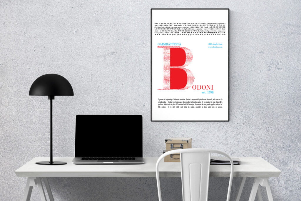
If you’re a designer, then you know that white space is a crucial part of typography. It’s the area between elements in a design–the visual breathing room that separates them and lets the eye rest.
White space can be used to separate elements or create contrast between them; it also helps improve readability and legibility by giving readers more room to focus on individual words or letters.
White space plays an important role in creating hierarchy within your designs: if you want something emphasized, increase its size so it becomes more prominent compared with other elements around it (and vice versa).
You can use tactical uses of white space not only for aesthetics but also functionality; this will help draw attention where necessary while keeping things organized at all times.
White space is also used to help separate elements from each other. If you want something to stand out, try increasing the size of its container or reducing the size of other elements around it so that it becomes more prominent.
This will help improve readability and legibility by giving readers more room to focus on individual words or letters.
7. Consistency
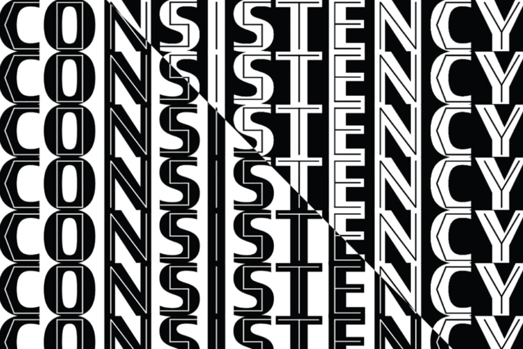
Consistency is key when it comes to typography. It’s one of those things that can help you with your branding, usability, and accessibility–and it’s also just as important for us designers!
Consistency can be used to help you create a visual brand for your website, as well as improve usability and accessibility. The consistent design allows users to easily identify and recognize elements on your site, which makes it easier for them to navigate around it.
It’s essential for us as designers because we want our users to be able to recognize and understand our designs quickly.
Consistency helps users learn how your site works, so they don’t have any problems navigating through it later on in their visit or when coming back another time (or even just clicking on other links).
Conclusion
Typography is one of the most important elements in the design. It’s not just about making things look pretty, it’s about communicating with your audience and helping them understand what they’re looking at.
Typography can be used to create hierarchy, contrast, and readability in your designs which are all crucial for creating a successful piece.
In today’s world of technology, it’s important to understand that the user is king. They are always looking for ways to make their lives easier and more efficient. A design that is easy to navigate, easy to read, and understandable will help your company grow and flourish.
Recommended reading: 15 Best Professional Fonts for Designers (Expert Curation)
What are the three elements of good typography?
Good typography is a balance between the three elements of alignment, readability, and hierarchy. These elements work together to create a document that is both easy to read and visually appealing.
What are the elements of typography?
Typography is the art and technique of arranging type to make written language legible, readable and appealing when displayed. The main elements of typography are…
1. Alignment
2. Readability
3. Hierarchy
4. Typeface
5. Contrast
6. Whitespace
7. Consistency
What is the importance of typography?
Typography is the art and technique of arranging type. It can be used to create a variety of different effects, including setting text in specific styles, adding emphasis on key points, and generally making your writing as clear and interesting as possible.
4 thoughts on “7 Essential Elements of Typography Every Designer Must Know About”