Negative space is a great strategy for creating powerful logos. It can convey meaning and a message, but also help your logo stand out from others.
So, what exactly is negative space? Simply put, it’s the white or empty space within your design that doesn’t contain any objects or text.
When used properly, negative space can improve the legibility of a logo and make it more recognizable over time. Plus, it makes for some pretty interesting designs!
In this blog post, we’ll explore why negative space matters in logo design—and how you can use it to improve yours today!
What is Negative Space in Logo Design?

Negative space is the area around your logo. When you look at a logo, your eye focuses on certain parts of it and ignores other parts. These other parts are called negative space because they’re not as important to focus on.
Negative space is an important element of logo design. It can help you create a clean, simple design—and it can make your logo more recognizable over time!
Negative space can also help you communicate certain brand values with your logo. For example, if you have a simple, clean design with lots of negative space, it might convey that you’re a modern and trendy brand.
If your logo is full of color and filled with detail, it might suggest that you’re fun or exciting to work with!
Why Does Negative Space Matter in Logo Design?
Negative space is an important element in logo design, but it’s not always obvious why. To understand why negative space matters, you need to understand the role of a logo.
A logo isn’t just an image–it’s a visual representation of your brand that communicates its essence in an instant. Your brand may be more than just one product or service; it could also include your company culture, values, mission statement, and/or slogan.
Logos are designed with this broader context in mind because they’re meant to represent something greater than just themselves: they’re visual representations of everything else associated with your business (or product).
And while logos can be used as standalone pieces on websites or marketing materials like flyers or posters–they don’t always have to include text at all!
In fact, most people would agree that some of their favorite logos are those which feature no words at all (think Apple).
But back on topic, Logos are designed to be used as standalone pieces on websites or marketing materials like flyers or posters.
Types of Negative Space
There are a few ways to use negative space in logo design.
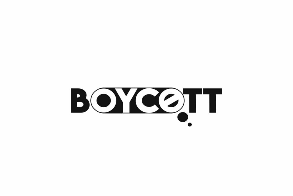
1. Double Entendres

These logos utilize the white space within a symbol or piece of text to create an artwork. Due to this, the logo is transformed into a picture that can be interpreted in two different ways, similar to a common optical illusion.
This is a great way to add some fun and playfulness to your logo. It also makes it more memorable, as people will be able to recall the meaning behind your design even if they can’t remember the exact logo itself.
In the above images, we have shown some examples of double entendres, but there are many more out there. You can find them by searching for “double meaning logo” or “Double Entendres logo” on Google or Pinterest.
Also, read How To Copyright and Trademark a Logo (Step-by-Step Guide)
2. Typography Logos
Typography logos are another great option for brands that want to create a memorable logo. The best way to do this is by using a custom font, but many people don’t know how to create their own font or find one that they like.
Fortunately, there are plenty of free and paid options out there that you can use to create a custom font for your logo. The best part is that these fonts look great on any device, so you don’t have to worry about them not displaying properly in certain situations.
The typography logos that you see above are great examples of how to create a custom font for your brand. It’s important that you go through this process step by step so that you can ensure it’s done correctly.
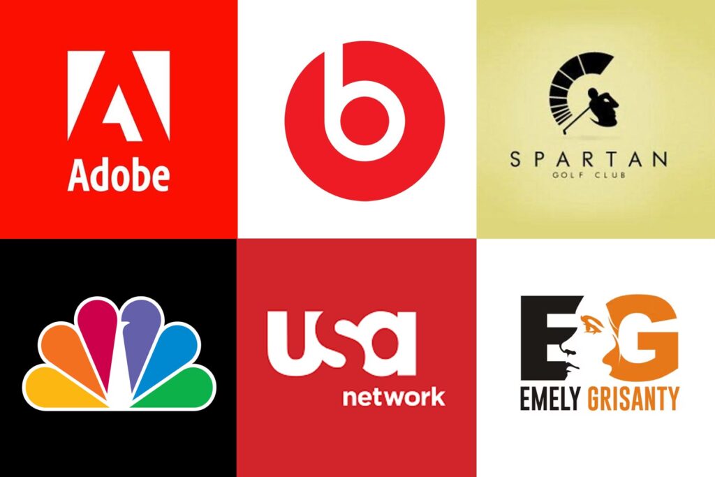
3. Hidden Images Logos
These types of logos are another great way to add a little bit of mystery to your brand. By adding a hidden image to your logo, you can make it more interesting and memorable for everyone who sees it.
This is something that many large companies do, but it’s also something that smaller businesses can benefit from as well.
You can use this type of logo to add a personal touch to your brand, as well as make it more interesting. The best way to do this is by making sure that the hidden image has some sort of connection to your business or services.
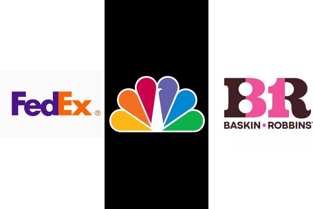
4. Closure

Positive and negative space can be used together to create images that are more complete than their minimalist counterparts.
Negative space acts as a frame around photographs, so look up the World Wildlife Fund logo if you’re having trouble visualizing it—the panda is well-known for using this technique!
Closure is one of the most commonly used visual illusions, and it’s a great way to make your logo more memorable.
This type of logo works best when there are multiple objects that work together in some way, such as when they form a picture or tell a story.
Benefits of Using Negative Space in a Logo
Negative space is a powerful tool for creating visual interest. It can be used to create a logo that is simple, yet elegant.
It can also be used to create striking logos that are subtle and complex, but still convey the message of your brand.
Negative space allows you to separate elements within your design by giving them their own space on the page or screen (or whatever medium you’re using).
This gives each element its own identity and makes it easier for viewers to understand what they’re looking at without getting distracted by other information surrounding it.
Negative space is one of the most important design tools you can use. It’s a simple way to make your logo more attractive, memorable, and effective.
Negative space gives each element its own identity and makes it easier for viewers to understand what they’re looking at without getting distracted by other information surrounding it.
Tips for Making a Negative Space Logo
In this section, we will discuss how you can use these five tips for making your logo stand out from the crowd and make it truly memorable!
1. Use a contrasting color in the negative space. For example, if your logo has a blue background, use red text to create the negative space and vice versa.
2. Keep the negative space consistent throughout your brand’s identity.
3. Use geometric shapes in the negative space. Geometric shapes are easy to read and understand and can make your logo more professional-looking.
4. Use a simple font for your logo’s text. The simpler the font, the easier it is to read and understand your brand’s message.
5. Make sure the logo’s style matches your brand’s identity. If you’re using a geometric shape in the negative space, make sure it’s consistent throughout all of your branding materials.
You may also like How to Present Logo Design Concepts to Clients (Step-by-step)
Negative Space Logo Best Practices
Negative space is an important part of logo design, but it’s not always used correctly. The goal of negative space is to create a logo that is memorable and has meaning behind it. Here are some best practices for using negative space in your brand’s identity:
1. Highlight the Crucial Features of your Brand
Keep your logo simple and easy to understand. Use negative space to highlight the most important aspects of your brand, such as its name or slogan.
2. Consider Subtraction
When using negative space in your logo, consider removing elements that aren’t necessary.
For example, instead of using a tree in your logo, consider just using the leaves. This will help focus attention on the most important parts of your brand’s identity and keep things simple.
Do not overcrowd the logo Keep your negative space clean and simple by limiting the number of elements. Use only those that are necessary to communicate your brand message.
3. Include Negative Space in the Early Stages
When using negative space in your logo, remember that it doesn’t have to be obvious. Try including negative space in the early stages of creative development by using a simple shape or outline.
This will help you determine whether or not the concept works, before investing time and money into the final design.
4. Use a Color Palette to Create Contrast
You can use color to create contrast in your logo by choosing a base color for the negative space and then adding a complementary color.
This will help break up the space and add visual interest to your design.
5. Consult a Professional
If you’re still having trouble creating the perfect negative space logo, consider hiring a graphic designer who specializes in logo design.
They can help you choose an appropriate color palette and shape to use and create an overall design that’s visually appealing.
Challenges and Limitations of Negative Space Logos
While negative space logos are powerful and memorable, they do pose some challenges.
They can be difficult to read Negative space logos are more about design than they are about legibility. If your logo doesn’t contain any words, it will be more challenging for people to understand what your business does or who you are.
They may not work for every industry While negative space logos can be visually appealing and memorable, they aren’t appropriate for every industry or business type.
For example, if your brand is based on a specific message or meaning, it may be difficult to convey this with a negative space logo. If you’re in the food industry, for example, it’s important that your logo clearly conveys what your business is about.
A logo that’s difficult to read can be confusing and frustrating for customers. For example, if you’re a restaurant selling chicken wings, it probably wouldn’t make sense to use a negative space logo of some sort because it doesn’t tell people what your business is about.
They’re not very versatile Negative space logos also aren’t as versatile as other types of logos. You won’t be able to use them on all kinds of materials or in many different contexts without losing their meaning or original intent.
Examples of Effective Negative Space Logos
There are many brands that use negative space logos. These include some of the most recognizable companies in the world: Apple, Facebook, and Twitter are just a few examples. Negative space logos can be used by any industry or type of business–they aren’t restricted only to tech companies!
Negative space logos come in all types of colors too. Some examples include black and white, red and blue (like our example above), green/yellow/orange; even purple! The possibilities are endless when it comes to creating an effective negative space logo design for your brand!
Conclusion
Negative space is a powerful tool in logo design, and it can be used to create a strong brand identity. The best logos use negative space to showcase their values and beliefs without being overly literal or boring.
Negative space logos are also flexible enough to work across different mediums (such as print or digital), which makes them more versatile than other types of logos. However, there are some challenges with creating this type of logo–namely that it can be difficult for people unfamiliar with design terminology like “negative space” to understand what makes an effective one.
Recommended Reading: Importance of Functionality in Logo Design (The Ultimate Guide)
FAQs
What are the benefits of negative space in design?
Negative space is the space around an object in a design. It’s often overlooked, but it can be just as important as the objects themselves. Negative space helps to define and highlight the features of an object. It also helps create balance and harmony in a design.
What does negative space mean in logo design?
Negative space is the space around a graphic element or design. Negative space is not necessarily empty, but rather it contains no visual elements. For example, in the logo for [company name], there are many different shades and colors, but there is also a lot of white space on the page to provide balance and contrast.
What is the importance of spacing in a logo?
Spacing in a logo is important because it creates the space that conveys the message of the brand. The spacing between letters and words can be used to create a visual hierarchy, which makes it easier for customers to understand what the company stands for.
What is the use of negative space?
Negative space is the space around an object, and it can be used to help emphasize a subject. For example, if you have a rectangular piece of paper, and you fill in all of the empty space around it with black paint, the rectangular piece of paper will stand out.
2 thoughts on “How Negative Space in Logo Design Makes a Brand Strong”