The best fonts for websites are the ones that work most effectively. You’ve probably heard about the importance of font, but it’s not something you can just pull out of thin air.
There are a lot of things to consider, including the font’s readability and how well it communicates your brand. The best fonts for websites will help you get your message across clearly and effectively.
There are thousands of fonts out there on the web and in stores, so how do we choose which one is right for us? In this article, we’ll explore some of the most popular fonts used on websites right now and how they affect users’ perceptions of your brand.
Primary Types of Fonts
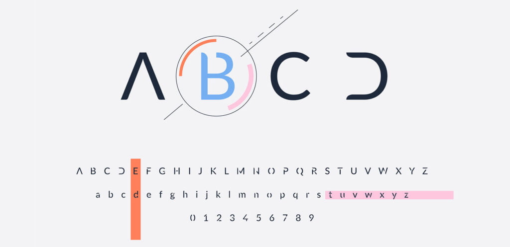
There are a few primary types of fonts that you should be aware of before choosing one. Some have more to do with how the letters look than others, but there are still some basic differences between them.
Serif fonts: These are the most common fonts out there. They have what are called “serifs” at the ends of each stroke in a letter or number. Serifs make it easier to read by improving legibility, which is why they’re used so often in print and digital media. They’re great for headlines and subheads because they stand out from their background
Sans serif fonts: Sans serif fonts are the most basic type of font and are used in the majority of websites. They’re called “sans serif” because they don’t have any serifs at all. Sans serif fonts are good for body text because they make it easy to read while still being attractive.
Script fonts: Script fonts are the most decorative type of font and are often used in logos. They’re also great for headlines but shouldn’t be used for body text because they’re hard to read, especially on small screens.
Display: Display fonts are fun and unique, but they shouldn’t be used for body text because they’re hard to read. They’re better used for headlines and logos.
What to keep in mind when choosing a font?

The most important thing to remember is that you want your font to be easy to read.
To create a balanced and harmonious page, you should use only one font family.
It also helps if the fonts are similar in style so they go together well. If you’re using a lot of different fonts, make sure there’s at least one sans serif on each page.
Sans serif fonts are easier for people with dyslexia or other reading disorders because they’re more consistent and don’t have any fancy flourishes or tails on them.
Here are some most important things to keep in mind when using fonts:
Ease of reading: The first thing to consider is how easy it is to read the text in your chosen font. If you use a font that has small letters, or if all of your words are capitalized, it will be harder for users to understand what they’re supposed to do on the site.
Hierarchy of information: The second thing to consider is how clear your hierarchy of information will be. For example, if you have a heading that’s bolded in one font and another heading that’s not bolded in another font, it may be hard for users to know which is more important.
Consistency: The third thing to consider is how consistent your look and feel will be across the website. If you use multiple fonts on a page, make sure they go together well
Simplicity: The fourth thing to consider is how simple your design will be. If you have too many colors or too many fonts, it may be hard for users to understand what they’re supposed to do on that page
Legibility: The fifth thing to consider is how easily people can read the text on your website. If the font size is too small or if there are lots of different fonts used, it might make it hard for users to read.
Popular Fonts for Websites
1. Open Sans
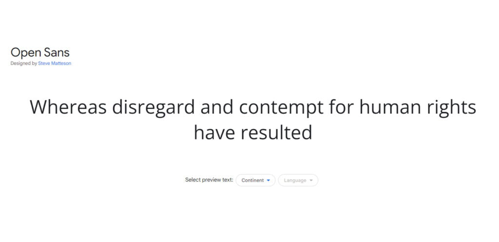
The sans-serif typeface Open Sans was designed by Steve Matteson and commissioned by Google. Open Sans is available for free on Google Fonts, and it’s used on the majority of websites today.
Helvetica is a typeface that was designed in 1957 by typeface designer Max Miedinger with input from Eduard Hoffmann.
It was originally released by Linotype GmbH of Germany as Neue Haas Grotesk (New Haas Grotesque) but has since been sold to Monotype Imaging Holdings Ltd., who sell it under the name Helvetica Neue®; they also offer other versions including Helvetica® Condensed and Helvetica Black™
Check out our latest post 15+ Best Signature Fonts for a Professional Touch (2023)
2. Helvetica
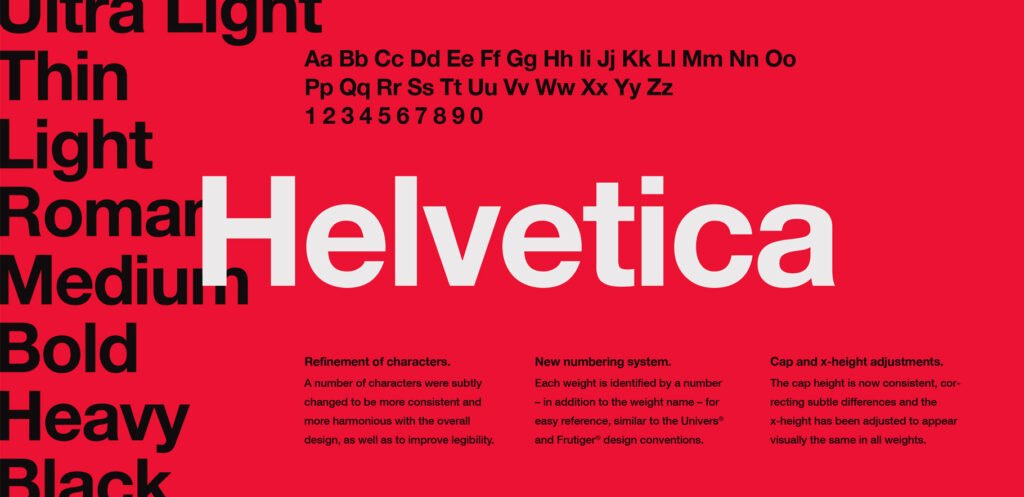
Helvetica is a sans-serif typeface designed in 1957 by Max Miedinger with Eduard Hoffmann and released by the Haas Type Foundry in 1960.
It has become one of the most popular and influential font styles, and it has been imitated since its release. Helvetica was developed from Akzidenz Grotesk Black by adding shorter ascenders and descenders to bring out a more relaxed feel, which makes it better for longer texts than other similar designs such as Futura or Univers.
Helvetica is considered to be highly legible and versatile. It has been used in a variety of applications, from advertisements to newspapers, magazines, and books. It is used by many government agencies because it is clear and neutral.
3. Ubuntu
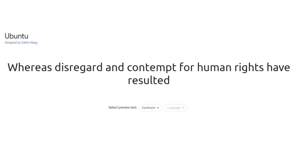
Ubuntu is a sans-serif typeface designed for use in body text and user interfaces. It was created by Aldo Novarese and released in 1996 as the default font for Ubuntu Linux.
The typeface was designed to be clear, legible, and neutral, with a modernist feel that makes it appropriate for use on screen. It has been called “the best interface font” by many designers.
The Ubuntu typeface has a tall x-height, large counters, and open apertures that make it legible in small sizes. It also has a very large range of characters, which makes it suitable for use in many different languages.
Ubuntu is the default typeface used in the KDE desktop environment and Ubuntu Linux. The font can be downloaded from here: ubuntu
4. Roboto
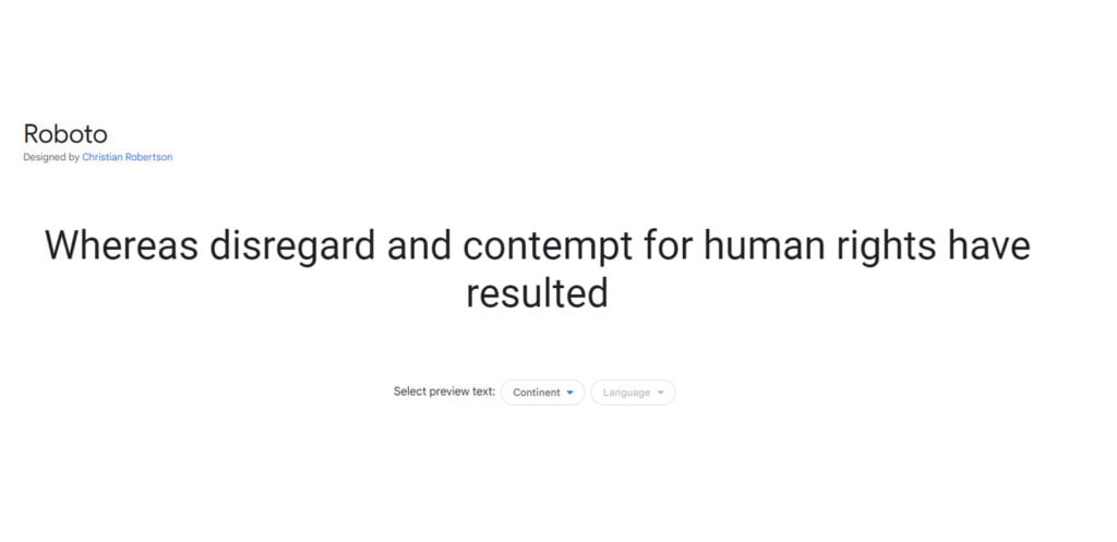
Roboto is a geometric sans-serif typeface designed by Christian Robertson for the Android operating system. The font was introduced in Ice Cream Sandwich (Android 4.0) and has become one of the most popular fonts in the world ever since then.
It’s used on millions of websites across many different platforms, including desktop browsers, smartphones/tablets, TVs/hubs, etc., so it’s easy to see why Roboto has become so popular!
Roboto has an elegant look and feels that makes it very readable on any typeface-based website or app page; however if you want your content to stand out from other similar sites then maybe Ubuntu would be better suited.
Roboto is a very rounded font, which means that all of the letterforms are slightly curved. When used as a body text font this can make it difficult to read at small sizes because of its lack of straight lines; however, when used as headers or headlines it’s perfect because they’re not meant to be read in large chunks.
5. League Gothic
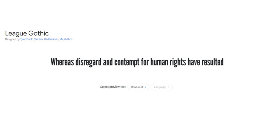
League Gothic is a geometric sans serif typeface designed by Tobias Frere-Jones and released in 2002. It contains five weight options, ranging from light to bold.
League Gothic is a revival of a classic sans serif typeface designed in 1903 by Morris Fuller Benton for the American Type Founders (ATF). The original design came out with ATF’s publication “Type Faces: Their History and Development”, which was published in 1906.
League Gothic is used primarily for display purposes and as a headline font. It’s very geometric in nature, so you may not want to use it for body text or paragraphs of text.
The font has a somewhat retro feel to it, so if you’re looking for something modern and sleek, this is not the one. It’s more of an old-school typeface that isn’t really used anymore outside of some vintage logos or signs.
League gothic font is best suited for the types of websites which require a retro, old-fashioned look. It’s not the kind of font that you would use for any modern-day projects that need to be more sleek and stylish.
You may also like Top 15 Minimal and Clean Fonts to Save the World of Design
6. Lato
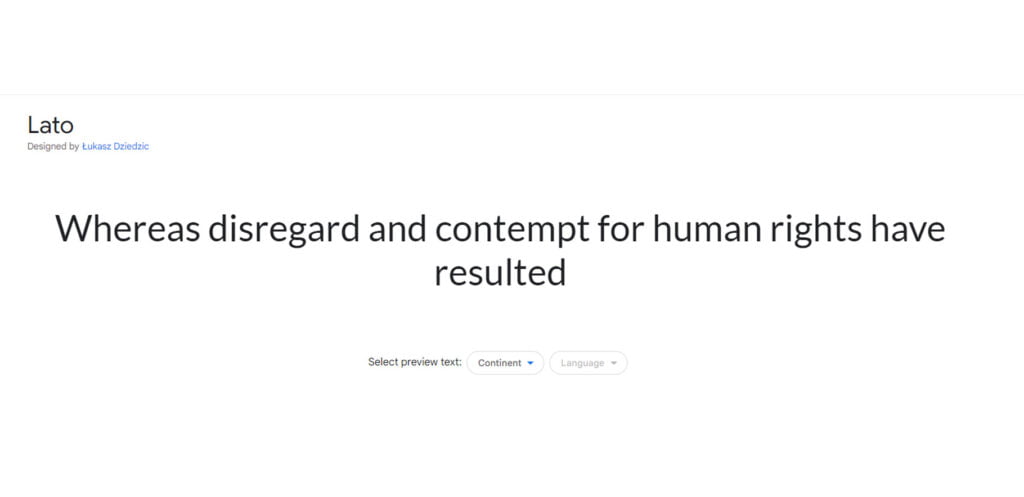
Lato is a sans-serif typeface designed by Łukasz Dziedzic and distributed by Google as part of the Google Fonts library. It is one of the most popular fonts on the Internet. The font is optimized to work well on screens, particularly mobile devices.
It was designed to be highly legible at small sizes, and it also includes some unique features such as ligatures for certain letter combinations.
Lato is a great font for any modern-day projects that need to be more sleek and stylish. It works well with almost any kind of design, whether it’s a website or an app.
It has a large x-height and open counters, which makes it easy to read at small sizes. It also has extensive support for languages with non-Latin alphabets. The Lato font family is available in over 30 different styles, from extra light to black.
It is best suited for the types of websites which are looking to add a touch of elegance to their design. It is also great for websites that need to be clean and professional.
7. Montserrat
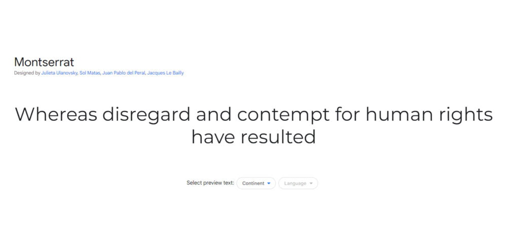
Montserrat is a sans-serif font that has a geometric structure and rounded corners. It’s available in both bold and regular styles, as well as many different weights. The font is best suited for websites that want to be modern and simple, but still have a touch of elegance.
Montserrat was designed by Julieta Ulanovsky and published in 2014. It is based on the lettering of Spanish scribe Joan María Simonet I Puig (1865–1936), who used his handwriting for many pieces, including advertisements and posters.
Montserrat is available in three weights: light, regular, and bold. It is best suited for websites that need a clean, minimalist look.
The font is available in both a serif and sans-serif style.
8. Playfair Display
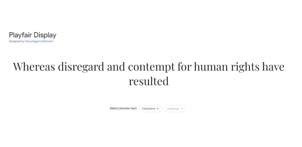
Jonathan Hoefler and Tobias Frere-Jones designed Playfair Display, a serif typeface, in 1994. It’s based on the work of John Baskerville and has a high x-height (tall lowercase letters), which makes it useful for display purposes.
Playfair Display was intended to be used in headlines, titles, and smaller text blocks. Merriweather is a sans-serif typeface with low contrast, designed by Sorkin Type in 2010. Merriweather comes in two styles: serif and sans-serif.
It is best suited for the types of websites you’d find on the web today, such as blogs and news websites. The font is available in both a serif and sans-serif style.
It has a unique, condensed look that makes it perfect for headlines and body text. It’s available in three weights: light, regular, and bold.
Don’t forget to check out Difference Between Font and Typeface (The Ultimate Guide)
9. Merriweather
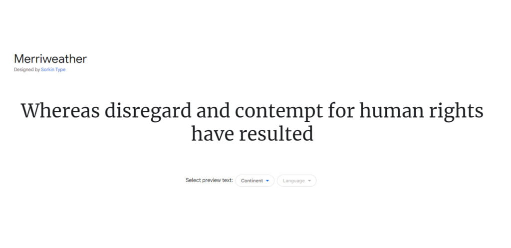
Merriweather is a sans-serif typeface family designed by Eben Sorkin and released by the Microsoft Corporation in 2010.
Merriweather has a unique condensed look that makes it perfect for headlines and body text. It’s available in three weights: light, regular, and bold.
It is closely related to the Fira Sans typeface family, which is a bit wider and has a larger x-height; however, Merriweather has thinner strokes and sharper corners than Fira Sans.
The typeface is available in three styles: regular, medium, and bold.
Merriweather is best suited for the types of sites that need a professional and clean look. It’s also a good choice for blogs, news sites, and magazines.
Since Merriweather is a serif typeface, it’s perfect for body text. The thin strokes and sharp corners make it easy to read even at small sizes.
10. Palatino
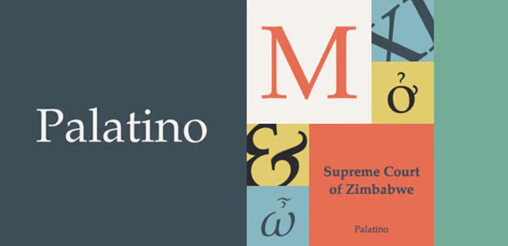
Palatino is a serif typeface that was designed by Hermann Zapf in 1948. It is one of the most widely used typefaces in the world, and it has been used in many books, newspapers, and magazines.
The name Palatino derives from the city of Palatine in Italy; it takes its inspiration from the Renaissance humanist design tradition of calligraphy and hand-lettering.
Palatino supports many languages due to its large character set (including Greek) which makes it ideal for any website with global traffic or a multilingual user base.
The typeface comes in four different variants: regular, italic, bold, and bold italic.
It is best suited for the types of websites which are aimed at an audience that values legibility and readability. It is a popular choice for websites with a classic, traditional, or even old-fashioned look and feel.
The typeface’s design makes it ideal for long passages of text as it has a large x-height which means that the lowercase letters are larger than the uppercase ones.
Conclusion
We hope that this article has helped you to understand how to choose the right font for your website. We know that it can be a daunting task, but with the help of our experts, we have tried to make it as simple as possible. Remember that there are many different types of fonts out there with each having its own set of pros and cons. Just remember not to overdo it with too many different styles in one design!
Recommended reading: 15 Best Poster Fonts to Make Big Impact on Your Design
FAQs
What is the best font for a website?
The best font for a website is Helvetica.
This is the font that has been used by the New York Times, Wired, and The Economist. It’s also the most simple, clean, and readable font you can use on your website.
What is the best font size for website content?
The answer to this question depends on your audience. If your audience is primarily older people, you’ll want to use a larger font size and not make the text too small. If your audience is younger and more tech-savvy, you can use smaller fonts and more abbreviations.
In our opinion, The best font size for website content is 12px. This is a standard size that will make your content easy to read and digestible for users.
What font do most companies use on their website?
The most used font on a company’s website is the Arial font. Arial is a sans-serif typeface developed by Monotype Imaging in 1982 and licensed to Microsoft. It was designed to be a modern, legible typeface that retained the character of Times New Roman.
How many fonts should a website have?
The number of fonts you should use on your website depends on the size and scope of your site.
For example, If you’re running an e-commerce site or a site with a lot of content, you’ll want to stick to around two or three fonts. You don’t want to overwhelm people with too many different fonts, because it will make people less likely to read what you’ve got to say.
Does font matter on a website?
Yes, the font does matter on a website. Fonts can make or break the user experience of your website. The wrong font could distract readers, or worse, make them feel uncomfortable and leave your site.
4 thoughts on “Top 10 Most Popular Fonts for Websites (2023)”